


In Part I and Part II of our Charting in Retool with Plotly series, we explained how to go from basic charting options on a line chart (and how to add some cool features) to a complex Sankey chart generator - all in Retool.
In this part III, we’ll be focusing on leveraging the power of both platforms to create not only useful charts, but highly interactive ones that integrate seamlessly with your internal app toolset. Using the selectedPoints attribute of the chart component is a brilliant way to make your charts more understandable and more actionable.
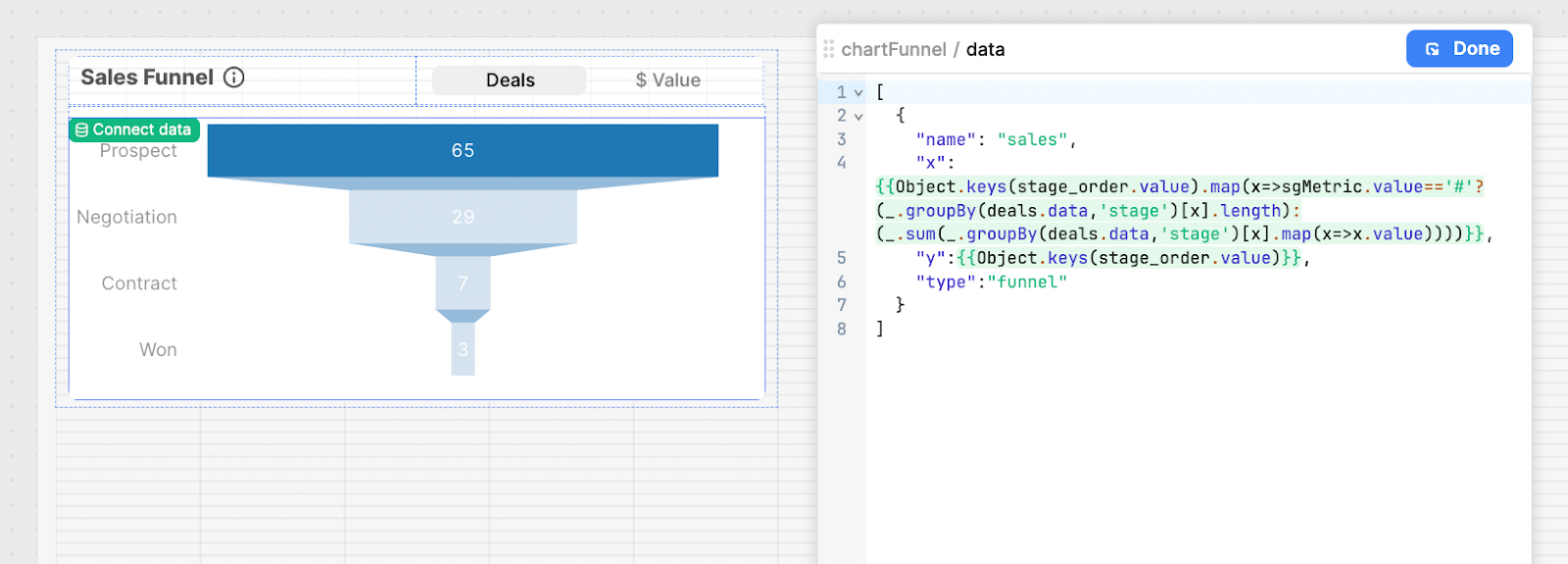
We’ll be building this funnel chart for a sales app that tracks the number of deals in each status tag. Users can simply click into a bar in the funnel and a modal will show them detailed data for that status group. They can even highlight and select multiple statuses to see all data.
We also made this chart into a module that can be reused across multiple apps.
Let’s jump into how we built this.
Building a funnel chart in Plotly
This is what the Plotly data object for a basic funnel chart looks like:
[\n{\n"name": "sales",\n"x": [\n65,\n29,\n7,\n3\n],\n"y": [\n"Prospect",\n"Negotiation",\n"Contract",\n"Won"\n],\n"type": "funnel"\n}\n]JavaScript code snippet showing how to set up a mock data query for a sales funnel component in Retool.
We’re going to expand on this basic format with some more complex and dynamic data and interactivity.
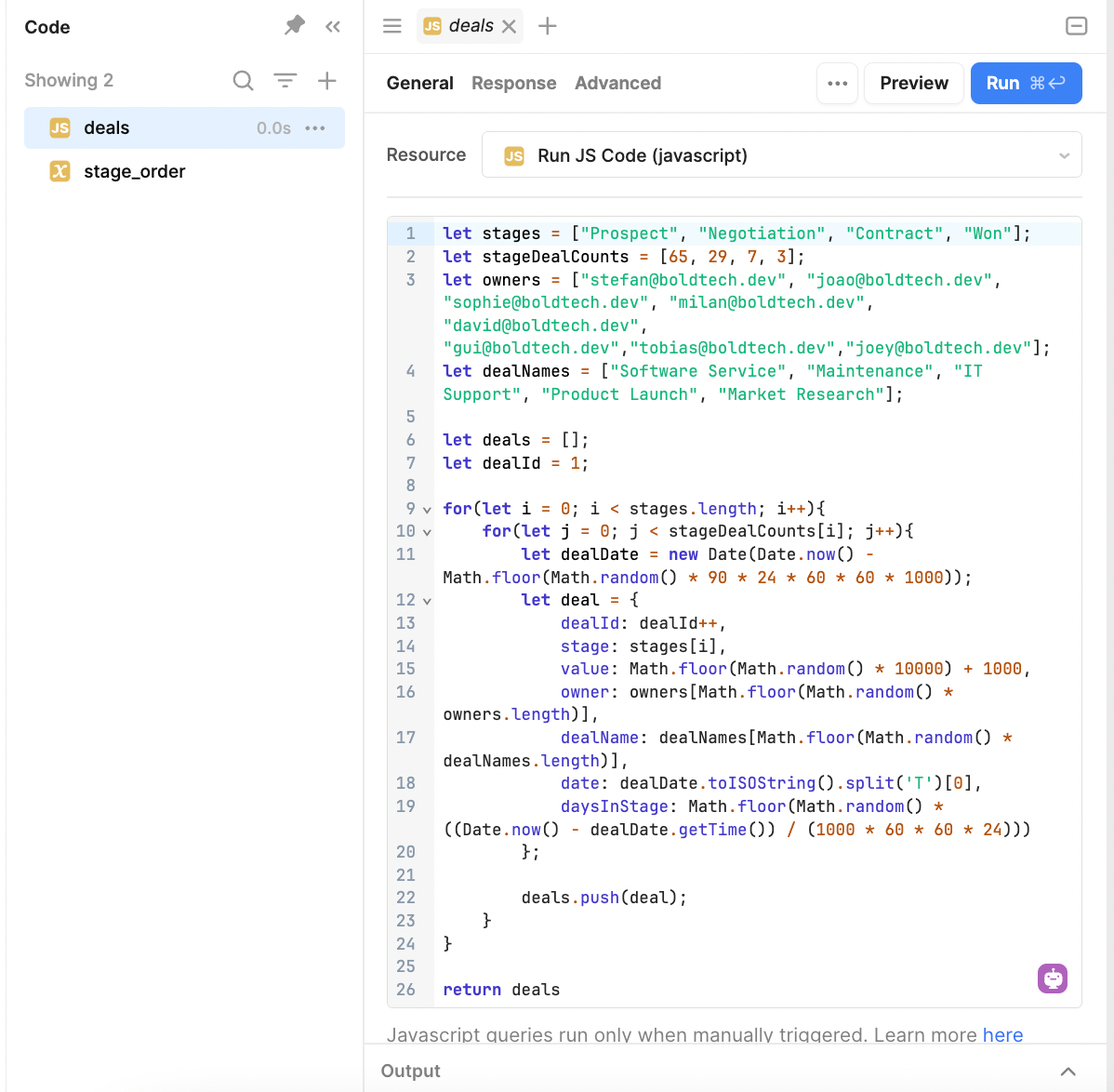
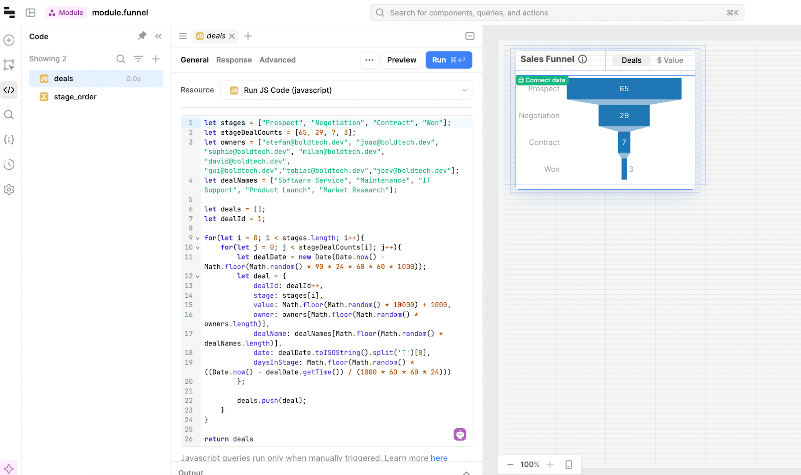
For our sales funnel, we started by creating some mock data in a JS query. This defines data keys such as stages, owners, deal names and then sets a deal date and calculates the days in that stage. The for loop creates the full dataset according to the counts defined for each stage.
This JS query is the data we use for testing, and also allows us to export the full module as a JSON for you to download below and use straight away.
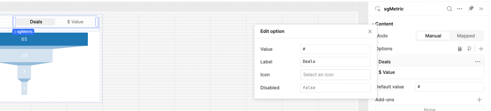
We also added a segmented control component above our chart to allow users to switch between number of deals (#) and the dollar value ($):
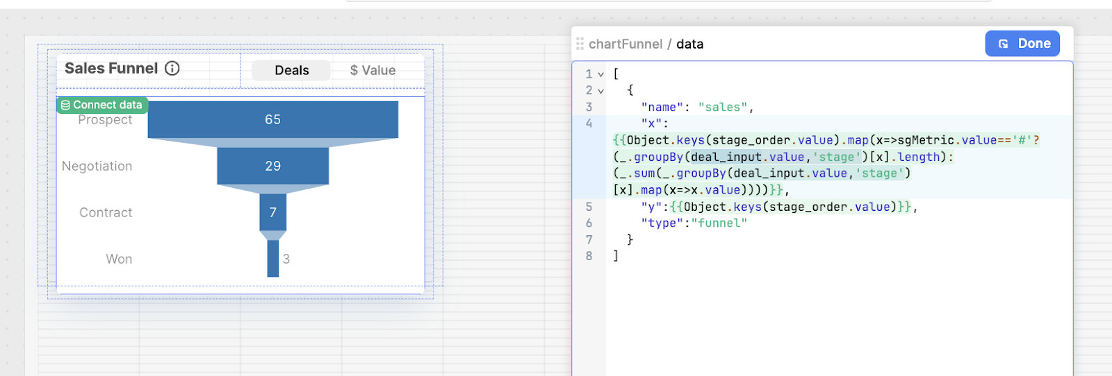
Next, we connected the data in our JS query and the switch functionality to the chart component in the data object. This is what it looks like:
This formats the deals data into grouped stages for the ‘x’ axis of the chart. If the segmented control value (sgMetric) is set to the number of deals (#), it groups the values by the stages defined, and counts the number of values in each group using .length. If the sgMetric is set to Value rather than the deal number, it groups and then sums the values in each stage to display the total dollar amount.
The keys are defined by the stage_order variable we defined, which looks like this:
{\'Prospect\':0,\n\'Negotiation\':1,\n\'Contract\':2,\n\'Won\':3\n}
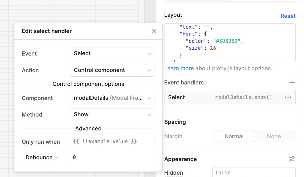
Then, the layout object of the chart is straightforward and principally defines the colors, as well as the ability to select and drag on the chart:
{"title": {\n"text": "",\n"font": {\n"color": "#3D3D3D",\n"size": 16\n}\n},\n"autosize":true,\n"height":1000,\n"font": {\n"family": "var(--default-font, var(--sans-serif))",\n"color": "#979797"\n},\n"showlegend": false,\n"margin": {\n"l": 72,\n"r": 0,\n"t": 0,\n"b": 0,\n},\n"hovermode": "closest",\n"hoverlabel": {\n"bgcolor": "#000",\n"bordercolor": "#000",\n"font": {\n"color": "#fff",\n"family": "var(--default-font, var(--sans-serif))",\n"size": 12\n}\n},\n"clickmode": "select+event",\n"dragmode": "select",\n}
By adding "clickmode": "select+event", "dragmode": "select" to the layout object, we make it possible to open the modal and display a table filtered off the data.
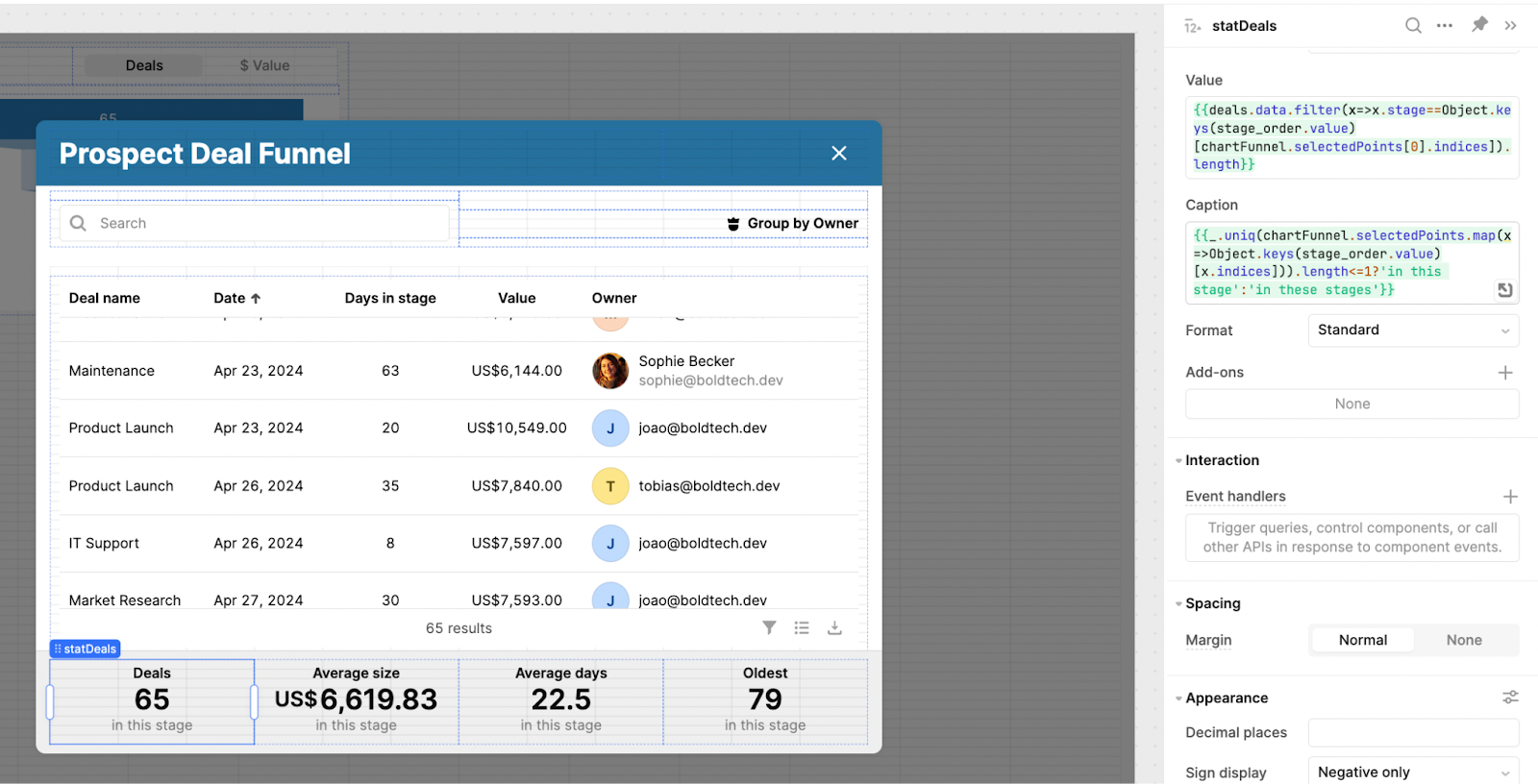
Chart details modal
For the next steps, we set up the modal and detailed table view.
In the chart component, we set an event handler to trigger the modal to open on select.
In the modal, we added a table, search bar, titles and more. For the table, we filter the data from the selected points in the chart. The table reflects the data we set up in the JS query at the beginning, and we have formatted these to be currencies, avatars, and dates in the column settings.
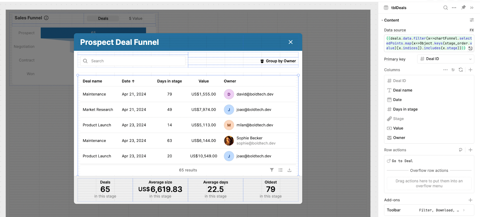
The search bar searches all records in the table and is connected to the ‘search term’ value in the table component.
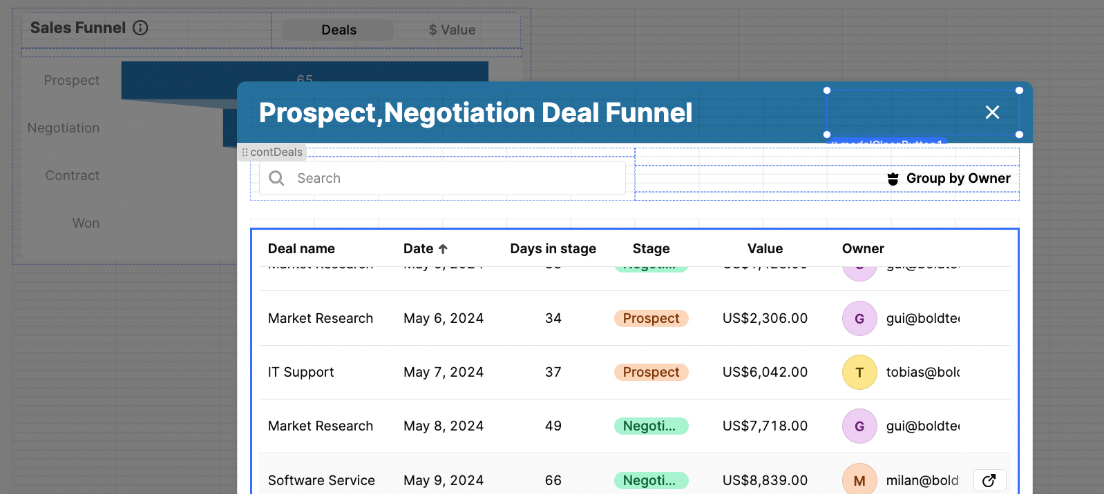
Using this filter will also apply multiple selected points, so users can drag over and select multiple stages at once and see all data for those tags.
Grouping functionality
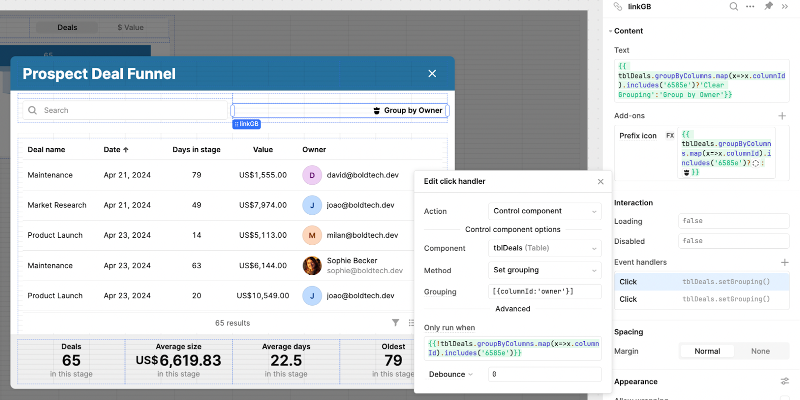
We also used the recently-added grouping functionality to this modal, so that users can group the data in the table by the owner of that sales account.
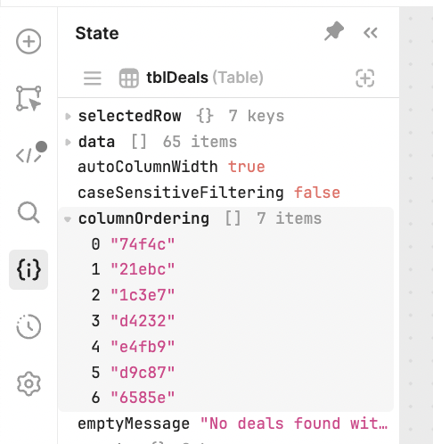
To do this, we first had to figure out the column ID of the ‘owners’ column. You can inspect this in the State section and copying the code - the order of these columns is reflected in the order in which they are listed in the table component inspector.
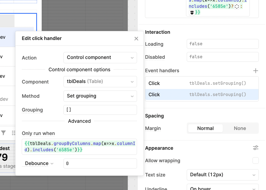
We then added two event handlers to set and reverse this grouping. The first sets the grouping of the table by the ‘Owner’ column. This only runs if they aren’t grouped already using this code: {{!tblDeals.groupByColumns.map(x=>x.columnId).includes(\'6585e\')}}
The other event handler performs the opposite and clears the grouping, if the groupByColumns value of the table is already set to Owners:
We also set the text and icon of the button to switch according to whether the grouping has been set.
Text: {{ tblDeals.groupByColumns.map(x=>x.columnId).includes(\'6585e\')?\'Clear Grouping\':\'Group by Owner\'}}
Prefix icon: {{ tblDeals.groupByColumns.map(x=>x.columnId).includes(\'6585e\')?"/icon:bold/interface-edit-select-area-circle-dash":"/icon:bold/interface-user-king-crown"}}
Statistics
Finally, to add additional info to the modal, we set up some statistics to summarize the data.
For the Deals in stage, this JS filters for the selected points and counts the length of the array it returns, to show the number of entries under this stage selection.
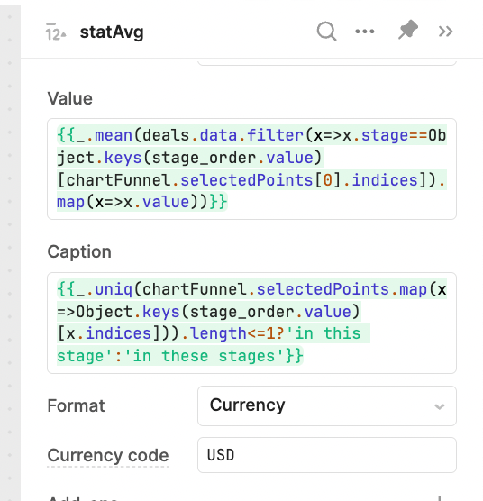
For the average size, the first JS script filters by the selected stage, and uses _.mean to find the average of the returned values.
{{_.mean(deals.data.filter(x=>x.stage==Object.keys(stage_order.value)[chartFunnel.selectedPoints[0].indices]).map(x=>x.value))}}
As in the first, the caption changes depending on whether one or more stages are selected.
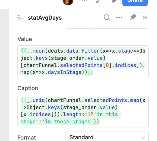
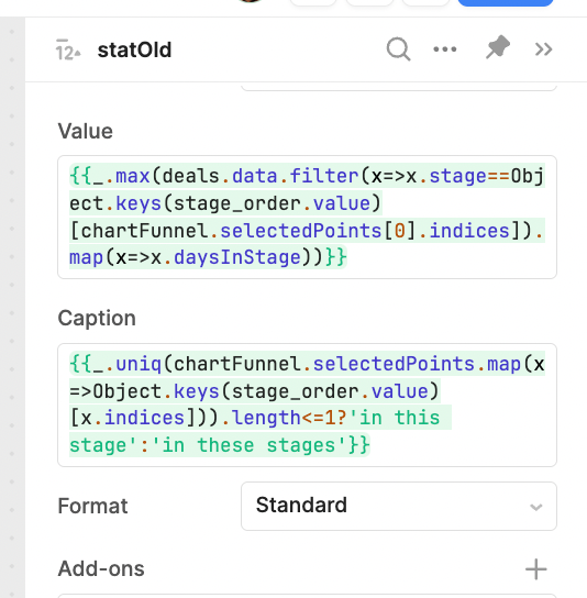
The third statistic counts the number of days in the stage(s) selected. The code is very similar to the previous, but instead finds the mean of the ‘daysInStage’ value.
Finally we want to return the oldest deal in this stage and present how many days it has been there. For this we use the _.max Lodash function to find the highest value in the data and return it.
And with those final touches - we have a fully functioning funnel chart with an interactive data modal. Since we want to reuse this exact same UI in more of our apps (as we recognize the value of consistent UI!), for our next step, we will make this chart into a module that simply needs to be connected to data to be easily reused.
Creating a module
Using modules effectively is essential for building great applications in Retool. While caution should be exercised when it comes to which modules to build (we typically aim for navbars, forms and non mission-critical features such as this one) since performance can slow with too many modules in each app, using them well can make your internal app ecosystem much more scalable and easy to maintain in Retool.
Next, we’ll show you how simple it was to make this feature a module.
Making a chart into a reusable module
This works much the same way as the normal app did, but instead we have defined values for the inputs that can be configured and reused across our Retool environment.
When you set up a module, it gives you the global option to define inputs and outputs for this module. In this case, most importantly we have the deal_input - our deal data. We also have the option to set the title and the default input.
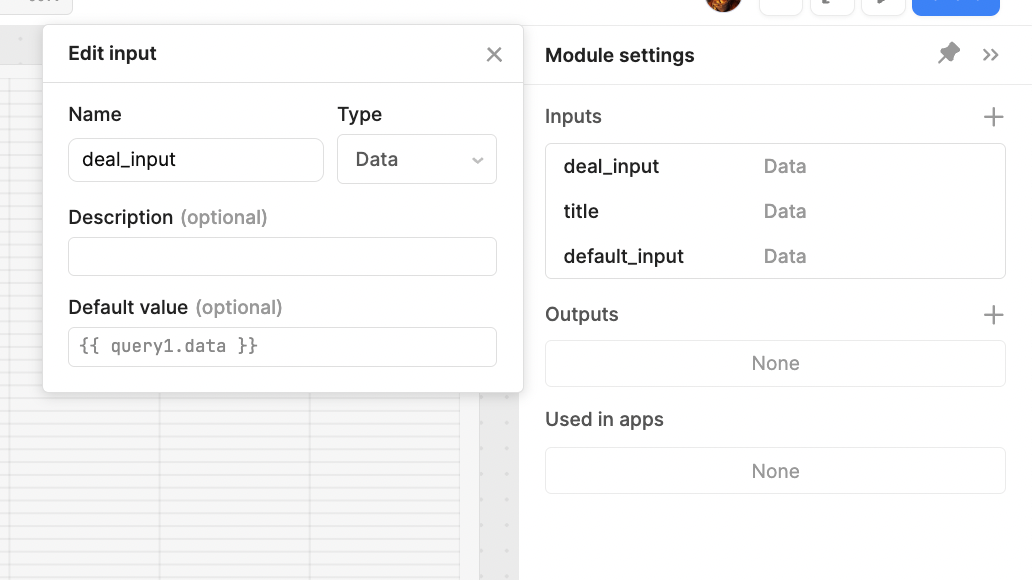
With modules, you can also connect test data in these places to make sure everything is working correctly. You can access these test values by selecting the moduleContainer in the component tree in the left-hand panel.
In our case, we set up another JS query with some mock data and connected this test data to the demo data as data_input:

This data is the same as we used in the first tutorial above, so all that we changed in the module was switching the references from deal.data, our previous demo data query, to deals_input.data, the name of our module input value. This way the data in the funnel chart input will automatically switch to whatever data it is connected to in each app.
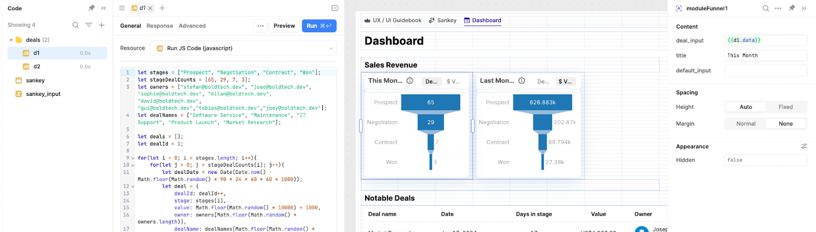
Here you can see the module in use within an app. All we needed to do was pull in the module, and connect our chart data to the deal_input value in the module component. We set the title manually, but this could also be connected to dynamic data or inputs in the app.
This is a great example of using modules to create repeatable patterns in Retool development that ensure consistency and that code is not constantly repeated throughout apps (and therefore becomes hard to maintain).
Download the sample toolscript
The Toolbox newsletter members can download the JSON and import it directly into their Retool environment to test it out ⬇️⬇️⬇️
Members will get guides, tutorials and internal tool tips in 1-2 emails every month.
Want to learn more about internal tools and how to build them? Check out our sections on low-code tools like Notion and Airtable, or developer tools like Retool and Windmill.
