

One commonly requested component in the Retool community is an image carousel. Well, good news! With the introduction of the pagination component in the October Changelog, we can now make a carousel-style component in Retool relatively quickly. In this tutorial, we are going to walk through exactly how to do just that.
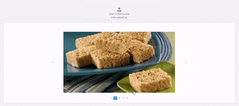
See the gif above for the finished product! The whole project will take only ~20 minutes.
Build Your Own Image Carousel in Retool
To get started, pull in a File Dropzone component to upload your images. If your workflow involves a different data resource, no worries - this tutorial will work in the same way as long as you have an array of images for your carousel.
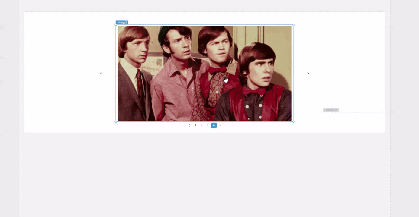
Once that’s ready, go ahead and upload a couple of sample images. Then, you can work on creating the carousel by dragging in a container, image component and pagination component. These will act as the main structure for the image carousel.
Now that you have the basics, let's get things connected to some logic. First you need to limit the pagination count to the amount of images you’ve uploaded so that it only shows one ‘slide’ per image, and no blanks. In the paginations input section, you can reference the length of the array of the images uploaded like so:

{{fileDropzone1.value.length}}
Now that your pagination component shows the right amount of available images, you’ll now want to connect your image component to display the index of the selected page of the pagination component.
For the image component’s “Image Source” input you can reference the array of images that you’ve uploaded to the file dropzone and then specify the index of the pagination component to pick out the corresponding image in the array:
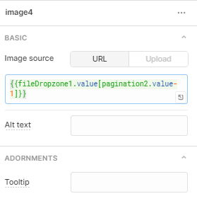
{{fileDropzone1.value[pagination2.value-1]}}
Note we had to subtract one here since the selected page is one more than the image’s actual index (which starts from 0).
With this really simple trick, you now have a basic image carousel in your Retool app, which chooses an image from an array based on the selected page of the pagination component! Now that you have the basics together, let’s go ahead and add some buttons that allow the user to scroll back and forth between images.
To improve the UI of this design, let’s pull in two button components and put them to either side of our image carousel to help make the carousel more intuitive:
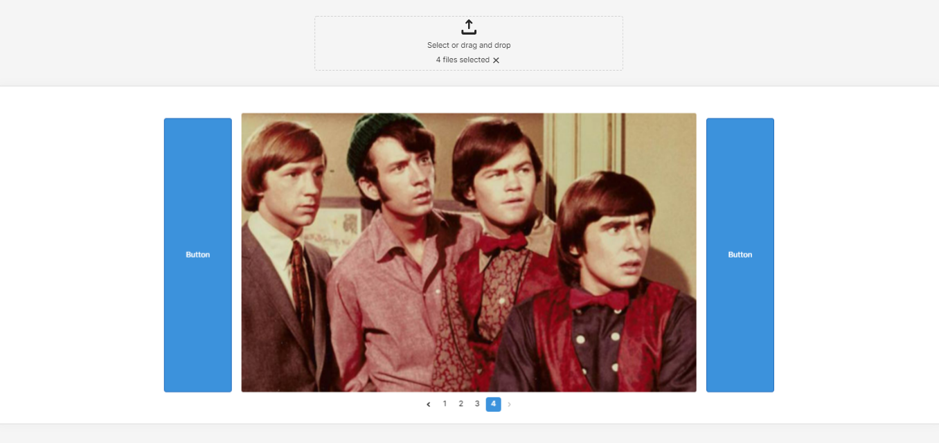
To give the buttons a cleaner look (and less like two blue blobs), it’s best to make their background transparent and remove their borders - you can control this at the bottom of the right hand panel under ‘Styling’. Then change the text to be a ‘<’ and ‘>’ arrow respectively, or ‘previous’ and ‘next’ - whatever works for you!
To get these buttons to work, you’ll have to add in two event handlers to change the pagination component’s value.
For the button on the right (i.e. ‘next’), you want to add ‘1’ to the page value except for when we are on the last page, this is easiest done with a ternary that will return to page 1 at ‘pagination.max’:
{{pagination1.value == pagination1.max ? 1 : pagination1.value+1}}
We will use the opposite logic for the left button:
{{pagination1.value == 1 ? pagination1.max : pagination1.value - 1}}
This says that if we are on the first page, go to the max pagination value (the end), if we are not, go back 1 page. With both buttons together, this effectively creates the carousel effect.
Note that here, we’re effectively using the pagination component as a state machine. A potentially more scalable alternative is to use temporary state to specify an index for the carousel, and have your button’s event handlers – as well as the pagination component – update that state.
Now you effectively have a carousel of images that supports pagination - and tabbing!
Create an Image Enlarger Modal for your Carousel
For our last UI tweak, let’s add a way to enlarge the image so that our carousel doesn’t take up the entire screen, but we can still take a closer look. For this you’ll want a modal to pop up with the enlarged image on image click.
Pull in a modal component and start by setting its ‘hidden’ input to true. Select the image component and add in an event handler to open the modal when clicked:
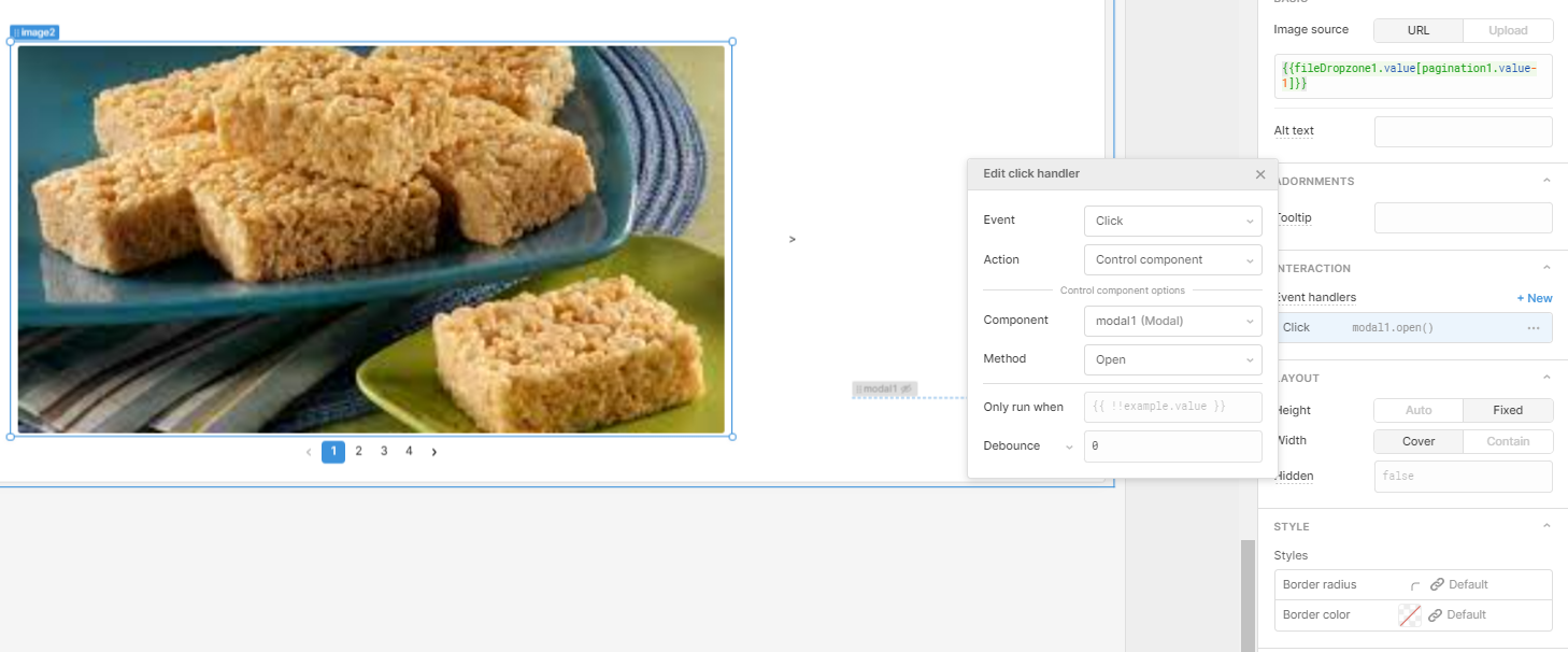
Change the modal width to circa 80% and the height to hug contents. Now you can add in the image component and size it to whatever suits you. All you need to do now is connect your modal image component in the exact same way as your carousel image component and your image enlarger is ready.
Now, when a user clicks on the image the modal is triggered to open with a zoomed version of the picture!
Congrats, you now have a carousel component that you can use for your internal apps!


