


Introduction
Media teams of all kinds - from television to advertising - need to be able to manage a sometimes sprawling concoction of assets, approvals and rights. Data and content management can become overwhelming. Ultimately, it can distract you from meaningfully engaging with the content itself, and its creators.
Custom-built apps that help media teams and companies to stay organized - whether it’s concerning content distribution, rights management, or reporting - are essential in streamlining the busywork so you can focus on creating, distributing, and scaling content that performs.
👀 Want a sneak peek of what you could have with Retool? Here's a quick demo of our app template:
Why do media companies need custom apps?
Too many tools spoil the broth…and integration is key
As a media company you’ll be relying heavily on internal tools to keep on top of all your content, but how many apps are you using? Perhaps you’re using Slack for internal comms, Asana for project management, Iconik for your asset management, Media Shuttle for file delivery… we could go on.
As this industry evolves, you want to be ahead of the curve, not struggling to keep up as you wade through a growing amount of mess. A lack of integration between apps can lead to mistakes and a lot of inefficiency: duplicate data entry, inconsistent metadata, slow handoffs between teams, difficulty gaining a unified view of content or performance, to name a few…
Overcomplicated workflows slowing down progress
But the deeper challenge isn’t just the number of tools, it’s the fragmented, complex, non-standardized workflows that grow around them. Editorial, video, design, ad ops, distribution and monetization teams all develop their own processes around the apps they already rely on - whether it’s Adobe or Avid for editing, Frame.io for review, Iconik or Dalet for asset management, Airtable for planning, or Brightcove for distribution.
Each team finds its own ways to version files, track rights, deliver assets, request approvals, or move content downstream. Over time, these workflows become harder to maintain, customize, or scale. The result is a user experience that feels more like wrestling with systems than empowering your team to do their best creative, operational or strategic work.
All the while, the demands on media organizations aren’t slowing down, they’re accelerating. New content types, emerging platforms, and increasingly powerful AI tools require systems that can adapt… and fast.
Many internal systems being used currently by media companies struggle to keep up. Metadata and rights management becomes messy and legacy tools rarely handle these scenarios cleanly, forcing teams to patch together custom solutions on a case-by-case basis. Far from efficient.
But modernizing isn’t easy…
Upgrading or replacing internal tools - CMSs, DAMs, MAMs, ad systems, rights-management tools - often turns into multi-year overhaul projects. Migrating massive content libraries, building custom integrations with dozens of systems, and retraining teams require enormous time and investment.
And even with all these tools, the gap between data and decision-making remains wide. Media companies want unified reporting, cross-platform metrics, real-time dashboards, and predictive insights tied directly to production workflows.
OK, enough problems! We’re writing this article because we (Bold Tech) have come up with solutions: and to show you how, we’ve even created a template for a custom, integrated, media-operations app, built in Retool and designed to bring together your workflows, your data, and your teams in one cohesive system. It’s a system built for the realities of how media companies work today, which is flexible enough to support how they’ll work tomorrow.
Why use Retool to build custom media tools?
Where traditional app development can take months and years, Retool simplifies the repetitive parts, allowing developers to move much faster to build a product that is fully bespoke to your needs, and that scales.
Retool’s combination of pre-built elements and the full flexibility of code means you don’t face the same limitations as other low-code platforms, nor the rigidity of SaaS functionality. You can build tools that grow with you, without getting stumped by an inaccessible price tag or hitting the low-code ‘wall’.
Bold Tech’s media tool template
Bold Tech’s media dashboard template brings together the sprawling roles media companies need to be able to perform and needs you are striving to meet, all in one place. A good custom app can be split into four key sections: Collections, Insights, Support and Campaigns.
Let's dive into what makes a good custom-build app for your business, and then look a bit more specifically at Bold Tech’s template UI highlights.
If you want to skip the explanation and go straight to downloading the template at the end of the page (which is free to download if you’re subscribed to Bold Tech’s newsletter).
File management and asset collections
Media companies will typically be dealing with huge qualities of assets and metadata. To manage this ‘stuff’ ideally you want to be able to access it from a centralised dashboard, not multiple environments. Having a section of your app - like this one’s ‘collections’ tab - makes this possible, giving you one place from which you access storage.
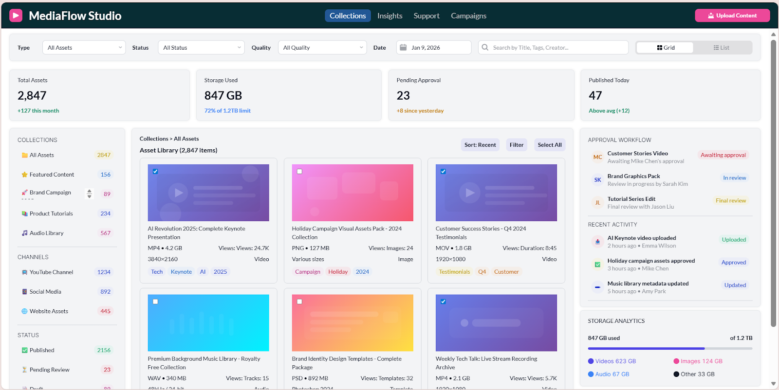
If all of this data is in one place, it means you can quickly access information about the total number of assets, how much storage space you have left, which assets have been published and which assets are pending approval (and perhaps you need to prompt).
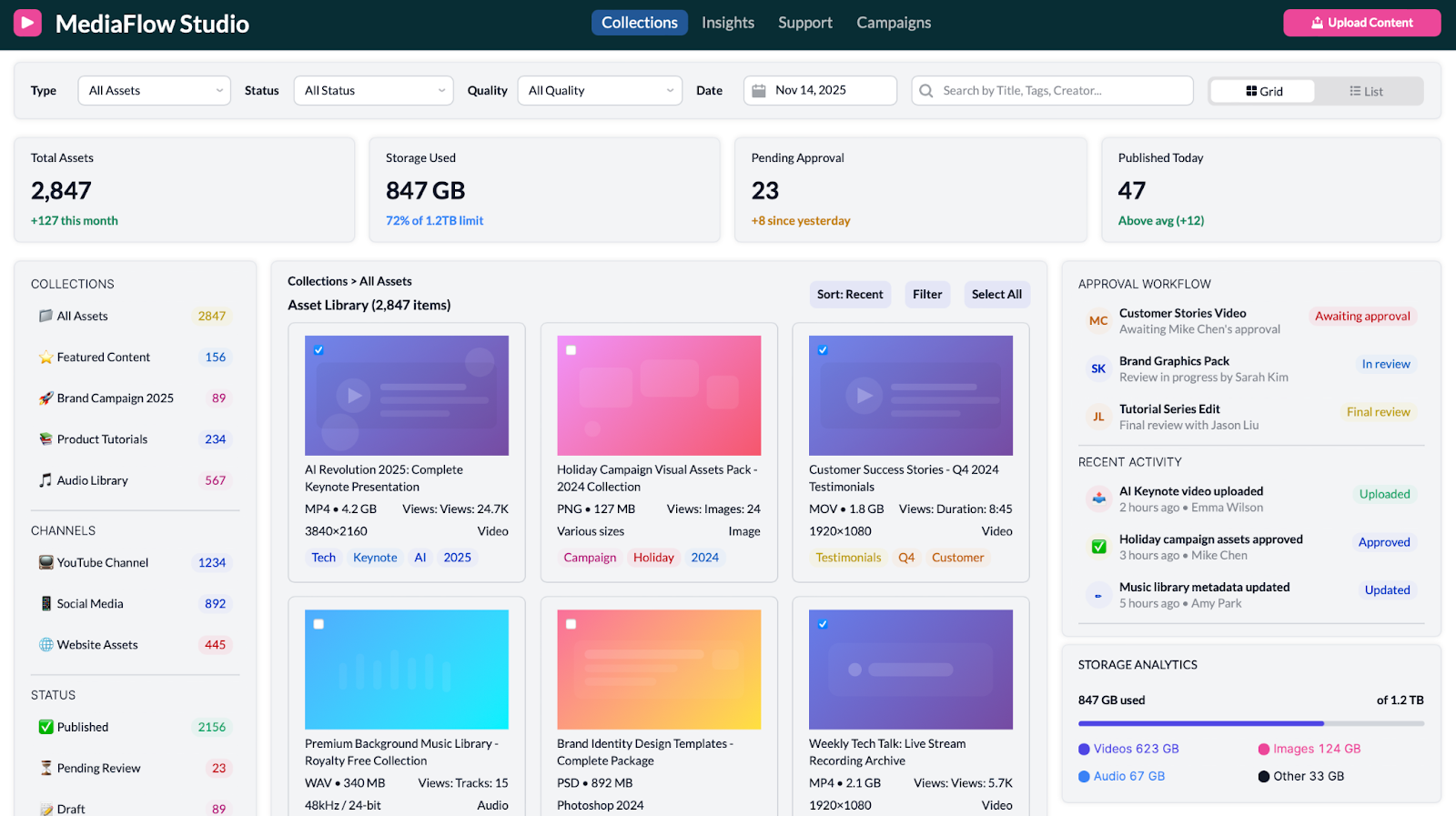
With a custom tools like this, you can organize it according to your needs, by file types, tags, file names, quality levels, date published, or metrics like numbers of views. More on insights about how well your content is doing in the next section.

Long story short: your information should be organized in a way that serves you, not so messily that storing and navigating it creates work for you. Having a dedicated section of your app which organizes your content in a user friendly format is a game changer when it comes to finding what you need, fast.
Insights for better business intelligence
Getting the most out of your data requires a bit more than well-organized content, though. Having a data insights dashboard makes your data readable, facilitates informed decision-making process much easier.
Whether you need to assess audience behaviour in the most recent quarter, or understand the watching habits of your audience through the devices by which they’re accessing your content, or you need to hone in on what content is performing best at the moment via a live-updating ‘top performing content’ league table, a dedicated dashboard for your data ‘insights’ empowers you to be more strategic in how you work.
You don’t need to choose between data that’s packaged into reports, or more raw analytics: you can have access to both in the same place. While analytics might allow you to search for some specific stats you need to communicate to a client, reports can be helpful in generating a snapshot overview for a presentation to senior management, or for strategy setting with your team.
The bottom line is, your business needs to be led by the data, for you to make strong, strategic decisions, and this is massively simplified by a well-designed data insights dashboard. For more on the UI features of our specific template, scroll down to the ‘UI Highlights’ section.
Customer support
Customer support requires a sensitivity to the client that is essential for any business’s longevity. To tailor your support to each individual customer, you need to know who they are, what their needs are, and any relevant context that might inform your response. This information can be tedious to gather, and relying purely on an individual employee’s initiative or personal knowledge creates variability in the quality of support delivered… and leaves plenty of room for human error.
The solution? Create consistency in customer responses by centralising - in one dashboard in your Retool app - all the resources needed to appropriately meet a client’s request. We’re talking customer details, communication history, ticket status, and even quick actions, all surfaced together so agents have immediate context and can respond efficiently.
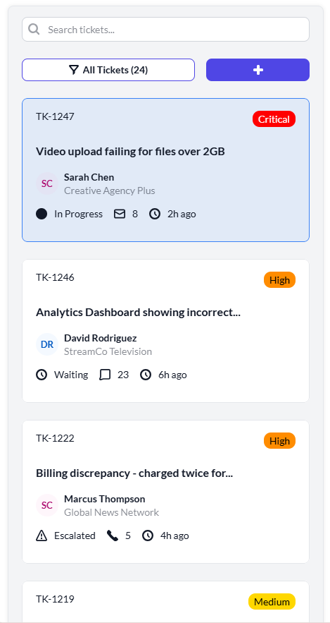
Along the left-hand side, agents can track tickets at a glance. This view provides an immediate snapshot into what each ticket concerns, its status, when it was last opened, the volume of communication so far, priority level, and ticket number. By organizing the information like this, you make it much easier to retrieve or revisit information later on.
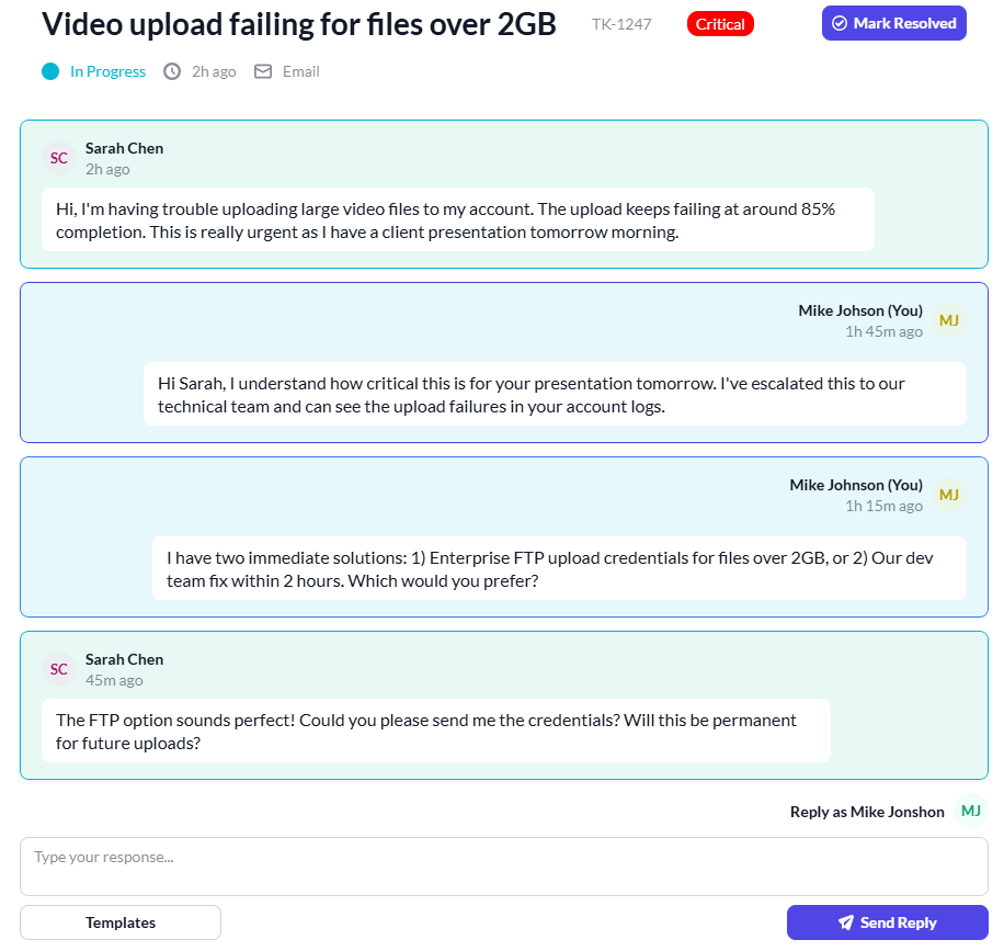
The main chat area offers an efficient way to communicate with the client. Designed like a messaging interface, it feels intuitive and human, meaning interactions (both for the client and your team member) are made much less daunting.
Customer details are surfaced clearly and immediately, providing crucial context for every interaction.
Finally, Quick Actions allow agents to respond decisively without navigating away from the screen. With all the relevant information at your fingertips, you can make informed decisions in the moment instead of hunting through multiple tools or pages. Centralizing this information saves hours of time and frees you up to focus your energy where it belongs: solving problems for your customers, not searching for data.
Media campaigns with better targeting and results
Campaigns are only as powerful as the actions they inspire. In a business, one of the key purposes of advertising and marketing campaigns is connecting to your client. So, what use is a campaign which beautifully promotes your business, only to result in no real follow up or tangible next steps? To make the most of your campaigns you need to be able to pull data from them to make actionable decisions which are rooted in the data.
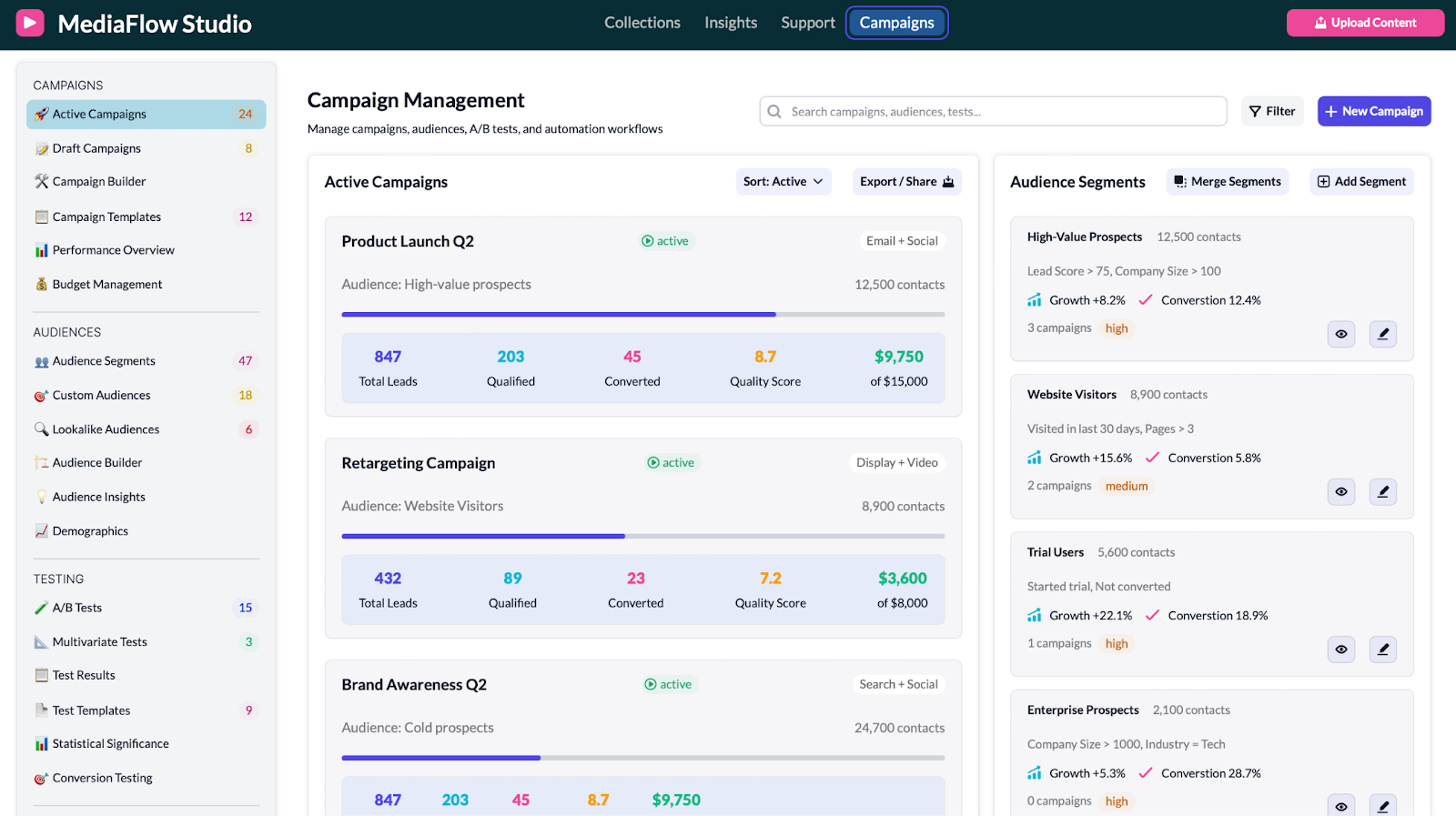
In your app, you can create a dedicated section for Campaign management, where you can both design the campaigns and track their progress after they’ve gone live, as well as analysing audience behaviour more generally. Campaigns can be designed, monitored, and optimized in one place. This dashboard brings together everything you need post-launch: performance metrics, audience insights, and quick visibility into what’s working and what isn’t.
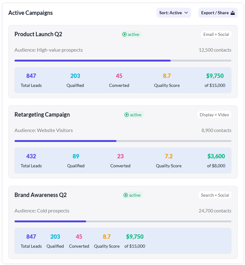
On the main panel, active campaigns are clearly listed with their status, audience, channel mix, and key performance indicators. You can see total leads, qualified leads, conversions, quality score, and budget progress - all without drilling down into separate reports. This makes it easy to compare campaigns side-by-side and quickly identify which ones are underperforming or exceeding expectations.
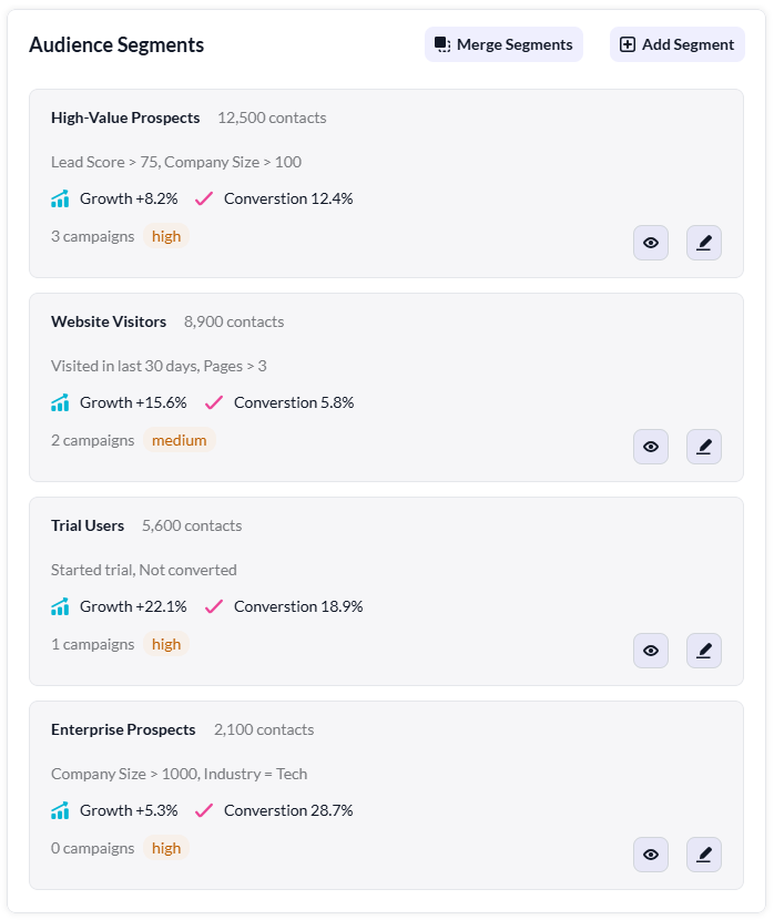
To the right, the Audience Segments overview provides deeper context. Segments such as high-value prospects, website visitors, trial users, or enterprise prospects are displayed along with growth trends, conversion rates, and risk levels. This helps you understand not just how campaigns are performing, but who they are resonating with. You can merge segments, add new ones, and refine your targeting strategy directly from this view.
Finally, the navigation on the left organizes everything from draft campaigns to A/B tests, templates, budget management, and audience builders. This structure makes it easy to move from planning, to execution, to analysis, without jumping between tools.
With all of this unified in a single dashboard, campaign management becomes less about manual reporting and more about continuous improvement. You’re able to iterate quickly, double down on what works, and re-target where needed… all guided by live performance data rather than assumptions.
Template UI highlights
Here are some of the highlights from this app that we think can inspire your Retool apps.
Collections snapshot - insights at a glance
In our template, the panels at the top give you a general overview of assets, meaning you instantly have a snapshot of the general status of asset management - essential when managing large volumes of content.
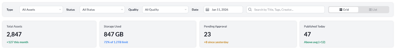
Above the asset tabs - ‘Total Assets’, ‘Storage Used’, ‘Pending Approval’ and ‘Published Today’, there’s a panel where you can filter the assets more granularly, by asset type, status, quality, date or even title, tag or creator.
On the left hand side, you can navigate to particular folders, designed according to the needs of your company, for example by ‘collections’ of assets, ‘channels’ or ‘status’. The folders are each assigned an emoji, making the experience more user-friendly and intuitive to navigate.
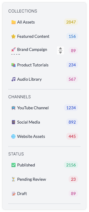
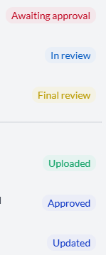
The use of color throughout this dashboard further adds to ease of navigation. For example, the color tags make it simple to identify different types of task, progress status, and different priority levels. Tags are also a great idea for organizing tasks and projects because they make it possible to filter later on.

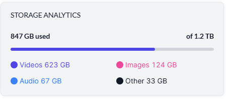
On the right hand side, we’ve added a task overview section, which allows you to quickly gain insights into your approval workflow and your recent activity. Below, the Storage analytics provide a visual aid regarding how much storage you have used, and how this storage has been allocated, enabling you to make assessments of which content types are taking up the most space.
Finally you’ve got the ‘Upload Content’ button which is always present - on every dashboard - in the top right corner. This means you can quickly navigate to this action wherever you are in the app.
Optimized insights for better readability
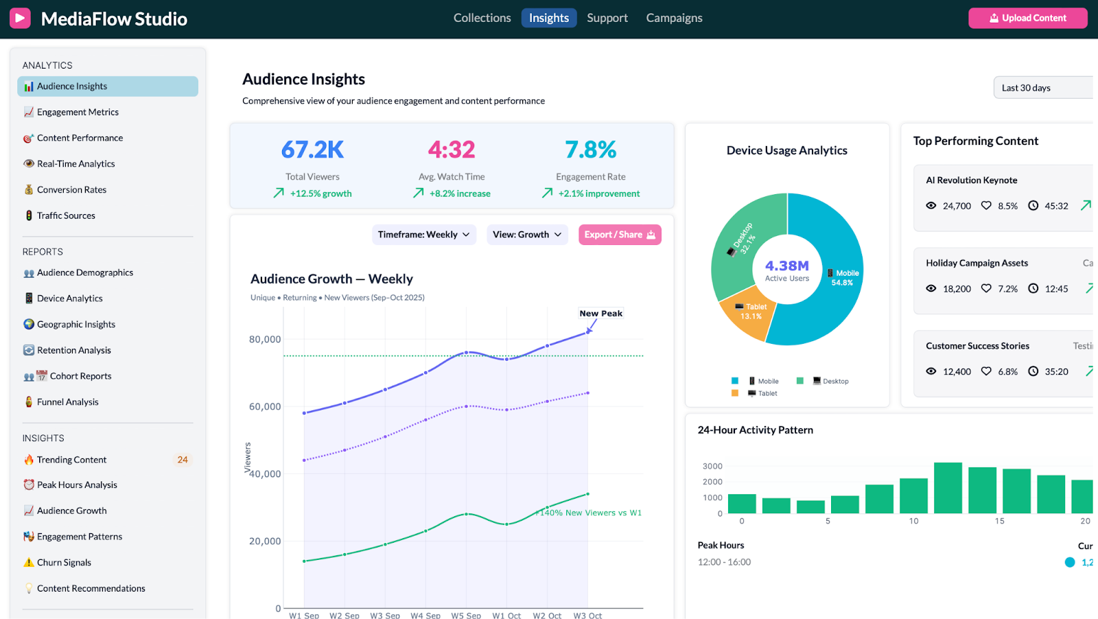
In our ‘Insights’ page we’ve formatted the data into graphs and other visuals to make your data more readable. Not only is presenting your data in this way important for you to be able to digest and apply the data, but it can also be useful in subsequently communicating with stakeholders about progress. Why not impress your clients with a few nicely formatted graphs and pie charts?
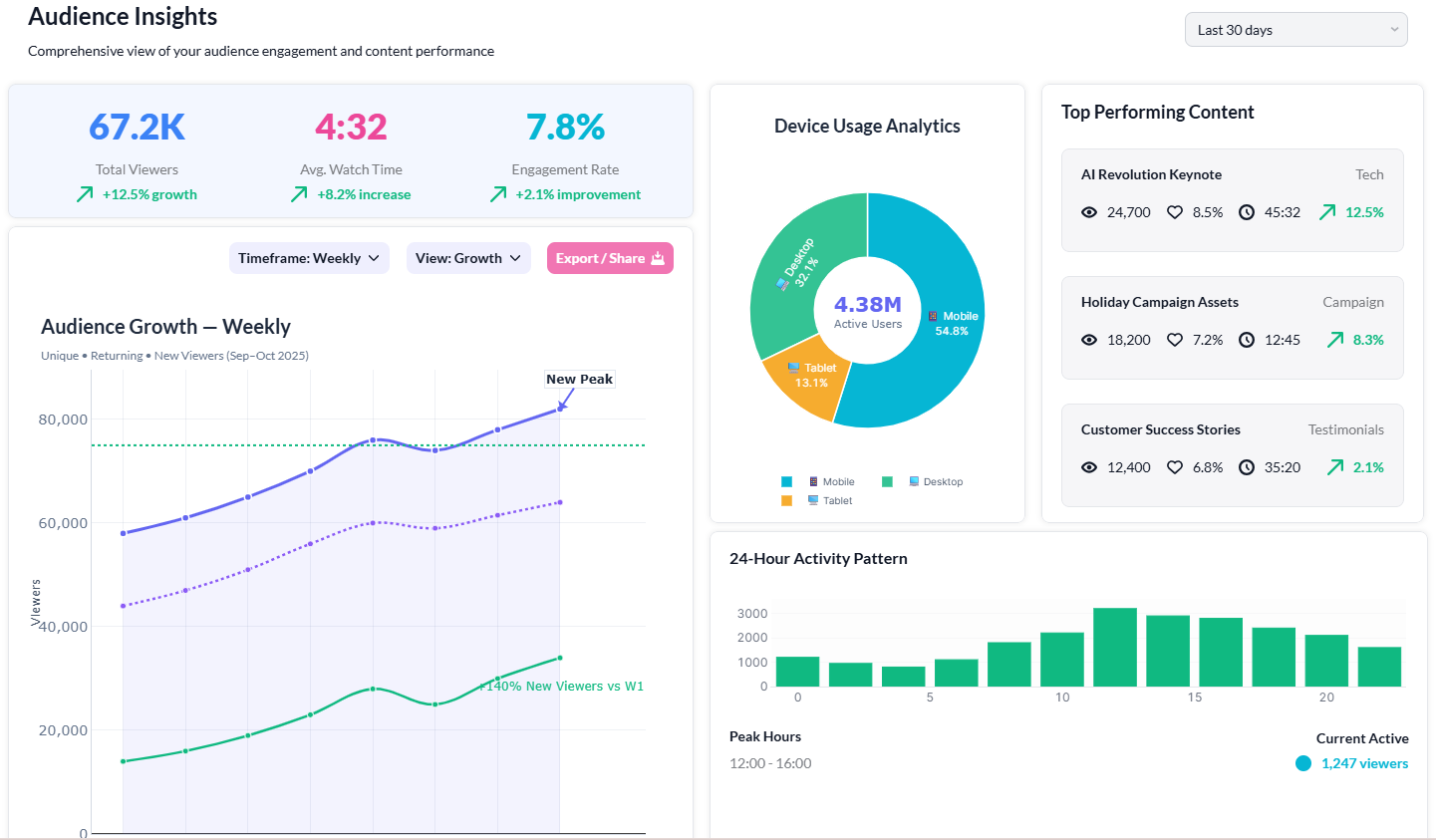
Similarly to the ‘Collections’ dashboard, in ‘Insights’ we’ve grouped the information into logical groups on the left hand side; we’ve organized the smaller folders into three sections: Analytics, Reports and Insights, and again we’ve used emojis to assist the user in navigating to the right folder as quickly as possible.
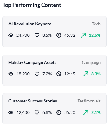
On an Insights page, it’s always important that the most important headlines jump out at you at a glance. On our dashboard, we’ve also included panels on the right hand side which tell you the ‘Top Performing Content’, including little icons for the different information highlights. It’s clear, and efficient.
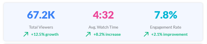
Similarly, you can see the headlines about audience engagement in the panel in the centre top of the page, which uses color to ensure the figures are bold and stand out.
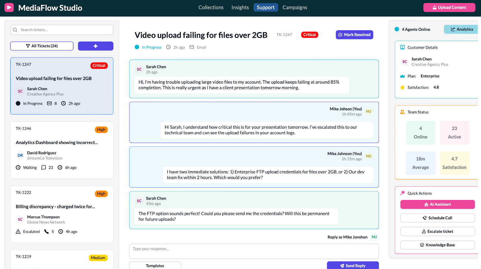
Support
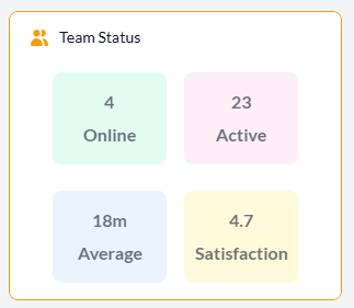
Again, on our support page we’ve been intentional about our dynamic use of color. For example, on the left hand side, you can quickly identify the level of priority of the task based on the color of the tag. On the right hand side, the activity headlines of your team members are presented in four main areas of information, which are colored accordingly: Online, Active, Average, Satisfaction.
The tickets log on the left hand side is cleanly and clearly displayed, in neat boxes as well as including the option to search for specific tickets. Within each ticket panel, you can see the most important information to enable you to action the ticket appropriately: the ticket title, client name, the progress status, the number of messages exchanged, the time of the ticket etc.
Again, the chat layout makes it feel familiar and easy to use, with different colors for each person in the chat.
The three boxes on the right hand side contain key information that might be employed in the chat with the customer: customer information, team status and quick actions.
Every part of the template has been placed for a reason and serves a clear purpose; nothing is there to simply fill space! Think about this when making your own app: what do you need in your app so that it serves your specific needs well?
Simple, intuitive campaign tracking
On the left-hand side, you’ll find the options are grouped in a logical way: Campaigns, Audiences, Testing, and Automation. This grouping makes it easy to move between planning, targeting, experimentation, and execution without getting lost in a long, unstructured list.
The main view is divided into two primary sections: Active Campaigns and Audience Segments. In Active Campaigns, you can track the progress of ongoing campaigns in real time, which each campaign card showing relevant, key information. The horizontal progress bar acts as a visual 'thermometer', giving you an at-a-glance feel for performance without needing to dig into detailed reports.
On the right, Audience Segments gives you instant visibility into who your campaigns are reaching. These insights support fast decision-making - helping you prioritise which audiences to double down on, where to refine messaging, and when to create or merge segments.
Together, these elements create a workspace where you can design campaigns, monitor performance, and understand audience behaviour, all from a single dashboard.
Want to learn more about internal tools and how to build them? Check out our sections on low-code tools like Notion and Airtable, or developer tools like Retool and Windmill.
