Retool apps can come in all shapes and sizes (and all of them are beautiful). Nevertheless, the vast majority of internal apps revolve around some sort of CRUD interface, and in these apps, layout is everything. Imagine building the world’s greatest, most ultra-efficient house, paying to kit it out with all the best tech and gadgets, only to put a coffee table in the bathroom and the couch in the garden. That’s what it means to get lazy with your internal dashboards and back offices, which might sometimes seem like the unsightly ‘utility room’ of the whole operation, but what really are some of the most crucial components that help your business grow.
To help you avoid these interior design issues and get you set off on the right foot, we will walk you through some different possible CRUD layouts in Retool, what they are good for and not-so-good for, as well as give you our top tips and tricks to achieve best practice (and avoid worst practice) when it comes to layout.
Disclaimer: Each Retool app is unique to its users and functions, so while we aim to provide a simple overview with some best practices and UI guidance, these won’t suit all use cases, and there are many exceptions to each rule!
Let’s start with some general best practices.
CRUD/Admin Dashboard layout best practices & top tips
1. No blank components
At the risk of sounding like my mother, don’t leave empty components lying around the place! Tidy up! If components (such as tables) remain empty unless something is selected or activated, hide or disable them - it’s bad UI to leave anything empty, as to the end-user it can look broken or confusing (unless the emphasis is on the lack of records). The best practice is to set components to ‘hidden’ when empty.

2. Limit editable fields
When thinking about editable elements, remember that anything that is permanently editable is a risk - if it’s easy to accidentally edit something, it’s hard to use an app properly. Think about adding an edit modal instead, which is automatically populated with the current values as default, to separate the edit action from generally viewing the data. Avoid making tables editable if you can (it’s hard to follow their edits and too easy to make a mistake).
3. Prefer no-scroll: singles have more fun
Aim for a single-page layout and try to keep as much as you can above the fold (i.e. no need to scroll down to see info) - this makes it easier for users to navigate and see all elements easily. Most importantly - try and avoid horizontal scrolls in tables, it’s too easy to get lost in the data.
4. Avoid large multi-app systems when they aren’t needed
The beauty of Retool is the ability to easily integrate many processes into a single app. If you have different apps that are reliant upon each other, things can get messy and change the way users interact with the tool - Retool also lacks a way of showing breadcrumbs well in applications, so it can be tricky to track back. To combat this, consider combining simple functions into a single app through modals, separate container tabs, hidden components, and unique container views.
5. Make use of the environment’s header section in creative ways
The header section (as opposed to the body) of your Retool environment is a neat little space that adjusts dynamically in size, so is a great place for any show/hide elements, such as extra overview analytics or even an advanced filter container. Its position can also be fixed, so you can utilize this space to use filters down the page, display aggregate statistics, or as a navbar.
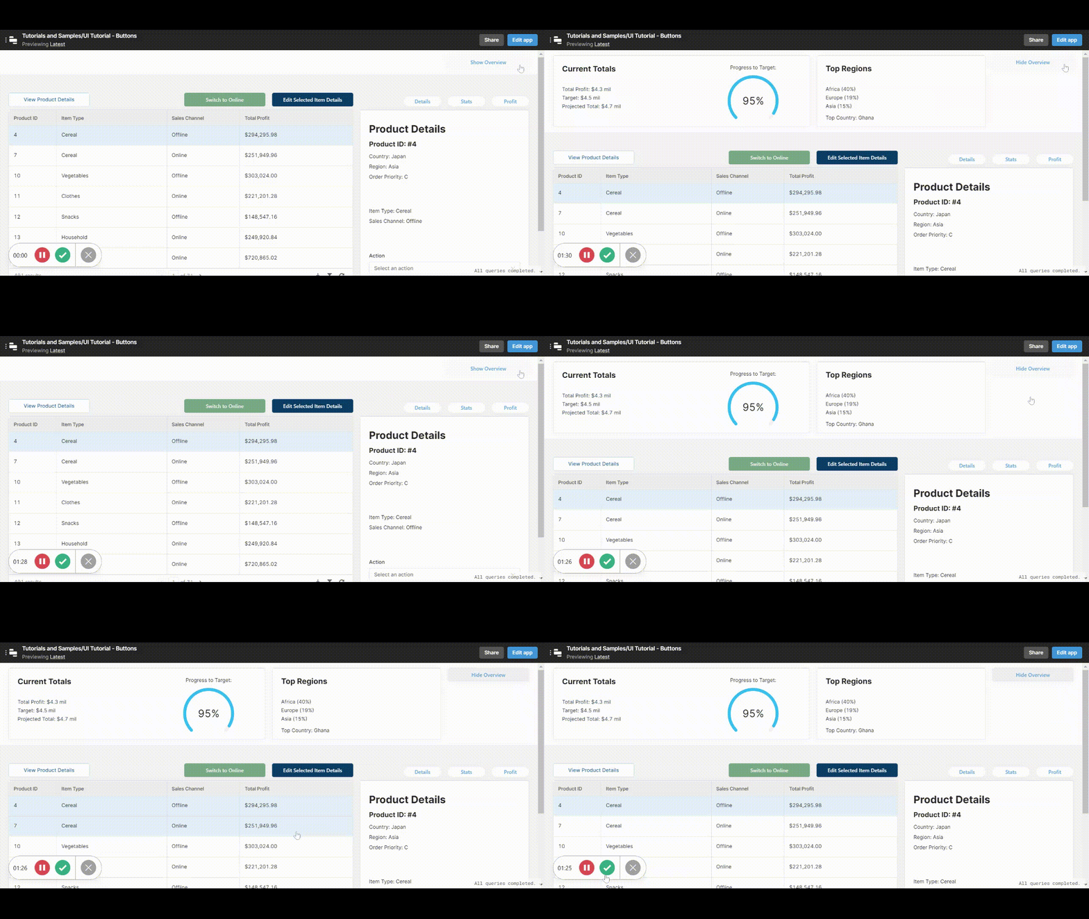
Now, let's take a look at some of the classic Retool UIs. For each of these we'll give an overview of the tool and then we'll go through the key advantages and disadvantages of each.
Wizard Components
Wizard workflows are great for completing complex multistep processes to create or update records, and where they really excel - where others don’t - is cascading logic.
Wizards are separated into multiple steps that require a user to click onto the next page. This works particularly well for processes that change depending on certain inputs, as the wizard can send a user in several directions to continue the form, depending on, for example, their selection in a dropdown component.
Something we see a little too often is developers integrating these cascading workflows into a tabbed container, which is far less intuitive and creates a whole host of problems for the user. Wizards are perfectly designed to fulfill this need, and should typically be used in place of tabs for multi-step processes.
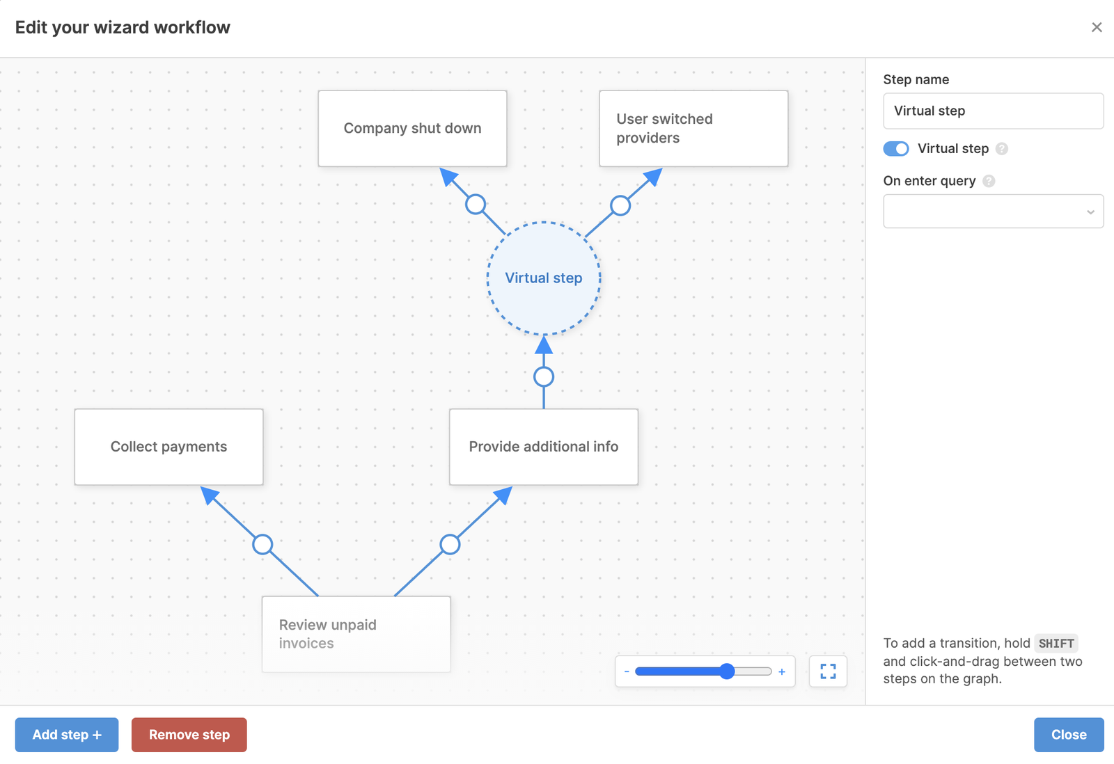
There are many ways to integrate the wizard. You could have a wizard on its own, or you could put a wizard in a side panel or action modal.
✨Good For✨
- Creating a narrative with the process. Allows you to create multi-step formats. Easier to break down a long action into digestible stages which may divert in different directions.
- Cascading logic. Where one step filters down to or alters the next.
👎🏻Not-so-Good For👎🏻
- Basing actions off data. If data needs to be seen to decide the action within the steps, perhaps a wizard is not for you - it’s tricky to fit tables and data into the wizard as well as the form to fill out. This is also the case if there is information in previous steps that may be forgotten, but is needed to carry out the next step.
- Comparing and changing multiple records at once.
- Quick updates and edits.
- Space (they need to be quite large on-screen).
Full-width table and custom column only
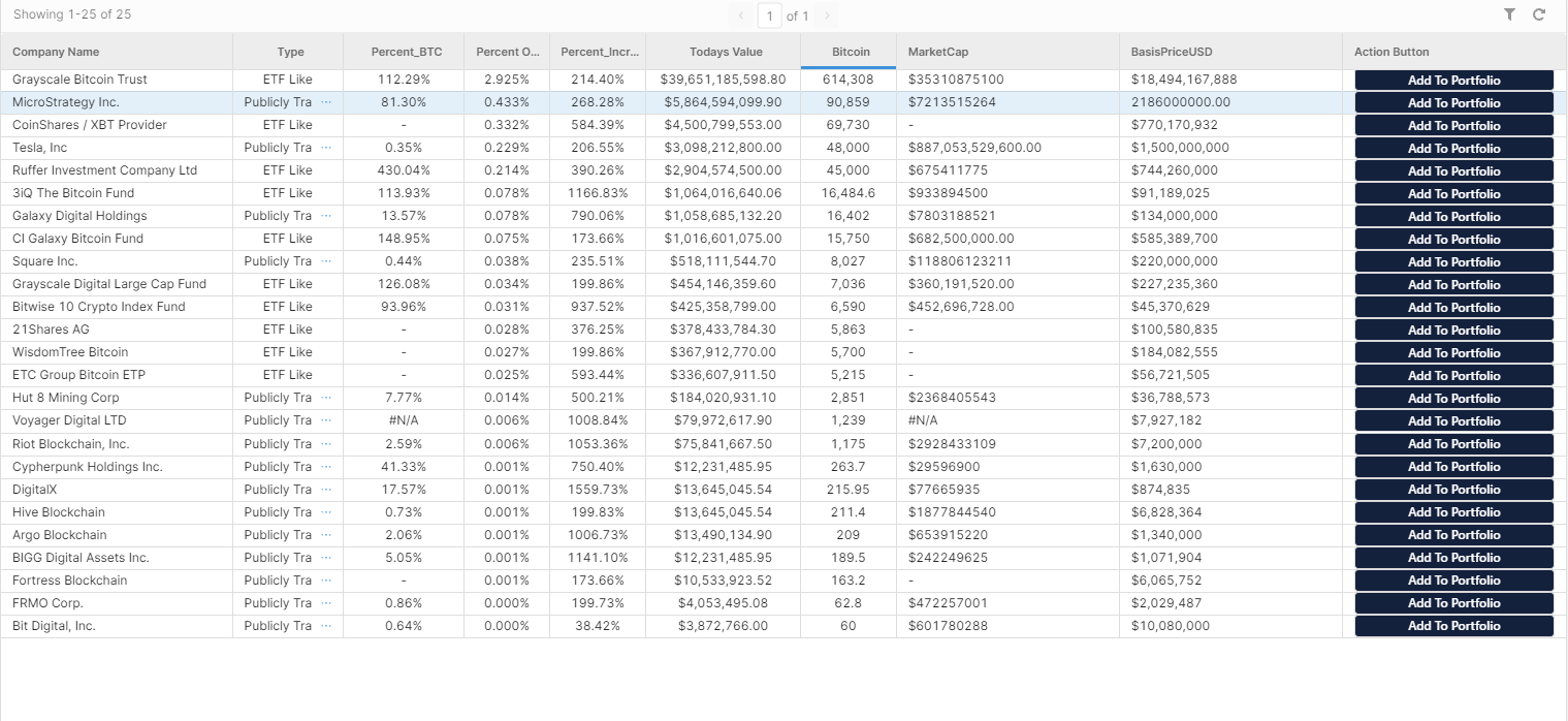
A single, full-width table with a custom column for actions is great for applications that have a limited number of columns, as it allows an emphasis on comparing records vertically, in a tabular format. This layout is particularly useful if you need to perform simple actions in a modal, such as editing a single row at a time, or viewing chart data specific to that single object that pops out (and doesn't need to be compared to other rows). You can use the event handlers of your custom button to trigger a modal to open for this.
In general, since we are using the entire screen real estate for the table, the types of queries performed in each row must be limited to a couple of simple buttons. This solution might not be best if any of your column headers or its values are particularly long: table headers and cells don’t wrap naturally in Retool and will require the user to hover over ellipses to see that attribute's value, or you’ll need to add in additional CSS to make the values wrap - not so great for UI.
✨Good For ✨
- Comparing several, simple attributes across a large number of records, in tabular format - essentially spreadsheet-like workflows.
- Applications that have charts in a modal associated with each individual record, such as analytics dashboards where charts open per object in a modal and don’t need to be compared to other objects, e.g. time series properties.
- Manipulating data quickly with limited actions (e.g. add, delete), e.g. apps that offer an accept/reject function based on a limited range of data or approving/denying outliers of your workflow.
- A non-variable query that needs to be triggered for single records.
- Displaying simple data, with objects that don’t include nested values, e.g. a basic inventory tracking app.
👎🏻Not-so-Good For 👎🏻
- Applications that put emphasis on editing multiple values and manipulating a large amount of data in bulk, especially if these updates are somewhat repetitive.
- Editing data in-line, spreadsheet-style (the table component is not yet as efficient in this way as spreadsheet alternatives).
- Columns whose values/attributes have a large number of characters and will overrun the table cell space.
Top tips for this layout:
- Retool has an 'Actions' section associated with the table: in our opinion, this is really just a lessened version of the ‘Custom column’, and since you can’t perform as many actions from this section, in almost all cases opting for the custom column is a better idea.
- One of our Retool worst nightmares: in-line editing when the table requires a user to scroll left to right. While it can be useful for updating a column or two, it lacks data validation, in-line editing requires a surprising amount of clicks, and can create a bad user experience. In most cases, opt for the formula edit to save your users from having a sideways scrolling nightmare.
- Bear in mind that some people might be using smaller screen sizes than the screen you are developing on - so the table might look entirely different on a user’s computer than your own. It’s always great to test the app in various screen sizes before going into production.
Side Panel Focus
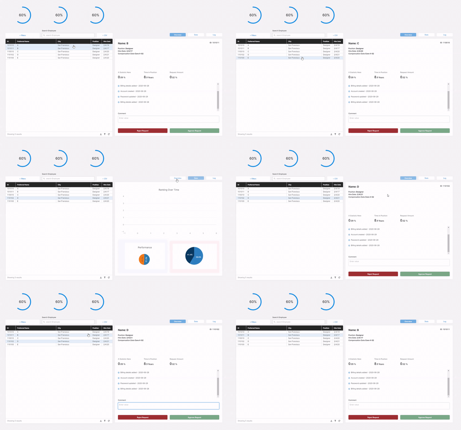
This layout is an absolute classic and tends to be one of the most common layouts in Retool. The table next to a container is great for workflows that include comparing a limited number of columns in tabular format, but with the main emphasis being on showing the entire record.
Having a side container allows for the use of additional Retool components to show and interact with your data. Take the example GIF above: on the bottom of the first tab, you can see that we use a timeline to show additional attributes of our record, where inside of a table, nested information like this might not make that much sense. By using a side panel we can also use the right components for the data we are presenting.
The side container is also great for drilling into your data. Perhaps a record includes time series data, with a side panel you can delve into the record and display the time series in a nice and neat chart. Since we switched our container to be a tabbed container, we can space out a large record even further, providing tidy categorization for additional statistics or separate types of data with which that record is associated.
If you are looking to quickly compare 4+ columns in a table, this format might not be the one for you, as there is less horizontal screen space available for your table to accurately display all those columns.
✨Good For✨
- Applications that place an emphasis on viewing many large records, with customized, individual breakdowns for each, requiring various components. E.g. admin panels for site users or product orders, where the side panel offers more detailed, nested information and individual actions.
- Interfaces with the need for several actions and/or buttons, which can be condensed to a few buttons or an action bar (see tips below), e.g. basic CRUD features to manage data in a database.
- Data with nested values that cannot be easily displayed in-line, with the ability to compartmentalize data into different tabs and use the best components and charts for the job.
- Applications that have different types of charts associated with each individual record.
- Edit-only apps where data is constantly updated and the side panel is an editing space.
- Apps with a read-only focus, where the focus is on the individual objects and their data, rather than comparison across them, e.g. product inventory with product details in the side panel. Also good with analytics-focused apps, where a panel might show data and charts about each user of a product, for example.
👎🏻Not-so-Good For👎🏻
- Applications that require updating every field of a record regularly - it’s best to stick to non-critical editable fields in the side panel (as explained above).
- Applications that emphasize the comparison of records, as data is only individually presented, and users need to click to switch between each.
Top tips:
- Use the selectedRow attribute to allow this to dynamically change when a user selects a row in the table. Here is an example of our dynamically changing text values from the gif above:

- Note how we used a single text component here instead of one for each attribute - not only does this save us loads of time, but it means that things dynamically expand and contract based on the entirety of our attributes instead of a single one, and keeps things nice and tidy.
- Use an action bar to condense your action buttons into a single component - saving space and keeping all actions in one place (and reducing button overload). Learn how to make it in our buttons tutorial.
- Important note: One thing we often see in Retool apps with this layout, and something we believe developers should be wary of, is using this side panel as a space for editing, when the app also serves as a space for users to read data. It’s great to use a panel for editing a couple of attributes of the record, but we wouldn’t suggest having the side container open 'in edit mode' with crucial live information at all times. Why? Because while it might be easy to edit a record in this panel, it can be a little too easy, and mis-clicks are very common. For this reason, if users are commonly in the app as read-only, any values that are editable within this space should be non-critical fields, such as notes and comments sections.
Tabbed Container - Switching Views
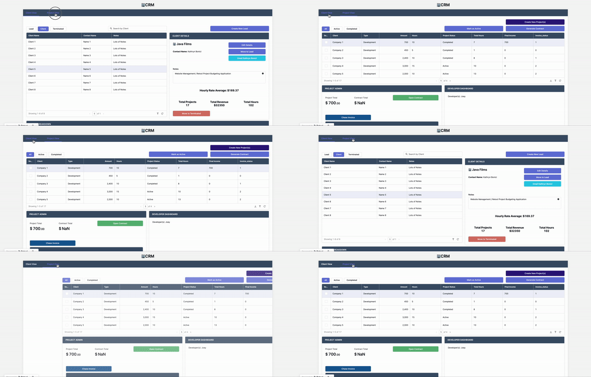
Depending on different actions that you take within your data, you may want to see different ‘views’ of tables, charts etc. You can use tabs to create dashboards with different primary focuses, such as ‘Overview’, ‘Detailed View’ ‘Financial View’, to name an example. These can work really well for apps that are used by different teams with different priorities, or for apps that perform different focuses using the same data.
This doesn’t work, however, if these views are dependent on each other, or if there is a multi-step action to take across them.
✨Good For✨
- Creating different ‘views’ of data. Presenting unaffiliated data. (i.e. data that doesn’t directly need to be compared to that in a different tab).
- Apps shared by users with different needs, who benefit from different presentations of data.
- Displaying chart data in different formats, e.g. website analytics grouped by CTR, impressions and clicks.
- Tabbed containers in a side panel layout - which allow you to space out data and create clear groups.
👎🏻Not-so-good For👎🏻
- Multi-step actions that are spread across tabs. If you are using forms which need to be filled out in a certain order with pagination, consider using a modal or a wizard instead.
- Creating a narrative in your process. If there needs to be a clear workflow - tabs are not for you. It isn’t intuitive to work through tabs like it might be to work through steps in a wizard workflow, so use tabs for things that aren’t mutually dependent, such as presenting different data.
Top Tips:
- As we’ve alluded to above, one of the largest mistakes we see in Retool UIs is the dreaded tabbed container edit workflow, with a single submit button at the very end of your last tab. When Retoolers take this approach, users can often get lost in the tabs, forget what they’ve edited and accidentally edit something they shouldn’t. When making edits, make sure that anything that a user is editing is displayed on the screen where they submit (this is a useful tip for wizards and modals too!).
Using Modals
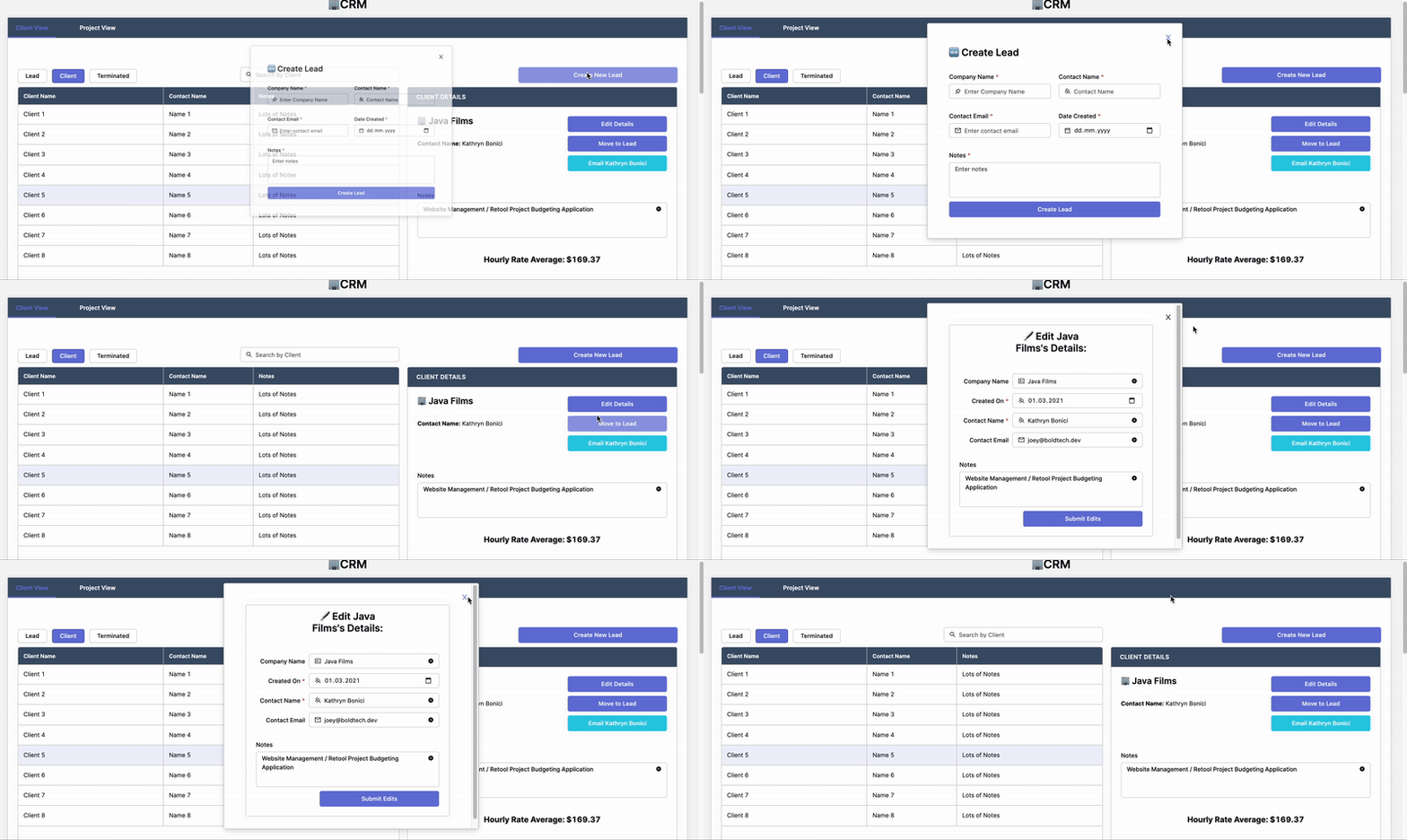
In general, it’s important to try to compartmentalize processes and actions in your application somewhat, to make it more intuitive and user-friendly, and most importantly, to avoid mistakes. For actions that are high-risk, it’s important that you don’t leave these out in the open and instead ensure that there is one click of distance between 'Edit Mode' and 'View Mode' - and this is where your modals come in.
✨Good for✨
- Applications that place an emphasis on or have a series of complex actions or a wide variety of actions performed to a record.
- Applications that have higher risk fields that are edited, that shouldn’t be easy to accidentally click into (in a side panel, for example).
- Editing and keeping editable elements tidy - you can pre-fill any text inputs with data in the default value box, so that you don’t need to check back to the original table/container etc. Using a modal keeps this editing function out of the way so that it’s difficult to accidentally edit something.
- Extra data that doesn’t need to be viewed at all times - especially if your data is usually displayed in a table, a modal will allow you to use space efficiently by condensing it into a pop-up that can be hidden.
- Time series data that would clog up the space of a table or container, e.g. edit timeline, or data pulled in by additional queries depending on the row selected.
👎🏻Not-so-good for👎🏻
- Applications that require editing extremely often (opening a modal means 2 extra clicks).
- Applications that require updating multiple records at once, based off a table.
- Comparing information. Modals can’t be moved around on the page, nor can more than one be opened, so if you want to compare data between a modal and a table, you probably won’t be able to see the data behind them properly.
- Quick actions or viewing data quickly. Modals often require extra clicks, as they need to be closed and the next opened. This can make it hard to quickly view different data breakdowns.
Top Tips:
- Don’t use modals within modals. Having a modal open another modal means it’s easy to get lost and open/close the wrong things.
- Use a custom column modal pop-up in your table. I.e. ‘view more’ which shows analytics - this is great if you have 50 columns of data per row and need to summarize, but also not so great if you need to compare info
- Use our nifty action bar to condense buttons and trigger modals to open actions separately
List View Component
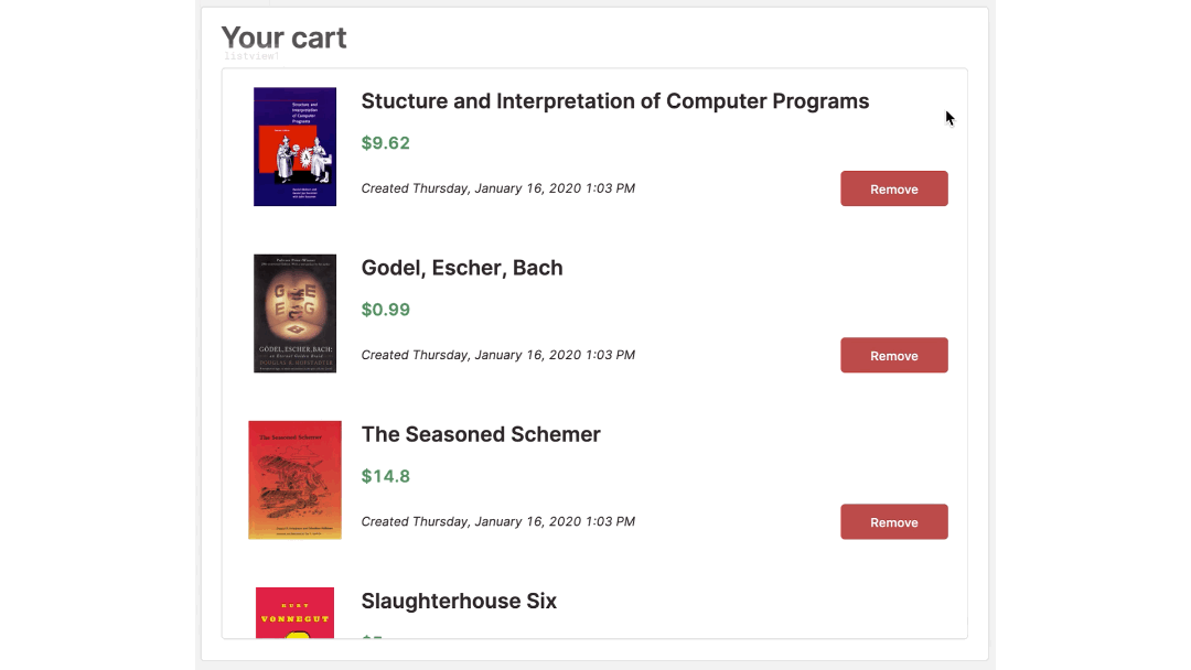
A ListView component is one of those components that everyone thinks makes a lot of sense for their application at first, but then quickly realizes that the table component is actually a lot more straightforward.
ListViews give you the chance to use all kinds of different components within them, from images to upload buttons to pdf viewers and more - all of which are limited within the table component capabilities.
In general, listViews are useful when the workflow includes engaging with a row of data multiple times, so a table is great for single-click actions, but if you need to enact several processes on a single row of data, a listview is probably better.
A con of listViews, however, is the sizing, and the way in which you can view your data, as with several components per row, they can become quickly clunky. So, if you are looking for a way to neatly present and evaluate your data, a listView might not be it. You could opt for a table with a side panel instead.
✨Good For✨
- Performing complex actions to each record, such as setting several fields and uploading to an S3 bucket (as the tutorial linked above).
- A small amount of cascading logic that’s applied to each record.
- Workflows that only focus on updating a series of records.
- Presenting data with an image or preview focus, such as the Retool example above.
👎🏻Not-so-Good For👎🏻
- Comparing multiple records at once.
- Completing a large number of steps to update a record at once.
And with that, we have covered some of the most common CRUD layouts in Retool, and hashed out some of their pros and cons.
Want to learn more about internal tools and how to build them? Check out our sections on low-code tools like Notion and Airtable, or developer tools like Retool and Windmill.


