


Glide is a fantastic tool for building beautiful custom apps and internal tools, even if you don’t have a technical background (or a design degree).
Regardless of whether you’re working on an internal dashboard, a client portal, or a polished product MVP, Glide gets you from idea to app fast.
One of the main reasons Glide is so popular is that the default UI components already look great! The design system is clean, modern, and mobile-friendly right out of the gate. Glide’s default styles are intentionally opinionated: they’re designed to make your app look good without forcing you to invest too much thought and time into it. That’s great - until you want to break out of the mold.
The good news is, you don’t need to be a designer to give your Glide app a serious glow-up. Glide gives you more tools than you might think, and the community has gone even further, coming up with all kinds of creative solutions - everything from styling tricks and layout tweaks to full-on component overrides.
Together, they give you the control to go way beyond the defaults and make your app look as custom as it actually is under the hood.
In this guide, we’ll walk through five of the most fun (and effective) ways to make your Glide apps more beautiful - complete with examples, resources, and some things you’ll wish you’d learned sooner.
Let’s start with the one that gives you the most control: CSS.
1. Add custom styling with CSS
Glide’s Custom CSS plugin lets you apply custom styles to your app’s components, giving you more control over the design. It’s built-in, officially supported, and available on all current paid plans.
You can use it to fine-tune the visual layer of your app - adjust spacing, override default styles, apply brand colors to components that don’t natively offer color customizations, or completely restyle how specific components look. And because it’s actual CSS, you’re not limited to what the UI allows.
A quick backstory on how CSS came to Glide:
Before official support for custom CSS, Glide builders had to get creative. If you wanted to do anything beyond the default styles, your only option was the Rich Text component. It wasn’t really intended for anything beyond basic text styling with Markdown - but people used it for advanced UI customization anyway because they had no other tools available.
And it actually worked pretty well! A lot of those tricks are still in use today - especially by users on the free plan who don’t have access to CSS or those who built apps before the CSS plugin came out.
But Glide never intended Rich Text to be used this way, and those hacks weren’t always reliable.
So they gave us the real thing.
Instead of working around limitations, you could now write proper CSS - target individual components or apply global styles - and exercise a lot more control over the visual presentation of your app.
These days, there are a ton of resources developed by the Glide community that you can use to get started with custom CSS (for some you’ll need to create an account):
And to get you off the ground even quicker, here are 6 functional, widely used CSS snippets from the Glide community:
- Gray out buttons + prevent form submissions: Disable buttons until all core information is populated and to prevent human error. This trick is helpful for both custom and standard forms.
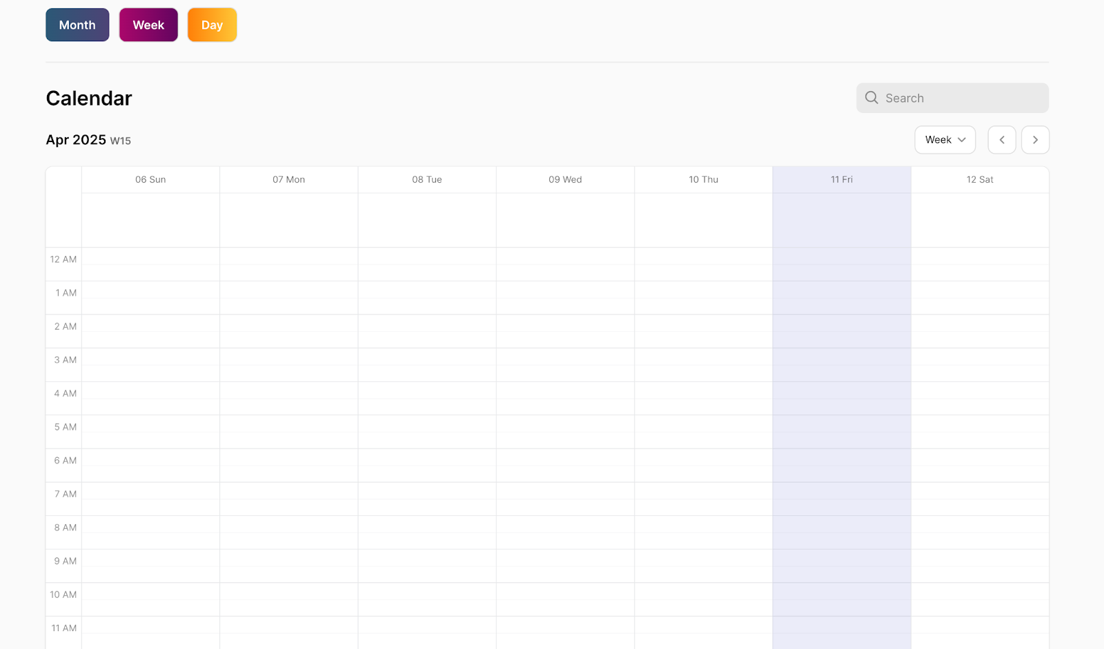
- Make the top container sticky: Pin navigation, search bars, totals, or summary info while the user scrolls.
- Style big numbers with outlines: This is a quick win for dashboards. Tip: you can also add shadows or custom colors for extra polish with a little customization of the code we shared.
- Change container card background colors: This is great for grouping sections or drawing attention to key content.
- Create a floating button: Keep CTAs visible, especially on mobile.
- Change button colors: Go beyond the defaults to match your app’s branding.
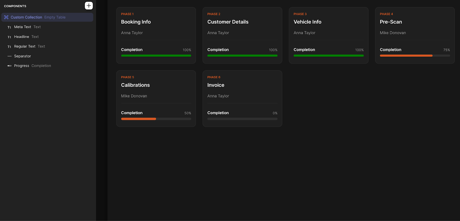
2. Build custom UI with Custom Collections
Glide gives you standard ‘collection’ layouts - Table, List, Grid, Kanban, Calendar, Card, and a few others - that work for most use cases. But sometimes, those aren’t enough and you want a bit more control over how you’re presenting your data.
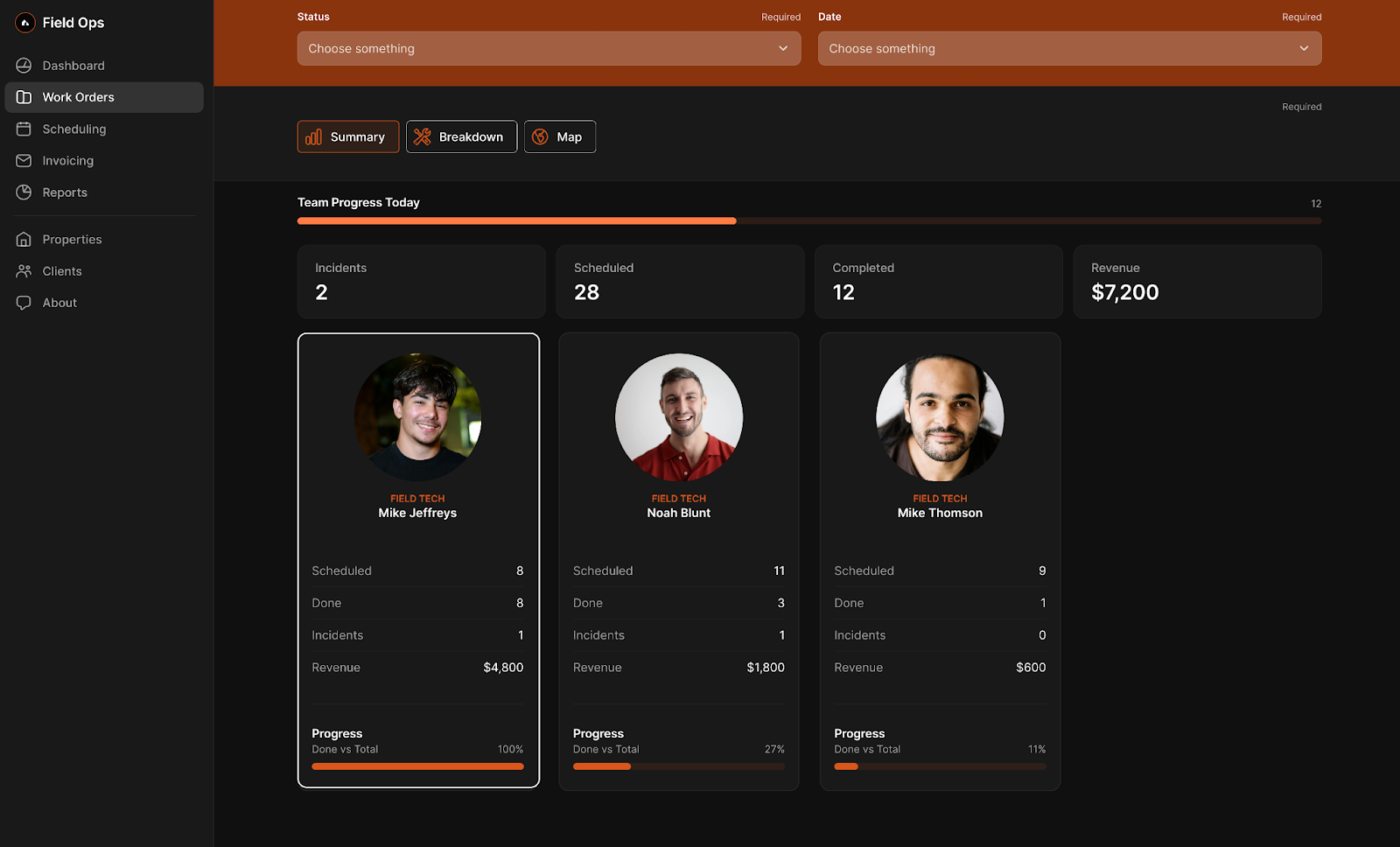
Custom Collections let you build your own layout from scratch using Glide components. You connect it to a data source, just like any other collection, but instead of picking a pre-set layout, you create your own using whatever components you want - images, text, buttons, progress bars, whatever fits.
Each item in the collection is a dynamic ‘row’ from your data. You drop in components, choose what each one displays, and style the layout however you like.
This is useful when:
- You want more control over how your data is displayed.
- You need to blend different types of content in one item.
- You’re working with a specific design in mind that Glide’s default layouts can’t do ‘out of the box’.
You can also reuse the same layout elsewhere in your app - just copy the custom component, paste it where you need it and change the data source. And because it's built with components, you can layer in visibility conditions, custom logic, and styling that wouldn't be possible in a default ‘collection’ otherwise.
If you're trying to go beyond the standard ‘Glide look’ and build something that feels more like your app, using Custom Collections is how you do it.
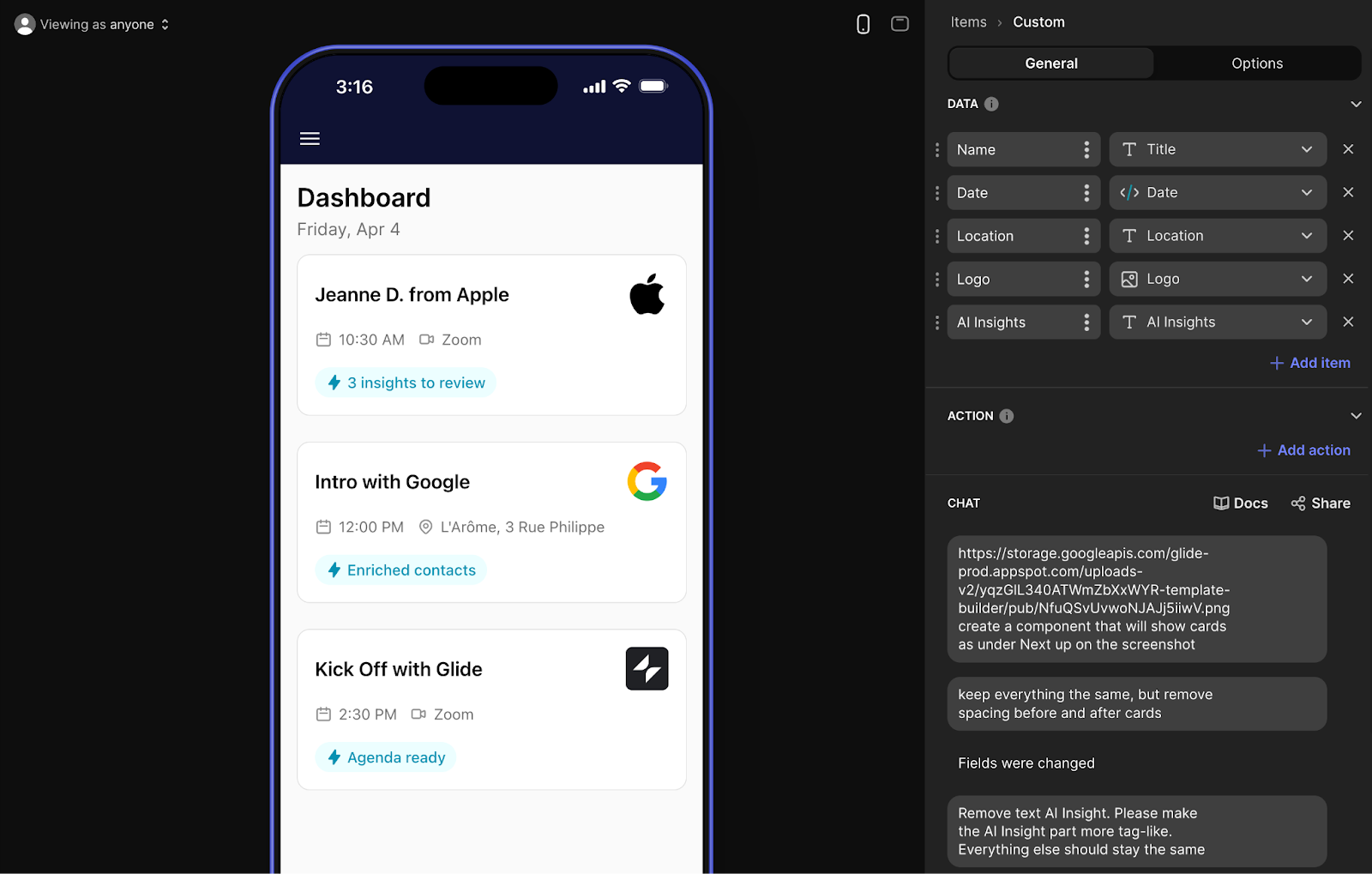
3. Experiment with the AI Component (Beta)
Glide introduced the AI Custom Component in 2024, and it’s a big step forward for customization inside the builder. It’s still in beta (and you can feel it) - but when it works, it can do things no other Glide component can.
The concept: you describe what you want - something that doesn’t exist in Glide’s native UI - and the AI has a go at generating it for you. That could be a stylized progress bar, a custom badge, a scrollable multi-step form, or even a new layout entirely.
The component is generated on the fly, based on your prompt, and rendered using a mix of HTML, CSS, and sometimes even JavaScript for additional interaction capabilities.
You’re essentially creating new components Glide doesn’t offer out of the box.
The interface is conversational. You type your request into a chat-style window, or even submit screenshots of the desired layout, and the AI responds with a live component you can drop into your app.
And yes - it can take a few tries to get what you want. Sometimes the output nails it. Other times, it misses the mark or takes forever to load, especially if the logic is complex or the prompt is vague.
That said, if you’re working on a highly custom UI or trying to solve a layout problem Glide doesn’t support natively, it’s worth experimenting with.
A few tips to get better results:
- Define your data and interactions first: If your component needs to pull dynamic content, link your dataset (DATA section in the AI component settings) to the component before you prompt the AI. It’ll perform better if it has real fields to work with. Same goes for actions (ACTION section in the AI component settings) - if you need the component to perform an action (like submitting a form or triggering visibility), define that logic first.
- Clarify interaction: If the component should be clickable, conditionally visible, expandable, etc. - say that upfront in your prompt. The more specific, the better.
- Use real code as a starting point: If you have existing CSS or layout code (even partial), include it in the prompt. This gives the AI context and usually gets you to a working result faster.
To be completely transparent, the AI component isn’t production-ready for every use case just yet, but it opens up a lot of possibilities - especially for builders who are comfortable testing, tweaking, and working with slightly unpredictable results.
If you’ve ever hit a wall with Glide’s built-in components, this is a tool worth exploring. Just know that it’s still early - and you’ll probably need to iterate.
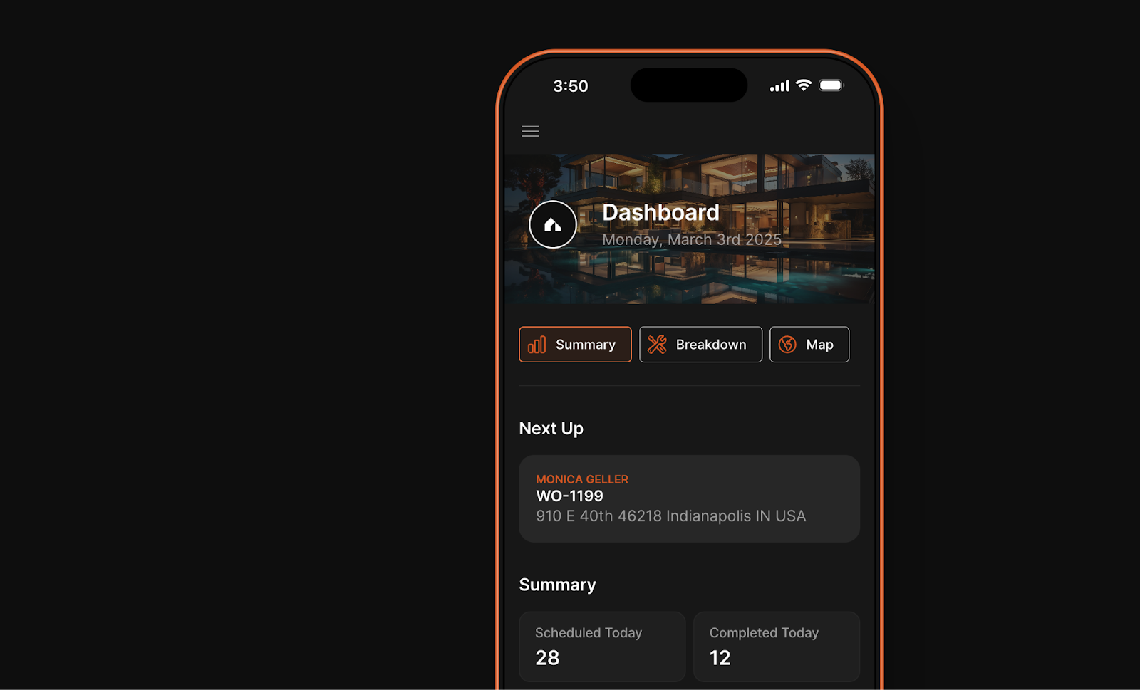
4. Elevate your apps with container images
Containers are one of the most useful layout tools in Glide. They act as a parent element where you can group child components and have more control over the layout - and that opens up a lot of design flexibility.
But that’s not all you can do with them. One underrated way to use them: upload branded images directly into top-level containers to give your app a more polished, on-brand look. You can use them as section headers, banners, background visuals, or even part of your navigation flow.
This works especially well on landing pages, dashboards, key pages and onboarding screens, where first impressions matter.
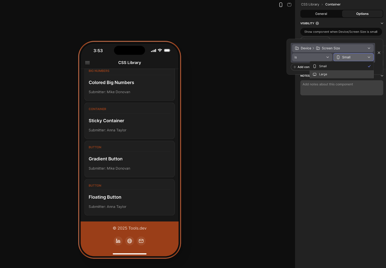
A quick tip for working with containers and images:
Glide recently launched the ability to use device size as a visibility condition.
That means you can create multiple containers with the same structure but different image sizing or aspect ratios, allowing you to tailor your AI for for mobile, tablet, or desktop specifically, and then conditionally show the correct container depending on the user’s screen size.
5. Customize your sign-in screen
The sign-in screen is the very first thing users see, so it’s worth putting some effort into it. Glide lets you customize the sign-in experience by uploading a background image, giving your app a more professional, branded first impression.
A few things to keep in mind:
- Images will be automatically scaled and centered depending on the device size.
- Use high-res images with simple visual elements—avoid text or anything that needs to stay in a specific position.
- Glide applies a dark gradient overlay by default to improve readability, so test contrast before finalizing your design.
Use it to:
- Show off your brand.
- Add personality to your app.
- Set a tone that’s more aligned with your users.
Small details, big impact!

Final thoughts
You don’t need to redesign your whole app to make it look and feel better. A few small changes - styling a button, branding your app, and simple design tweaks - can already make a huge difference and instantly elevate the look of your app.
Whether you’re using CSS for more control, building out Custom Collections, experimenting with AI, or tightening up layouts with containers and visuals - these are the tools that help your app feel more polished, more intentional, and more yours.
If you liked this article, you’re in luck - we’ve got plenty more tips and tricks coming your way.
Not done building? For more support on how to build apps in Glide, check out our article which gives you the Glide low-down.
Want to learn more about internal tools and how to build them, check out our sections on low-code tools like Notion and Airtable, or developer tools like Retool and Windmill.

