One of Retool’s standout qualities as an internal tool builder is the ability to tie your company’s data management and analytics to effective actions, using a variety of powerful components and integrations.
Something we often notice in apps is that this desire to turn data into actions often translates to an overwhelming amount of action buttons, whereby apps begin to resemble a ‘Where’s Waldo’ of that-button-I-need-to-submit-that-thing, rather than a slick user interface to streamline processes. Not only does this slow down work, but busy UIs also leave the potential for your users to make big mistakes.
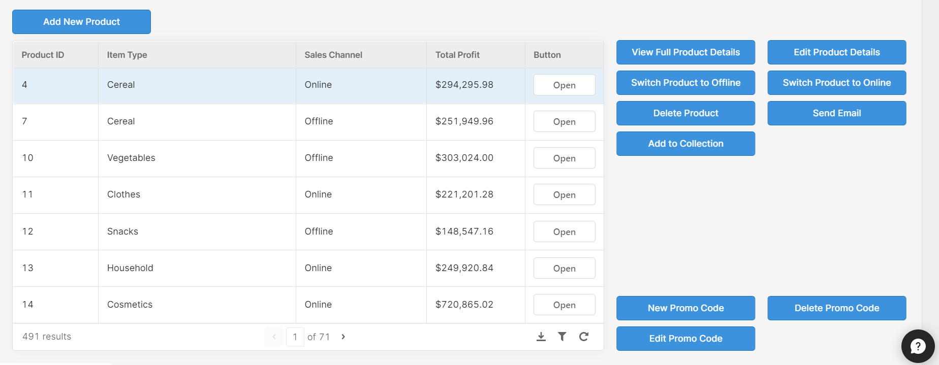
In the first instalment of Bold Tech’s UI sessions, we are tackling busy component enemy no.1: the button, to bring you some top tips for making better use of this powerful component, as well as some handy and innovative tricks to improve your UI even more.
So without further ado, to button tip number 1!
1. Keep actions dynamic using ternaries
The beauty of Retool’s dynamic features means it isn’t actually necessary to have an individual button for every action in your app. If you have multiple button actions which depend on the data you have selected (e.g. a selected row in a table), you can make use of ternaries to keep your button’s action dynamic, automatically adjusting to the needs of the data in front of you.
Here’s an example:
In the image below, you can see that our sales data has products that are either ‘online’ or ‘offline’, which is a key piece of data that we need to change from within the app. Instead of having two separate buttons to perform this action, our button automatically switches its action and text according to the row selected. This is how it looks in practice; note the ‘Switch to Online/Offline’ button above the table and how it changes depending on the row:
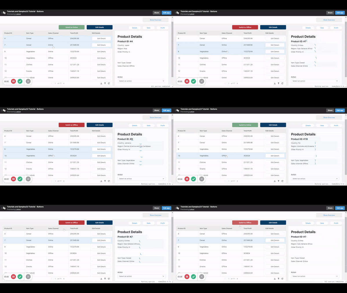
This is a very simple process that reads the data and changes the text, button color, and query accordingly by using a ternary. The changing button color also improves the UI, making the action more obvious to the user to avoid mistakes.
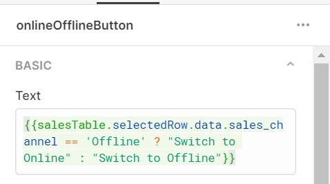
Let’s have a look at how this works. This is what the button text looks like:
And the button color:

You would also need to apply the same principle in whichever query this button carries out, such as our query below. This query is triggered by an event handler ‘on click’ of the switch button we made above.
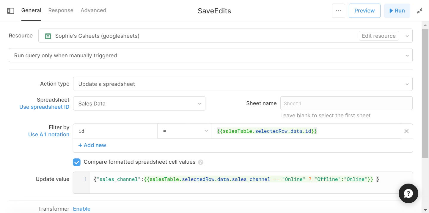
This dynamic action button is particularly useful for opposing actions or any kind of action that changes depending on the data itself.
Note: if you’re managing more than two states for a button via a ternary, the syntax can get hairy pretty quickly. In that case, it may make sense to encapsulate a switch statement in a Transformer for cleaner routing.
2. Avoid unnecessary repetition in table components
While action buttons within tables make for a very simple UI, if each button performs the same action it means lots of wasted space within your app and a generally cluttered appearance. Take this same table for example:
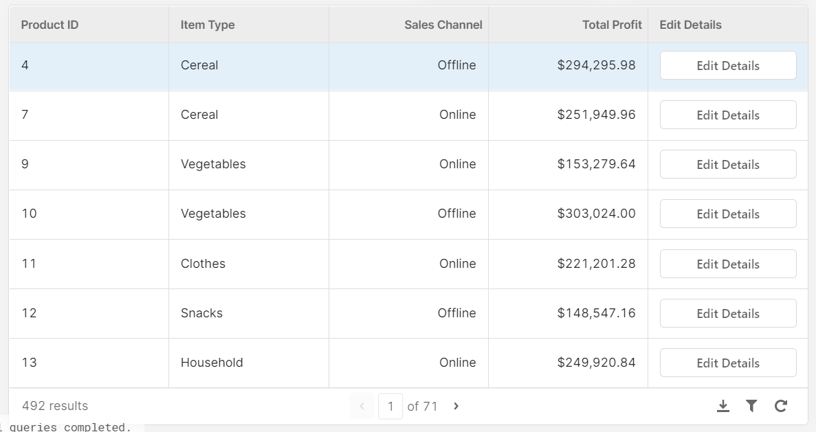
Since every button performs the same action, the repetition of the button doesn’t serve a useful function. Instead, you can use a single button that performs the action according to the selected row for a more streamlined interface, such as our ‘Edit Selected Item Details’ modal button as below:
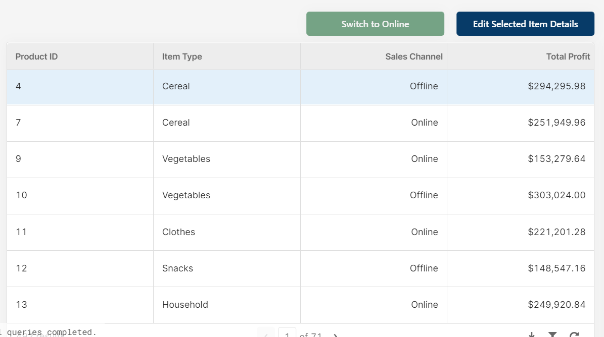
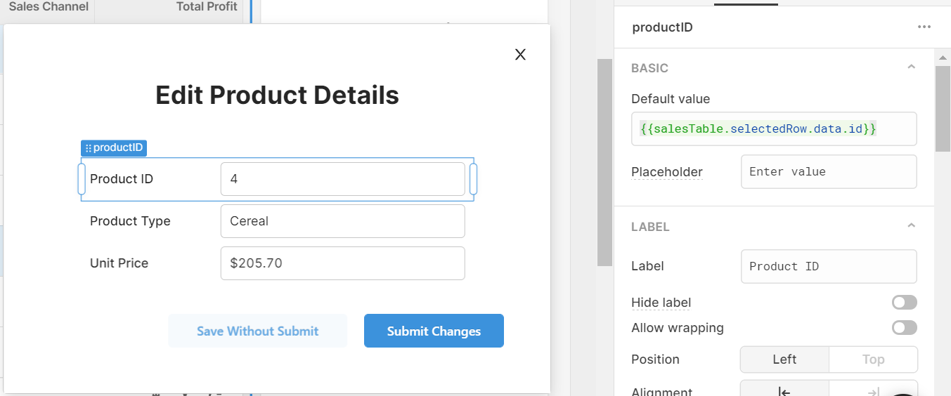
In our case, this opens an edit modal, which responds to the data of the selected row in the table, filling in the details accordingly (see default value box).
A better way to make use of Custom Columns and action buttons in table components is by using our tip in Step 1 to create dynamic buttons. For this, you would use a similar idea to the code in Step 1, this time using ‘currentRow’ instead of ‘selectedRow’, as in this example:
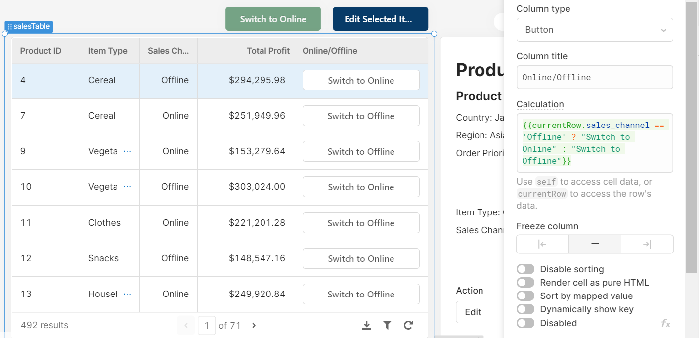
Just as in step 1, your action ‘on click’ would also need to connect to a dynamic query.
3. Use colour and shape effectively
It’s a well-known tactic in marketing UI to use color to draw attention to the key action buttons which convert to sales - but this concept is not reserved for marketing alone, it can be really useful in internal apps too! By using color intentionally, developers can aid productivity by guiding users to the correct or important actions.
We’ve seen many Retool apps defaulting religiously to the blue button that Retool provides as standard - and not only is this (sorry) really quite boring for the user, it also means that you are relying too heavily on the text of each action button. This means that your user needs to read (or remember the position of) each button before clicking, which can slow productivity, and once again, lead to silly mistakes. Color here helps to give the user some clues as to what each button does to speed up the processes within the app.
To illustrate, compare the two UIs here:
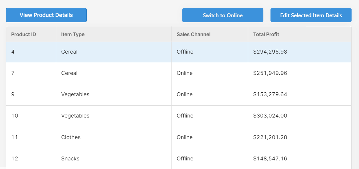
and:
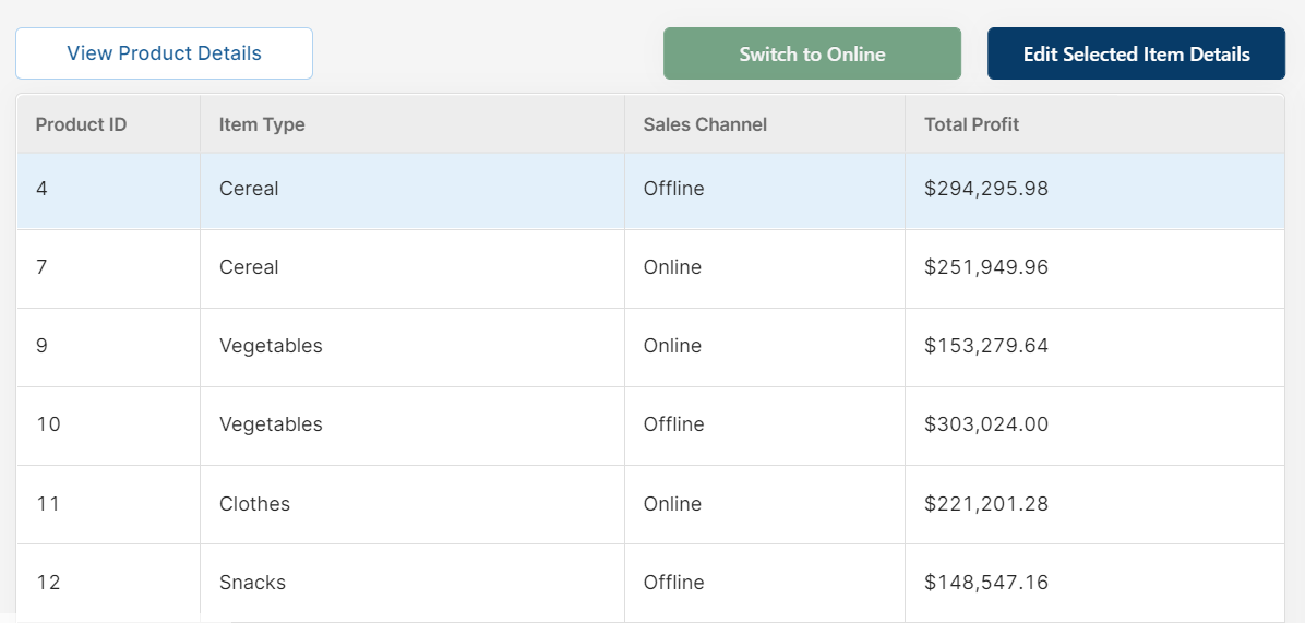
The simple changes to button color have made the actions much clearer and easier to discern: the associated green/red of online/offline for our dynamic button helps indicate the kind of action that takes place. Then, the action of ‘Edit Selected Item Details’ (which is a key process for this app) is in a darker color to indicate its dominance and importance as an action, and the ‘View Product Details’ (which is a lesser-used, secondary action) uses an inverted white/blue color scheme to make it more subtle and allow the user to focus on the key action buttons instead.
Here is another example of using dominant and then inverted colors to indicate key action versus secondary actions with our save/submit buttons:
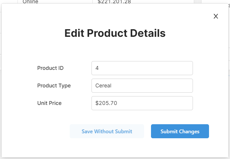
This simple change guides the user towards the most commonly used or important button. Likewise, you can guide them away from riskier actions.
Similarly, you can also use the button shapes to differentiate between button types. In our app, we use buttons to switch between tabs in a container (we’ll get to that snazzy move later), but these buttons are less important than the action buttons for the data. So we changed the shape of each to reflect that difference:

Although it may seem subtle, and perhaps inconsequential, small details such as these guide the user to the correct action buttons quicker and avoid confusion.
To summarize (and give you some extra ideas), here are some of our top tips for tactical button design:
- Use darker colours for the most used or most important actions to guide your user’s attention towards it.
- Use more toned down or inverted colours (e.g. blue text on white background) for less important or secondary action buttons to maintain focus on key actions.
- If relevant, use colors such as green for actions such as ‘Go’, ‘Validate’, ‘Submit’, ‘On’ etc and red for actions such as ‘Delete’, ‘Stop’, ‘Reject’, to give the user a clue before reading the button (people react to color quicker than they can read text!).
- You can also use Emojis to enhance the meaning of the text on the button, such as alert sirens (🚨) for delete buttons or risky actions.
- Use button shape to differentiate between action buttons and buttons that interact with the UI, such as tabs.
4. Give your users feedback using event handlers
Perhaps something that is overlooked within Retool apps is the indication to the user that an action, query or the like has been successful (or even unsuccessful). Good UI means giving your users a response to the actions if the results are not clear and immediate (such as data changing in a table - which may be obvious enough).
There are a few ways you can do this:
- When you have submitted or saved changes within a modal, a simple trick is to set the modal to close upon success to indicate that the action has been completed. You can also use a form component, which will clear upon success, to show the successful submission. Here is how to close your modal on success by using an event handler in your ‘Submit Changes’ button:

- For another simple success indication, use confetti - everybody loves confetti! (And digital confetti requires no clean up). You can do this in the event handlers of your button (on click) or in your query (on success) like so:
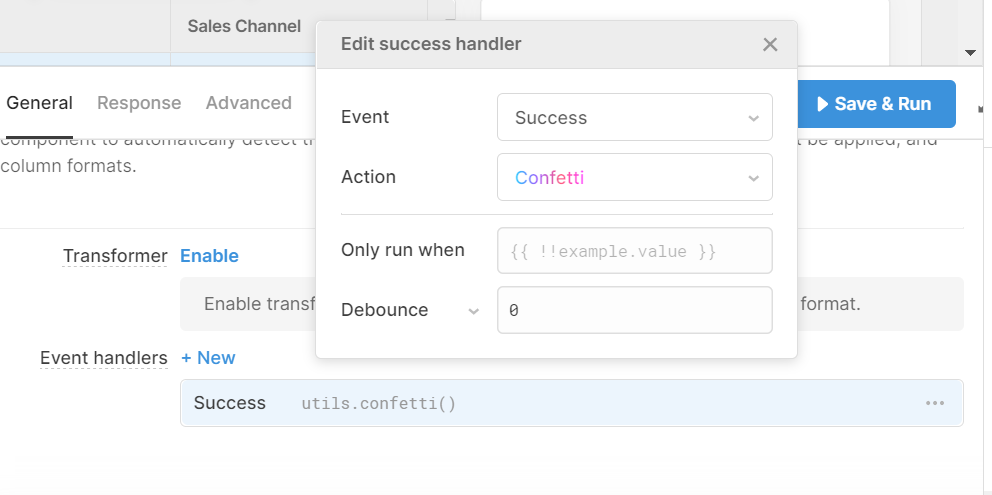
- Another great option, which also allows you to add text explanation for specificity is the event handler option ‘Show Notification’, which you can set to appear for Success or Failure and change the message accordingly for the user. Here is an example for our ‘Delete Product’ query:
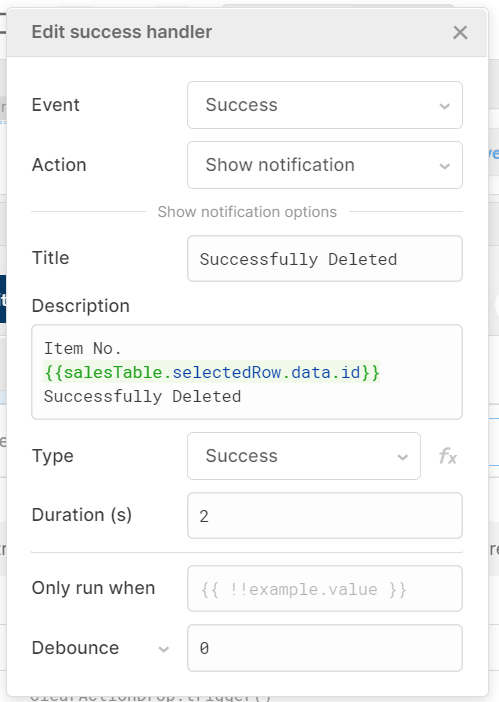
- Upon success, you would see this notification, which simply helps the user to know what has taken place and that their action has been successful, but will also indicate what exactly has happened in case of a mistake - to give the user the chance to rectify this:

5. Avoiding mistakes: disable button options
UI is not only about making processes easier, but also making it harder to make mistakes. Cluttered UI interfaces with button overload make it just as easy to click ‘Delete Client’ as ‘Create Client’ - and therefore creates space for big problems.
There are a couple of validation options within Retool to avoid these kinds of mistakes and these are great to implement in apps, particularly when the actions are risky and need extra layers of verification.
The easiest option is adding a validation within your query, which you can do in your query settings as below:

This simply creates an extra step between clicking a button and performing an action, which avoids risky mis-clicks.
Another way to avoid accidental clicks is to add a simple Captcha-style task, such as our ‘type YES to verify’ option here:
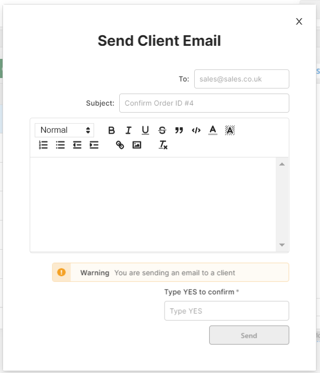
Since the ‘Send’ button here will allow someone to email a client, we want to double-check that the app user is sure they are ready to send. One step was by adding a simple alert message to get their attention (the alert component), and the other is by using a text input component which enables the button.
To make this work, simply add the following reference to the ‘Disable When’ section of the button component:

So unless the text input contains the string ‘YES’, the action will not be clickable, adding an extra degree of separation between the user and that accidental ‘hit send’ to a crucial customer.
Another handy option to avoid these critical mistakes would be to disable the buttons for certain user groups who do not need access to these actions. You can do this by adding user permissions in your Retool settings and adding a ternary like this to your ‘Disable When’, which only enables a button if the current user is in the ‘Managers’ group.
{{!current_user.groups.map(group => group.name).includes('Managers')}}
6. Get creative with other components!
Actions don’t need to be tied exclusively to the button component, and buttons can also be used in place of other, more typical components, for both UI and style reasons. For our final tip, we have a bumper selection of tips and tricks to use other components like buttons, and buttons like other components (in all kinds of exciting and unexpected ways!):
Use buttons as tabs for a slicker UI
The tabbed container component - while useful - is not exactly the prettiest. In fact, we don’t really like the appearance of the standard tabs at all. This is why we’ve created a snazzy (albeit more complicated) way of switching tabs using buttons instead of ordinary tabs! This is how it looks:
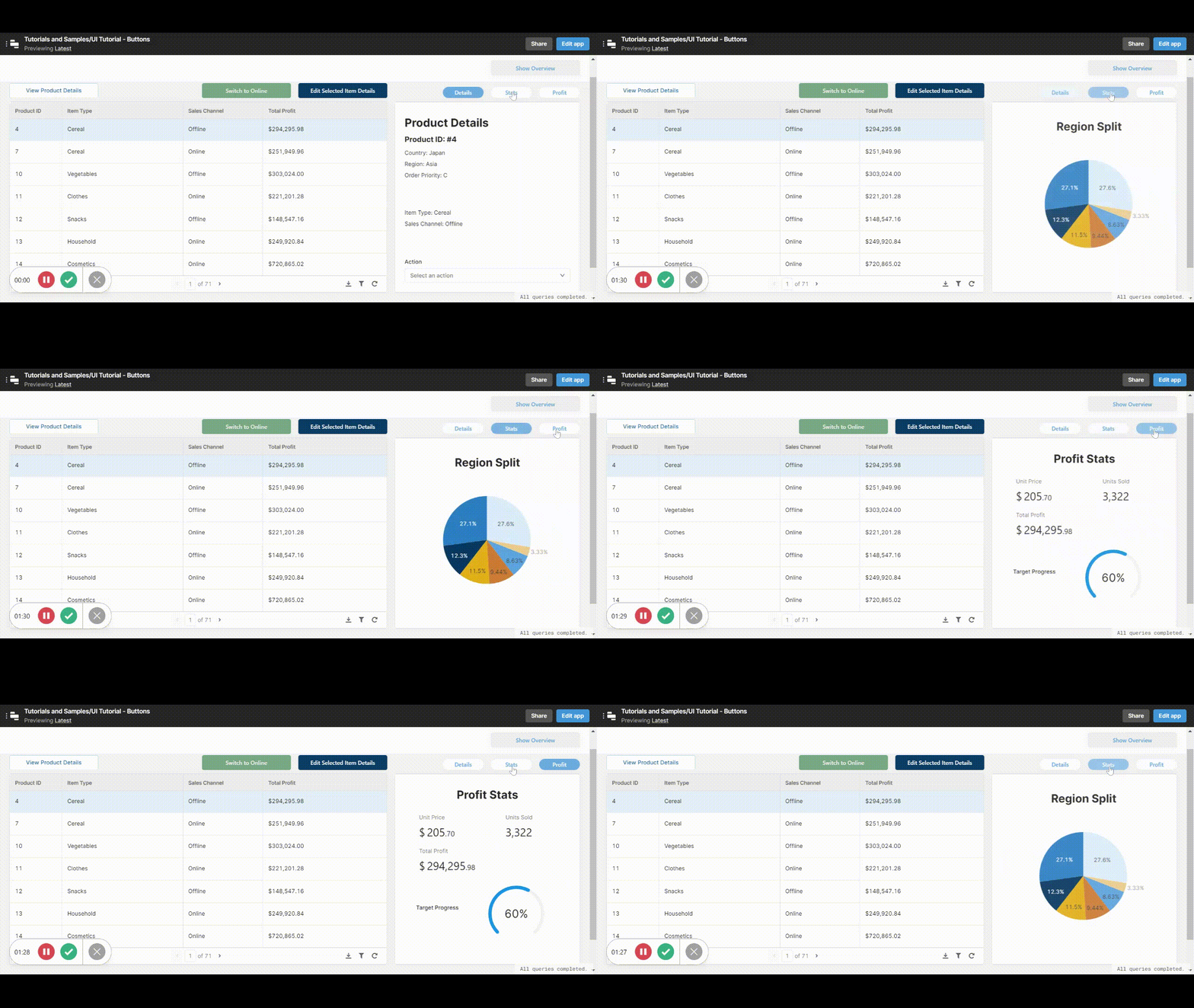
Here’s how to use this trick yourself:
First create a temp state (by clicking ‘Create New’ under Temporary State in the left panel) and label it for clarity:
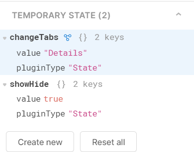
Then insert your tab buttons and name them accordingly.
Now you want each button to change the value of the temp state on click - to do this you’ll use the event handlers within the button component. First create an event handler that selects the relevant tab when the button is clicked, like below:
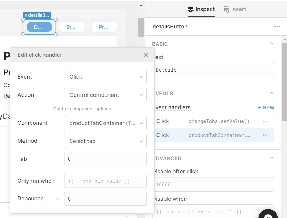
So now, when the button is clicked, it will control the tabbed container and switch the tab to ‘0’ (the details tab).
Then, add another event handler that sets the temp state value:
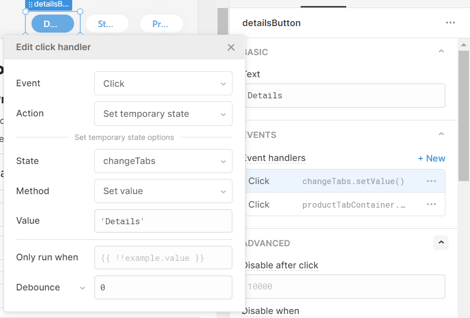
You’ll use this event handler to change the color of the button according to which is selected, using the code below:
Background:
{{changeTabs.value == 'Details' ? "#67AAE4" : "#FFFFFF"}}
Label:
{{changeTabs.value == 'Details' ? "#FFFFFF" : "#67AAE4"}}
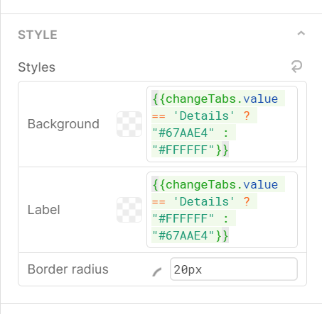
This ternary will set the color to blue text on white when the button/tab is not selected, and white text on blue when that button and tab is selected.
Do this exact process to each of your buttons and tabs, only changing the temp state to an appropriate, unique value each time.
Once that is complete, make sure to set the default value of your temp state (in the left-hand column, click the ‘Temporary State’ you created and change this value in the right-hand column) to the tab you would like the app to open on.

And with that you are done creating more beautiful, and more customizable, buttons for your tabbed container!
Buttons in place of switches
Switches (or toggles) are handy for true/false values, but they don’t always make the most sense when it comes to certain UI functions, where the switch doesn’t naturally indicate whether something is on or off. An example is a show/hide container function, where the button changes dynamically to change the action. Here’s how it looks in practice:
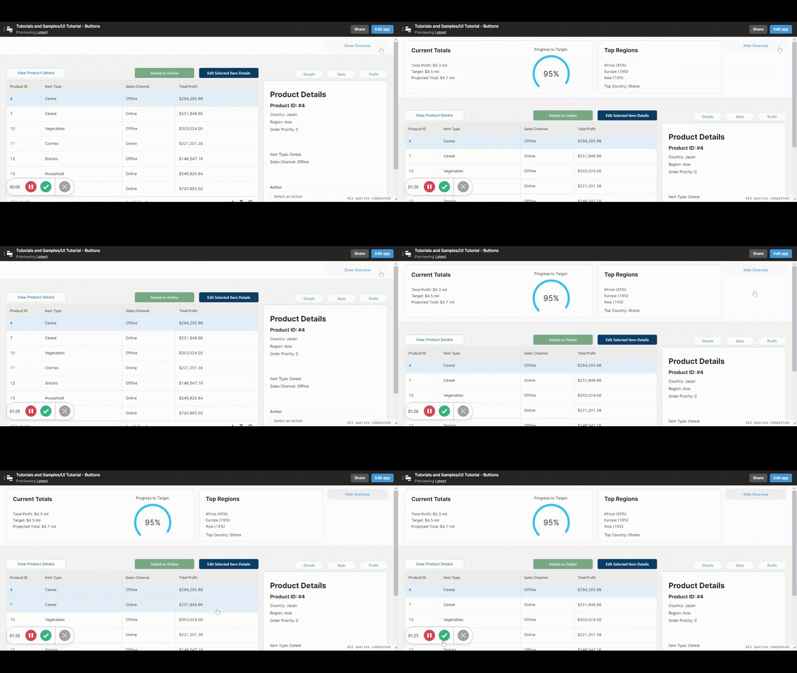
Like the buttons in place of tabs, this works using temp states to indicate whether the action is true/false or on/off (or even multiple options).
First, like above, create a temp state (by clicking ‘Create New’ under Temporary State in the left panel) and label it for clarity:
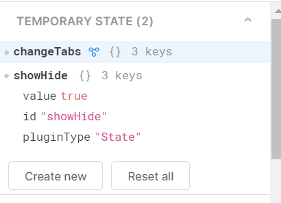
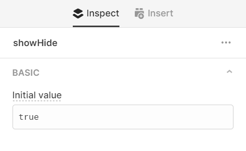
Set the state’s default value by selecting it in the left-hand panel and editing it in the right-hand panel, in our case we wanted it set to ‘true’.
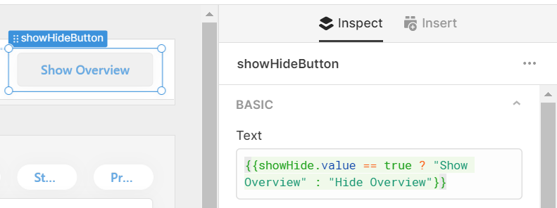
Next to whatever components you wish to show or hide, add a button. In the button text section add a ternary that changes the button text dynamically according to the value of the temp state:
Then add two Event Handlers which sets the value of the temporary state to true and false, back and forth, by completing the opposite action, as below:
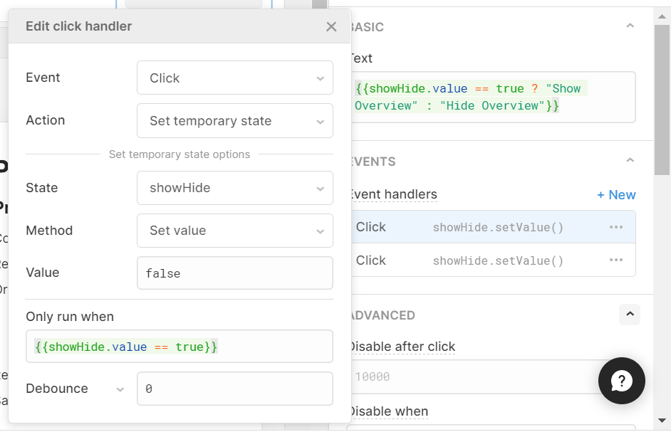
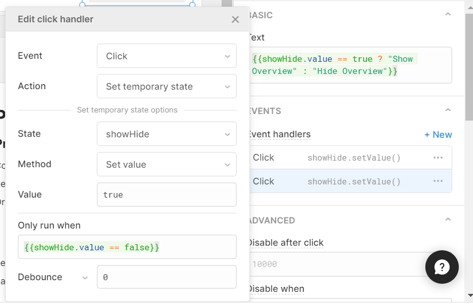
Essentially, the first event handler sets the value to false (the default is true) on click, but will only do so if the temp state is currently set to true, and the second event handler sets it back to true on a second click (again only if the temp state is currently false - to create a cycle).
Once this is done, you just need to set the relevant components to hide, by adding this to your ‘Hidden’ value box (where showHide.value is the temp state):

This true/false button in place of a switch creates an intuitive action with a slicker UI than a toggle.
Dropdown action bar
Our final, and snazziest, Retool hack is super simple and is one of our absolute favourites - we use it across many of the apps that we develop. In essence, it takes a series of action buttons (e.g. edit, view, send, save, upload documents) and condenses what would be many buttons into a simple action dropdown.
This is how it looks:
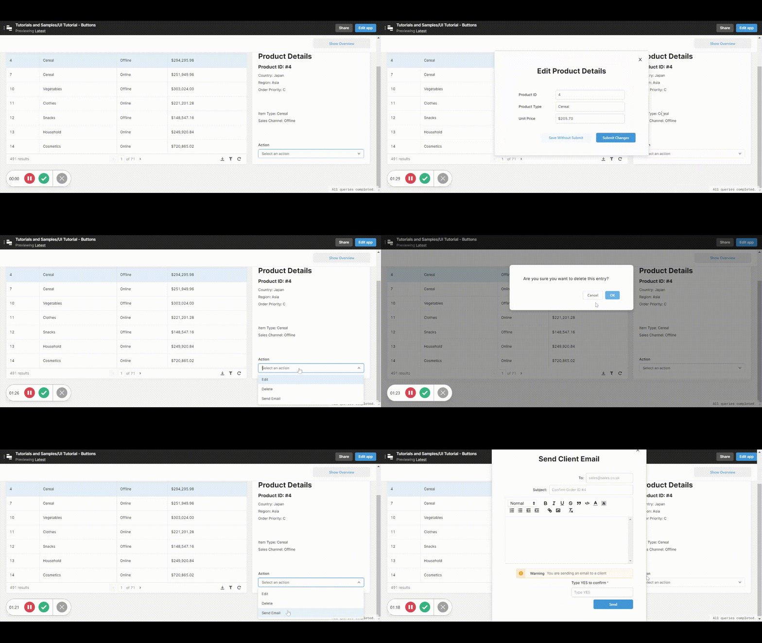
It works by triggering modals to open when the option is selected by using event handlers (which can also be linked directly to queries where needed).
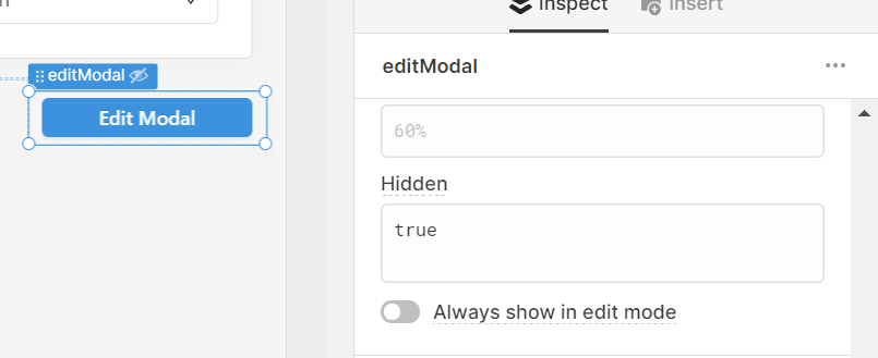
To get started, insert your modal components into the app, set them up however you need, and then hide the button itself by adding ‘true’ to the ‘hidden’ value box.
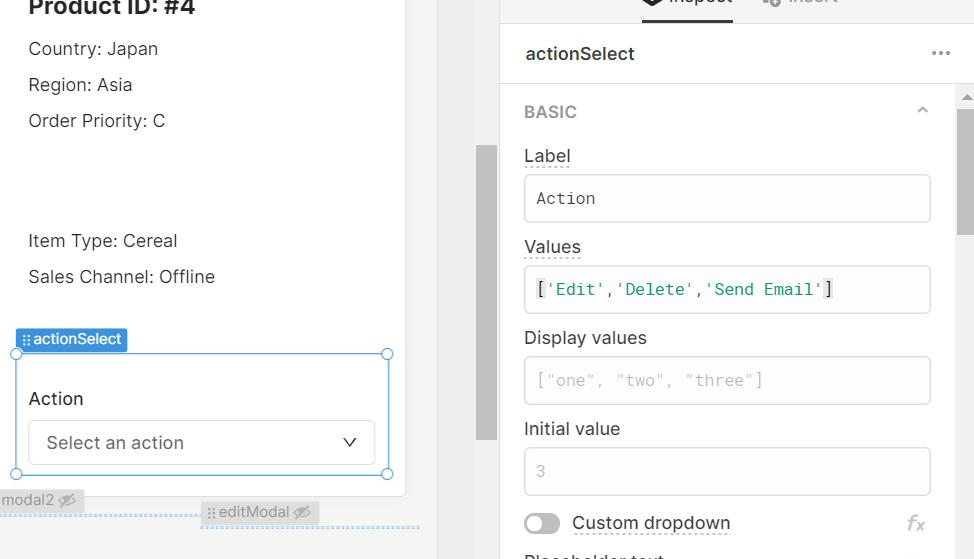
Then add a dropdown/select component to your app and label it ‘Action’.
Set the values of your select component however you need. Here is how ours looked:
Then, in the event handlers, set the values to trigger the modals to open. Here is our ‘Edit Details’ modal as an example:
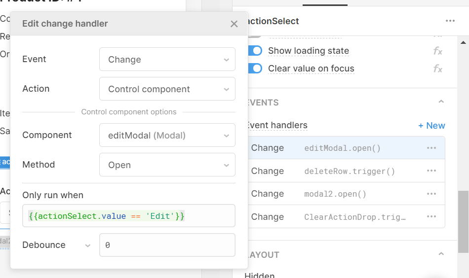
Now, when the dropdown value changes, the editModal will open, but only if the value changes to ‘Edit’. Do the same with your other modals.
You can also connect this straight to a query, just like our ‘delete’ action:
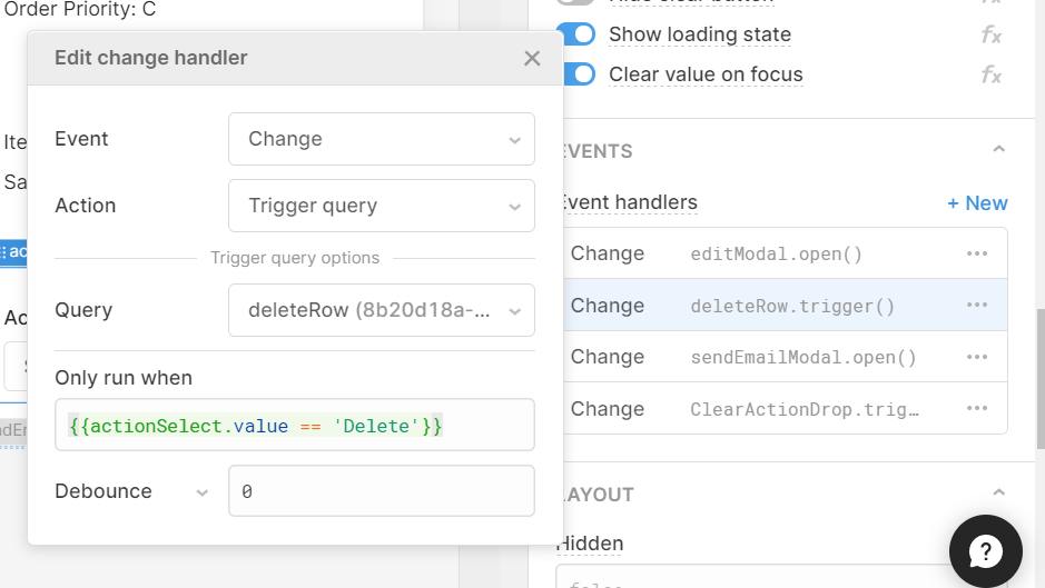
When ‘delete’ is clicked, the delete query will run (with a confirmation modal).
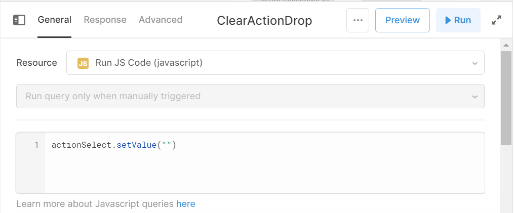
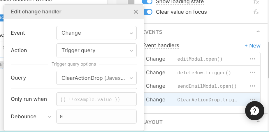
Finally, you can use a JavaScript query to set the dropdown to clear each time the value changes, so that you can select another option or reselect the same one.
Here is your query, which simply sets the dropdown value to empty (“ ”):
And here is how to trigger it from your dropdown:
And with that you are all done!
We hope you've found these tips and tricks useful in making your buttons more UI-friendly within Retool, look out for our other articles on Retool.
Want to learn more about internal tools and how to build them? Check out our sections on low-code tools like Notion and Airtable, or developer tools like Retool and Windmill.


