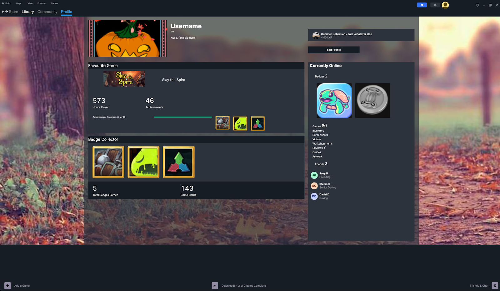
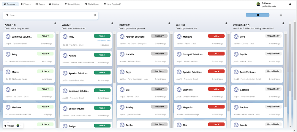
In the final release of our Retool UI inspiration series, we recreated the dark and moody Steam interface using just Retool (and a touch of CSS).
It’s quite uncommon to see dark modes in Retool, and Steam’s dark, layered design and functional layout inspired us to explore how Retool’s features can bring a similar interface to life.
You can play with his Retool version of the Steam UI yourself.
There are four key features that are particularly unique about this UI design in Retool:
- Using a container to create a sticky footer for the whole Retool page
- Using custom CSS to eliminate the repeated scroll bars on Window (a particular Bold Tech pet peeve)
- Applying gradient backgrounds to containers to create a more three-dimensional graphic design
- Double top navigation bars for primary and secondary menu
Creating a sticky footer
One of our favorite elements of this UI design is the sticky footer at the bottom of the page. This isn’t something that Retool natively offers in the main canvas, and can be a really useful addition to many Retool apps with the need for additional navigation options.
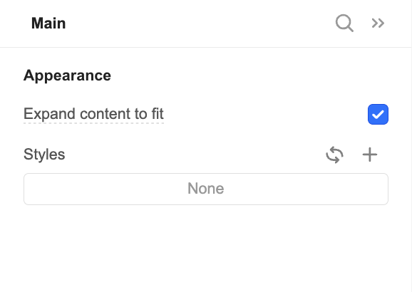
To do this, we used a container within the body of the canvas and ticked the ‘expand content to fit’ to avoid padding from shifting everything about.

We then set up the container with a footer option and added some necessary buttons.

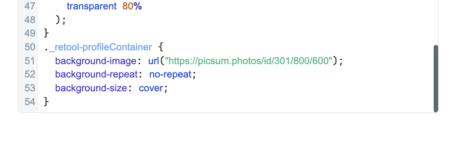
We also love this unique design of having a photo background and near-transparent container on top - this could be a great option for profile pages where it’s nice to add a personal touch for users.
Here’s the custom CSS we used to get it:

}
._retool-profileContainer {
background-image: url("https://picsum.photos/id/301/800/600");
background-repeat: no-repeat;
background-size: cover;
}
Using Custom CSS to adapt Windows Scrollbars
Bold Tech does a collective sigh when we hear our clients work on Windows… not because we’re Apple fanatics, but because Windows doesn’t properly hide scrollbars when they’re not in use. This means that containers and tables appear cluttered with multiple scroll bars all showing simultaneously and often confusing the user.

But thank the heavens for Mitchel, because with this Steam design, he figured out a way to hide these additional scrollbars with a little CSS trick.
This custom CSS adjusts the scrollbar’s width, track, and color, improving the look and feel across the app.
/* width */
::-webkit-scrollbar {
width: 5px;
}
/* Track */
::-webkit-scrollbar-track {
box-shadow: clear;
border-radius: 10px;
}
/* Handle */
::-webkit-scrollbar-thumb {
background: #606774;
border-radius: 10px;
}
/* Handle on hover */
::-webkit-scrollbar-thumb:hover {
background: #BCBCBC;
}
Applying Gradient Backgrounds to Containers
Steam’s design includes subtle gradients and background visuals, which gives a sleek look we don’t often see in apps in Retool. We replicated this in Retool by applying radial gradients with a little custom CSS.
As well as looking great, this is a subtle yet effective way of drawing the user’s eye to the most important elements of the app that they need to interact with. You’ll notice that the areas of the app without this glow seem to disappear more into the background, which is a great way to decentralize those secondary features and allow users to focus on primary actions.
With this code you can tweak the colors and percentages to get the effect you’re looking for.
/* News Container */
._retool-newsContainer {
background-image: radial-gradient(
ellipse 60% 50% at 60% 110%,
steelblue 50%,
#464B53 95%
);
}
._retool-achievementsContainer {
background-image: radial-gradient(
circle farthest-side at 40% 150%,
steelblue 40%,
transparent 60%
);
}
._retool-underglowContainer {
background-image: radial-gradient(
circle farthest-side at 40% 250%,
steelblue 40%,
transparent 80%
);
Double navigation bar
Steam’s interface uses a primary and secondary navigation bar at the top of the page, which creates a structured way to organize lots of navigation options without being overwhelming. We replicated this in Retool with stacked navigation containers.

The use of a larger font for the lower navigation is also a unique design choice that can be really useful for certain UIs - particularly when the secondary navigation is actually more important than the higher-level options in the first, top one.
That’s the last in our quick series of UI-inspiration buildouts in Retool! While we don’t expect you to go building the next YouTube, Steam, Hubspot (or even Retool) on Retool itself anytime soon, we hope you enjoyed the exercise of pushing the limits of Retool for some cool out-of-the-box UI thinking - we certainly have!
Download the sample toolscript
The Toolbox newsletter members can download the JSON and import it directly into their Retool environment to test it out ⬇️⬇️⬇️


