


At Bold Tech, we think that Plotly Charts are a criminally underrated option in Retool. For that reason, we’ve spent some time digging into all the options available with Plotly and have come up with a whole series of design choices, ranging from simple to complex, to help Retool users integrate better data into their apps.
In this first part of the series, we’ll strip it back to basics with the line/scatter chart and add various features to make it more useful. This will also help to illustrate the structure of the data/layout objects in Plotly, which is often the biggest struggle for developers using it in Retool.
In the rest of this series of Plotly guides, we’ll show you how to make more advanced graphs and charts that might just rival those of your favorite BI tools.
Plotly in Retool: Pros and Cons
Pros
- Plotly is hugely flexible and with a little tweaking you can get most of the results that you are looking for. This is very useful for consolidating your tech stack and removing costly BI seats for your organization.
- You can build out niche use cases for your team based on interactive data already available in your apps.
- Simple charts are really easy to build - and these tend to be the majority of use cases we see. For presenting these simple charts, paying for PowerBI or similar products might be overkill and Retool is a great alternative.
- Annotations help add a lot of contextual information to chart formats.
- The flexibility of Retool means you can build your charts specifically for the end user. For example, you might see that operations teams want to see data in a more action-focused format than team leaders, or even marketing teams, who might prefer detailed charts. With Retool you can present the data exactly how it suits these teams.
Cons
- Development speed using Plotly is the major limitation compared to standard BI tools, and is typically slower than the speed of development you’d be used to in Retool too.
- Nevertheless, Business Intelligence tools like Tableau are usually very expensive, so if you only use a limited selection of charts, you might find using Plotly in Retool a good way to save money.
- Plotly can take a little time to get into and truly understand, and there is a steep learning curve to mastering the system that may not pay off if you are only looking to make a single chart.
Plotly Essentials
Retool has built in a UI layer for working with Plotly in Retool, but they are mostly limited to simple charts like bar graphs, line and pie charts, and scatter plots. Working with these options is simple and Retool does a lot of the heavy lifting for you, automatically offering the data as available in your data resource, and allowing you to sum, average, median your data, and more.

With more complex datasets, however, it can be tricky to format the data correctly in the spaces provided. In this case it can be more straightforward to format into a JavaScript query. The Retool UI also doesn’t leave much space for customization with the built-in options.
The key to learning how to use Plotly in Retool is understanding how to transfer their detailed documentation into the data and layout objects used in Retool.
Luckily, there is a simple trick that can help you get started with this for all the demo charts and their code that are available in the Plotly docs. All you need to do is copy and paste the example code into a JavaScript query and change the final line from Plotly.newPlot('myDiv', data, layout); to return {data, layout};.
You can then refer to these objects in the respective value boxes in the Retool chart component - switching the option to PlotlyJSON instead of the UI form, and referring to the attributes in your query.

This gives you a great starting point from which to understand how to manipulate the example charts that Plotly provides.
Here is an example of how the Plotly attributes are organized within the object.
data = [
{
type: 'scatter',  // all "scatter" attributes: https://plotly.com/javascript/reference/#scatter
x: [1, 2, 3],     // more about "x": https://plotly.com/javascript/reference#scatter-x
y: [3, 1, 6],     // #scatter-y
marker: {         // marker is an object, valid marker keys:https://plotly.com/javascript/reference #scatter-marker
color: 'rgb(16, 32, 77)' // more about "marker.color":https://plotly.com/javascript/reference#scatter-marker-color
}
},
{
type: 'bar',      // all "bar" chart attributes: https://plotly.com/javascript/reference#bar
x: [1, 2, 3],     // more about "x": https://plotly.com/javascript/reference#bar-x
y: [3, 1, 6],     // https://plotly.com/javascript/reference#bar-y
name: 'bar chart example' // https://plotly.com/javascript/reference#bar-name
}
];
layout = {                     // all "layout" attributes: https://plotly.com/javascript/reference#layout
title: 'simple example',  // more about "layout.title": https://plotly.com/javascript/reference#layout-title
xaxis: {                  // all "layout.xaxis" attributes: https://plotly.com/javascript/reference#layout-xaxis
title: 'time'         // more about "layout.xaxis.title": https://plotly.com/javascript/reference#layout-xaxis-title
},
annotations: [            // all "annotation" attributes: https://plotly.com/javascript/reference#layout-annotations
{
text: 'simple annotation',    // https://plotly.com/javascript/reference#layout-annotations-text
x: 0,                         // https://plotly.com/javascript/reference#layout-annotations-x
xref: 'paper',                // https://plotly.com/javascript/reference#layout-annotations-xref
y: 0,                         //https://plotly.com/javascript/reference #layout-annotations-y
yref: 'paper'                 // https://plotly.com/javascript/reference#layout-annotations-yref
}
]
}
return {data, layout}; // which formats this to be easily referenced from Retool.
An example of Plotly attributes within the object
Something that many developers using Plotly are unaware of, is the ‘Annotations’ options it offers. These annotations need to go in the ‘Layout’ object of the Plotly code as you can see in the example above. This can be helpful for adding useful contextual customizations to any chart.
Features such as subplot annotations can be particularly useful for highlighting certain data points. You can read more in their annotations section.

Scatter plot/line graph step-by-step
For this demonstration, we’ve used the scatter plot option as an illustration, as this trace type includes line charts, scatter charts, text charts, and bubble charts and the code can easily be used to create any of these examples.
Line charts are set by changing the ‘mode’ type from ‘markers’, a scatter plot, to ‘line’, or ‘lines+markers’ to combine the two. Bubble charts are achieved by setting ‘marker.size’ and/or ‘marker.color’ to numerical arrays.
Chart 1: Basic chart
To get started, we set up a simple line chart with some social media analytics data. In the code below, we have annotated the purpose and some of the customization options of this chart.
As you can see, the data object is where you’ll format your X and Y values, the type of graph and some of the color scheme (including the color of the line/scatter plots), as well as the format of the text in the hover label.
Data object:
// Format the data object from the dataset ‘YouTubeTotals’
let formattedData = formatDataAsObject({{youtubeTotals.data}});
// Create the chart data array
let chartData = [
{
"name": "Subscribers gained", // The name of the data series shown in the legend
"x": formattedData.Date, // X-axis data: array of dates from the formatted data object
"y": formattedData['subscribers_gained'], // Y-axis data: array of subscribers gained from the formatted data object
"type": "scatter", // Plot type: scatter plot
"mode": "line", // Display mode: ‘line’ for line chart, ‘markers’ displays points only, ‘lines+markers’ for both
"marker": {
"color": "#1E3A8A" // Marker color: blue shade
},
"hovertemplate": "<b>Date:</b> %{x}<br><b>Subscribers Gained:</b> %{y}<extra></extra>" // Hover template: customizes the information shown when hovering over points
}
];
// Return the chart data array for Plotly
return chartData;
An example of a data object in Retool
Now, in the layout object, we can define more customization options. These typically include the title, legend, labels and their respective design options, such as font and color, and define the margins of the plot.
You can also define whether it’s possible to select points on the chart. This can be useful when using a chart to filter data in a table for instance, which is possible in Retool using the chart.selectedPoints attribute. Note, this is straightforward with scatter plots and bubble charts with clearly-defined markers, but requires some more complex code for line charts.
Layout object:
// Define the layout for the chart
let layout = {
"title": {
"text": "Daily Subscribers Gained", // Title text for the chart
"font": {
"color": "#3D3D3D", // Color of the title text
"size": 16 // Font size of the title text
}
},
"font": {
"family": "var(--default-font, var(--sans-serif))", // Default font family for the chart
"color": "#979797" // Default font color for the chart
},
"showlegend": true, // Display the legend
"legend": {
"xanchor": "center", // Anchor point for the x position of the legend
"x": 0.45, // X position of the legend
"y": -0.2, // Y position of the legend
"orientation": "h" // Orientation of the legend (horizontal)
},
"margin": {
"l": 16, // Left margin
"r": 24, // Right margin
"t": 24, // Top margin
"b": 32, // Bottom margin
"pad": 2 // Padding
},
"hovermode": "closest", // Hover mode: show information for the closest data point
"hoverlabel": {
"bgcolor": "#000", // Background color of the hover label
"bordercolor": "#000", // Border color of the hover label
"font": {
"color": "#fff", // Font color of the hover label
"family": "var(--default-font, var(--sans-serif))", // Font family of the hover label
"size": 12 // Font size of the hover label
}
},
"clickmode": "select+event", // Click mode: allow selection and trigger events
"dragmode": "select", // Drag mode: allow selection of data points
"xaxis": {
"title": {
"text": "Date", // Title text for the x-axis
"standoff": 6, // Standoff distance for the x-axis title
"font": {
"size": 12 // Font size for the x-axis title
}
},
"type": "-", // Axis type (default)
"tickformat": "", // Tick format (default)
"automargin": true, // Automatically adjust margins
"fixedrange": true, // Fixed range for the x-axis (no zooming)
"gridcolor": "#fff", // Grid color for the x-axis
"zerolinecolor": "#fff" // Zero line color for the x-axis
},
"yaxis": {
"title": {
"text": "Number of subscribers", // Title text for the y-axis
"standoff": 6, // Standoff distance for the y-axis title
"font": {
"size": 12 // Font size for the y-axis title
}
},
"type": "linear", // Axis type: linear
"tickformat": "", // Tick format (default)
"automargin": true, // Automatically adjust margins
"fixedrange": true, // Fixed range for the y-axis (no zooming)
"zerolinecolor": "#DEDEDE" // Zero line color for the y-axis
}
};
// Return the layout for Plotly
return layout;
An example of a layout object in Retool
Chart 2: Basic chart with trend line
For this chart version we have the same chart but have added a trendline that summarizes the values as an average of each month. To set up the trendline, you need to make these changes in the data object. In this chart, the layout object is exactly the same as in the first.
This trendline is just another line on the chart, so this method can also be used for adding a second line to the chart to represent different data.

In our case, we needed to first group months and calculate averages of each, so we initially had to define these variables and number formats and calculate the averages:
Data object:
// Format the data object
let data = formatDataAsObject({{youtubeTotals.data}});
// Convert dates and subscriber gains
let dates = data.Date.map(date => new Date(date));
// Convert subscriber gains to numbers
let subscribersGained = data.subscribers_gained.map(Number); // Ensures values are numbers
// Group data by month and year
let monthlyData = {};
dates.forEach((date, index) => {
let monthYear = `${date.getFullYear()}-${date.getMonth() + 1}`; // Format as YYYY-M
if (!monthlyData[monthYear]) {
monthlyData[monthYear] = [];
}
monthlyData[monthYear].push(subscribersGained[index]);
});
// Calculate the average for each month
let monthlyAverages = {};
for (let monthYear in monthlyData) {
monthlyAverages[monthYear] = _.mean(monthlyData[monthYear]);
}
// Prepare the data for the trend line
let trendLineX = [];
let trendLineY = [];
for (let monthYear in monthlyAverages) {
let [year, month] = monthYear.split("-");
let date = new Date(year, month - 1, 1); // Start of the month
trendLineX.push(date);
trendLineY.push(monthlyAverages[monthYear]);
}
// Main data series (scatter plot)
let plotData = [
{
name: "Subscribers gained",
x: dates,
y: subscribersGained,
type: "scatter",
mode: "line",
marker: {
color: "#1E3A8A"
},
hovertemplate: "<b>%{x}</b><br>%{fullData.name}: %{y}<extra></extra>"
}
];
// Conditional trend line addition with switch toggle
if ({{ trendlineChart2Switch.value }}) {
plotData.push({
name: "Monthly Average Line",
x: trendLineX,
y: trendLineY,
type: "scatter",
mode: "lines",
line: {
dash: "solid",
color: "#FF5733"
},
hoverinfo: "skip"
});
}
// Return the data for Plotly
return plotData;
Data object showing coding to create averages for the trend line
Chart 3: Annotations
For this chart, we have replaced the trendline with an annotation that alerts the user to an event on the chart. For the sake of clarity in this first code, we manually coded in the annotation label and value, but you could use the annotations options to set dynamic values to automatically indicate values such as the highest or lowest with some JavaScript calculations.

The data object is the same as in the first chart, but we’ve changed the layout object by adding the ‘Annotations’ object within it. This ‘Annotations’ object comes in right at the end of our layout object code, after all the other code.
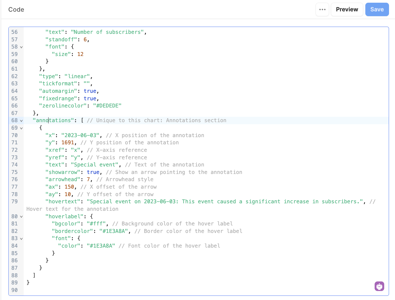
This is the annotations object to be added to the layout:
"annotations": [ // Unique to this chart: Annotations section
{
"x": "2023-06-03", // X position of the annotation
"y": 1691, // Y position of the annotation
"xref": "x", // X-axis reference
"yref": "y", // Y-axis reference
"text": "Special event", // Text of the annotation
"showarrow": true, // Show an arrow pointing to the annotation
"arrowhead": 7, // Arrowhead style
"ax": 150, // X offset of the arrow
"ay": 10, // Y offset of the arrow
"hovertext": "Special event on 2023-06-03: This event caused a significant increase in subscribers.", // Hover text for the annotation
"hoverlabel": {
"bgcolor": "#fff", // Background color of the hover label
"bordercolor": "#1E3A8A", // Border color of the hover label
"font": {
"color": "#1E3A8A" // Font color of the hover label
}
}
}
]
Annotations object within the layout in Retool.
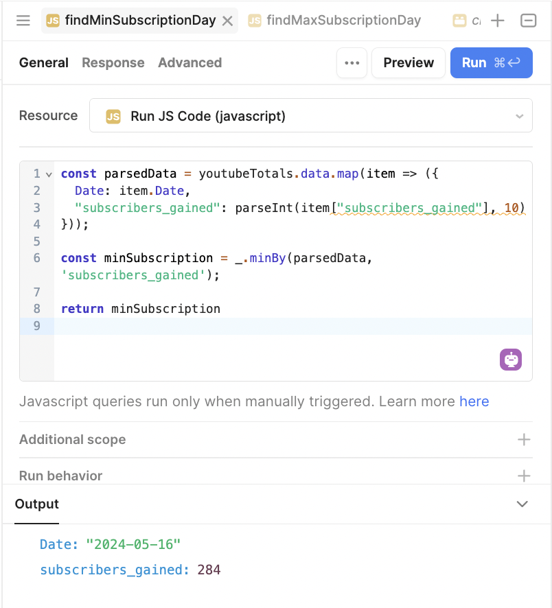
To take these annotations one step further, we’ve made some dynamic options based on some calculations. We included a multi-select component (named selectedAnnotations here) where users can decide which features to highlight.
When any of these are selected, a marker will show on the chart to point out the relevant value.

These are calculated in JavaScript queries that look for the minimum and maximum values using _.minBy and _.maxBy. These queries can be triggered to run on the value selection.
Min:
Max:
In the Plotly code, we then check if the multiselect (selectedAnnotations) includes the selected value, and then if so, sets that annotation on the chart. As before, this code is right at the end of our layout object.
if (selectedAnnotations.includes('maxSubscription')) {
annotations.push({
x: {{ findMaxSubscriptionDay.data.Date }},
y: {{ findMaxSubscriptionDay.data['subscribers_gained'] }},
xref: "x",
yref: "y",
text: "Max Subscription Event",
showarrow: true,
arrowhead: 4,
ax: 200,
ay: -20,
hovertext: "Max subscription on  + {{ findMaxSubscriptionDay.data.Date }} + : This event caused a significant increase in subscribers.",
hoverlabel: {
bgcolor: "#fff",
bordercolor: "#1E3A8A",
font: {
color: "#1E3A8A"
}
}
});
}
if (selectedAnnotations.includes('minSubscription')) {
annotations.push({
x: {{ findMinSubscriptionDay.data.Date }},
y: {{ findMinSubscriptionDay.data['subscribers_gained'] }},
xref: "x",
yref: "y",
text: "Lowest Subscription Event",
showarrow: true,
arrowhead: 4,
ax: 25,
ay: -100,
hovertext: "This was the day with the least subscribers on  + {{ findMinSubscriptionDay.data.Date }} + .",
hoverlabel: {
bgcolor: "#fff",
bordercolor: "#1E3A8A",
font: {
color: "#1E3A8A"
}
}
});
}
A layout object showing code for the annotations graph in Retool.
Chart 4: Color scale
In chart 4, we’re getting a little funky with our color scheme and have used the built-in color scale to add some interest to the chart. It’s not a major lift, but color can go a long way to making data easier to understand with a single glance. This might be particularly useful for bubble maps.
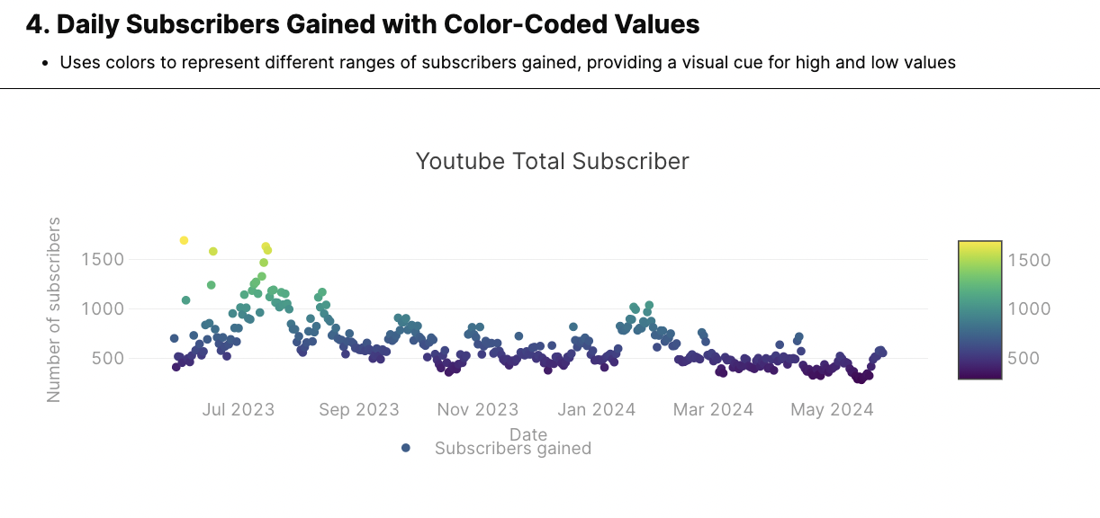
The color scale is defined in the data object under "colorscale": "Viridis".
return [
{
"name": "Subscribers gained",
"x": {{formatDataAsObject(youtubeTotals.data).Date}},
"y": {{formatDataAsObject(youtubeTotals.data)['subscribers_gained']}},
"type": "scatter",
"mode": "markers",
"marker": { // Marker customization
"color": {{formatDataAsObject(youtubeTotals.data)['subscribers_gained']}}, // Marker color based on subscribers gained
"colorscale": "Viridis", // Color scale for the markers
"showscale": true // Display color scale
},
"hovertemplate": "<b>%{x}</b><br>%{fullData.name}: %{y}<extra></extra>"
}
]
A data object in Retool with the colorscale defined for the gragh.
Chart 5: Range slider and time buttons
For our last addition, we’re adding a handy range-slider feature and some buttons to adjust the time span.

The data object is the same as in chart 1. For the layout object, everything we need here is under the ‘x-axis’ object. The range slider is a built-in option, and can be activated simply by setting ‘rangeslider’ to visible.
The integrated buttons are an additional UI feature that can save some screen real estate by keeping buttons on a Retool app to a minimum. It’s important to note however that the state of these buttons are not exposed to Retool, so can’t be used to filter more data in the app if needed. To filter data in both a chart and table, for instance, the buttons would need to be configured in Retool itself.
X-axis object:
"xaxis": { // X-axis configuration
"rangeslider": {
"visible": true // Display range slider
},
"rangeselector": { // Range selector configuration
"buttons": [
{
"count": 7, // Number of units to go back
"label": "1w", // Button label
"step": "day", // Unit of time (e.g., "day", "month")
"stepmode": "backward" // Step mode (backward in time)
},
{
"count": 1,
"label": "1m",
"step": "month",
"stepmode": "backward"
},
{
"step": "all" // Button to view all data
}
]
}
},
A layout object to include a range slider and buttons into the Retool graph.
Candlestick chart
Another similar option to the line and scatter graphs is the Candlestick chart. This chart gives you a clear overall trend line of values, and up close users can get a better understanding of the positive and negative values and their min/max values.
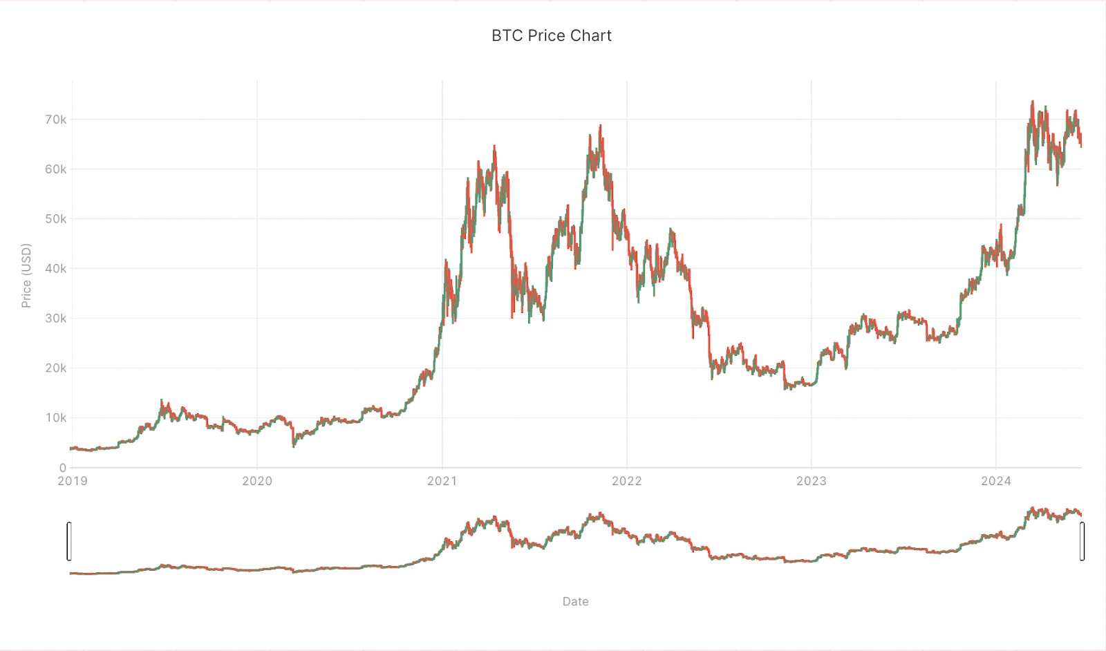
It’s a particularly common format in financial charts.

To illustrate this chart, we used the publicly available Bitcoin price data.
Data
// Accesses the nested historical data for BTC from the API response
let btcData = {{ getHistoricalData4BTC.data }};
// Converts timestamps to ISO date strings in 'YYYY-MM-DD' format
let btcDates = btcData.Data.Data.map(item => new Date(item.time * 1000).toISOString().split('T')[0]);
// Extracts the 'open' prices for each data point
let btcOpen = btcData.Data.Data.map(item => item.open);
// Extracts the 'high' prices for each data point
let btcHigh = btcData.Data.Data.map(item => item.high);
// Extracts the 'low' prices for each data point
let btcLow = btcData.Data.Data.map(item => item.low);
// Extracts the 'close' prices for each data point
let btcClose = btcData.Data.Data.map(item => item.close);
// Constructs a data series object for a candlestick chart
let btcDataSeries = {
x: btcDates,
open: btcOpen,
high: btcHigh,
low: btcLow,
close: btcClose,
type: 'candlestick',
name: 'BTC Price',
hovertemplate: `
<b>%{x}</b><br>
Open: %{open}<br>
High: %{high}<br>
Low: %{low}<br>
Close: %{close}<extra></extra>
`
};
// Returns the data series object as an array
return [btcDataSeries];
A Retool data object using the Bitcoin price data.
Layout
In this case, our layout object is very straightforward and mainly defines the labels, legends and color scheme. The range slider is set to visible as default, but can be added as in chart 5 and set to false if not required.
return {
title: {
text: "BTC Price Chart",
font: {
color: "#3D3D3D",
size: 16
}
},
font: {
family: "var(--default-font, var(--sans-serif))",
color: "#979797"
},
showlegend: true,
legend: {
xanchor: "center",
x: 0.45,
y: -0.2,
orientation: "h"
},
margin: {
l: 72,
r: 24,
t: 80,
b: 72,
pad: 2
},
hovermode: "closest",
hoverlabel: {
bgcolor: "#000",
bordercolor: "#000",
font: {
color: "#fff",
family: "var(--default-font, var(--sans-serif))",
size: 12
}
},
xaxis: {
title: {
text: "Date",
font: {
size: 12
}
},
type: "date",
automargin: true
},
yaxis: {
title: {
text: "Price (USD)",
standoff: 6,
font: {
size: 12
}
},
type: "linear",
automargin: true,
zerolinecolor: "#DEDEDE"
}
};
A layout object in Retool set for a candlestick chart.
There you have several variations to improve your scatter/line charts in Retool with just a few simple tweaks! For our subscribers we’ve included links to these charts in Retool below.
In the part II of this series, we’ll be sharing how we built out a complex Sankey diagram in Retool.
Want to learn more about internal tools and how to build them? Check out our sections on low-code tools like Notion and Airtable, or developer tools like Retool and Windmill.

