We’re not entirely sure if the Retool community is ready for this… but we’re doing it anyway. In the next of our Retool UI-inspiration series (where we use Retool to replicate well-known UIs we like) we created the ultimate Retool UI dupe - it’s Retool. On Retool. No guts, no glory.
Here’s what it looks like:
Don’t believe us that this isn’t just… Retool? Have a play around and see for yourself.
And, if you’re feeling really daring, members of our newsletter can download the JSON to blow their minds in edit mode too.
Once you’ve got your head around the Retool-ception, keep reading for some key UI pattern takeaways from this most monumental UI endeavor yet.
Key disclaimer: Yes, this was Stefan, and no, he cannot be stopped.
Closable Notification Containers
Why not have notifications in your Retool apps? Using the Retool style of container you can set up notifications for your users that alert them to new features, important announcements and updates, that can quickly be closed away when read. This is particularly useful for the Home pages of multi-page dashboards.
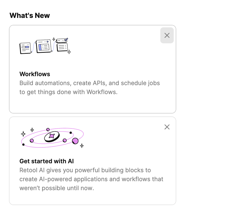
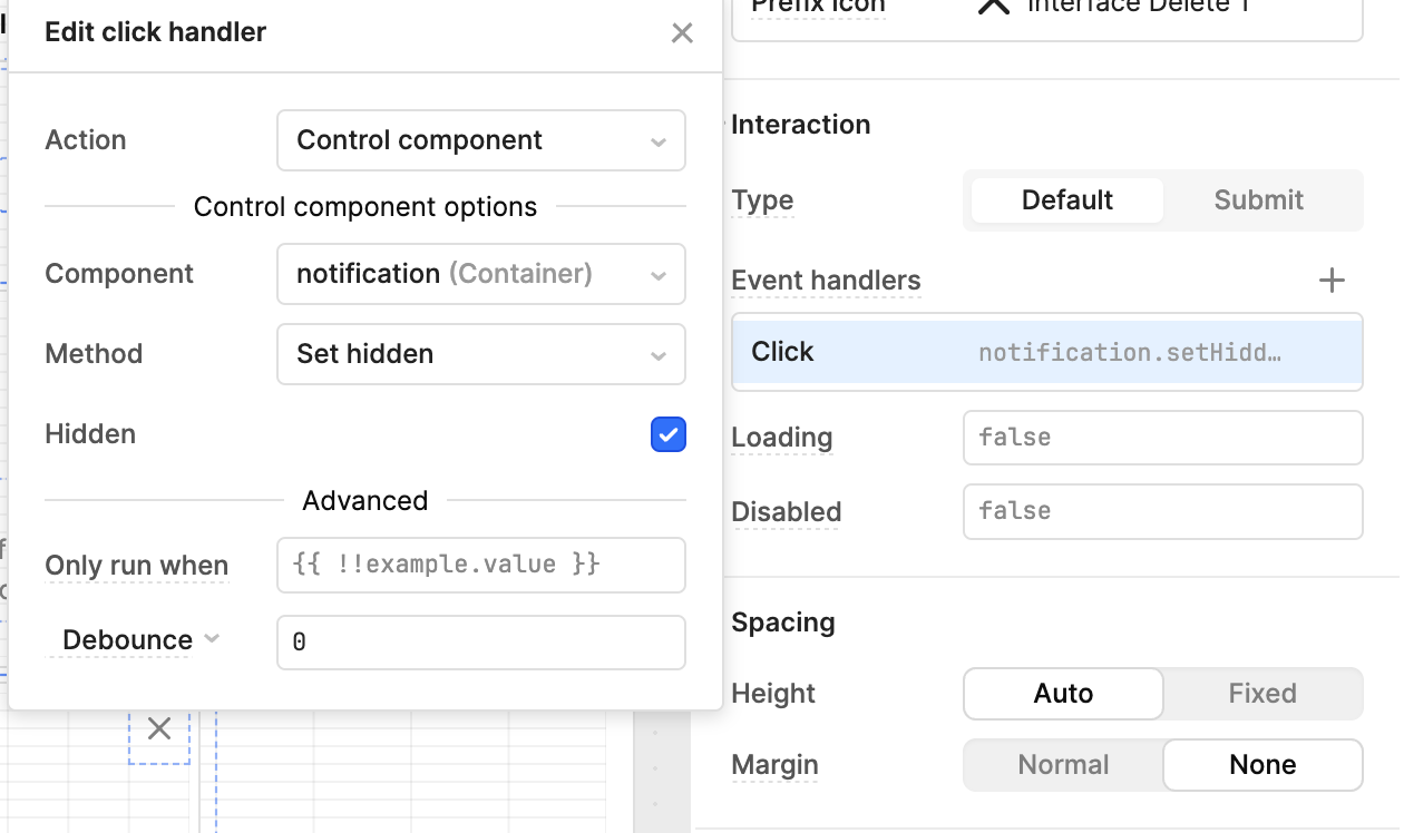
In Retool, (real Retool, not Retool on Retool) you can natively perform this use experience by using the setHidden event handler and the close button. You can use a listview with a setHidden event handler on each container to surface and hide notifications that might be relevant to the end user.
Minimalistic and well-styled listviews
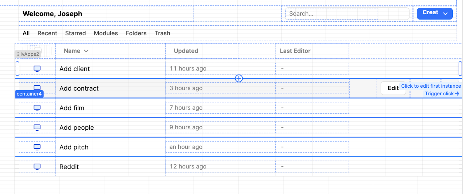
We bet you didn’t think that our app menu was a built in a listview! The Listview is a little neglected as a component: we often find that, since listviews take longer to configure, people don’t fully stylize them and their Listviews end up looking like clunky cards rather than tidy lists.
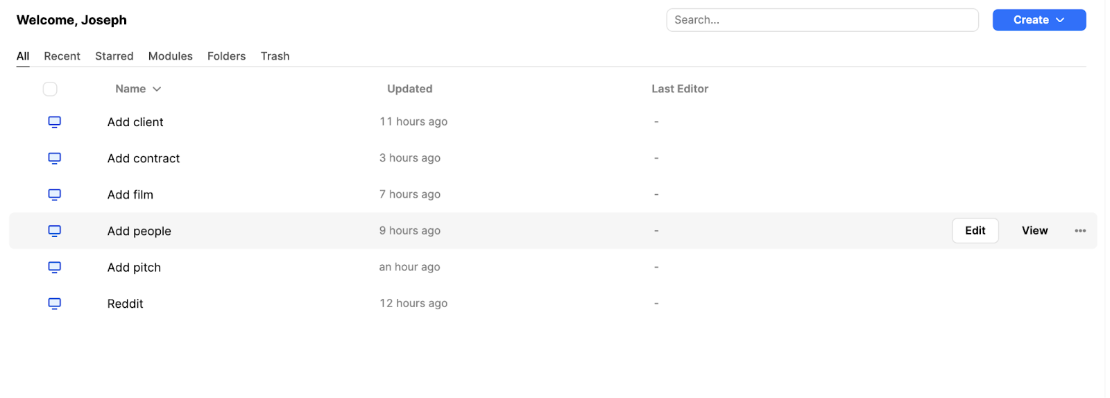
In this app we used all kinds of stylistic tricks to hide the fact that this list is made of a list view component - download the app to find out how! Listviews can be more flexible than tables, since you can use any component within them and there can be more options for editability. Plus, a well-styled Listview can look very beautiful too.
Subtle user feedback: container hovers
One of our favorite things to do when developing in Retool is to use design patterns that are 99% invisible but still highly effective in guiding the user experience. In the top right-hand corner you can see the outline change on hover. There’s a reason Retool uses this: this kind of subtle feedback helps users understand the UI intuitively without needing instructions or feeling overwhelmed with repetitive buttons or text. They might realize something is clickable that wasn’t obvious before or notice a button better.
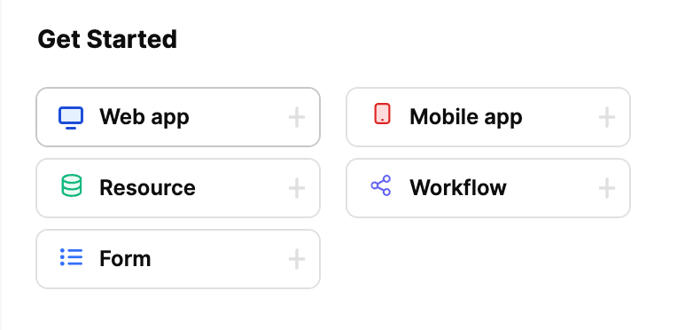
To achieve this, we can write a short snippet in the button’s ‘border’ styling, to change the border color on hover.
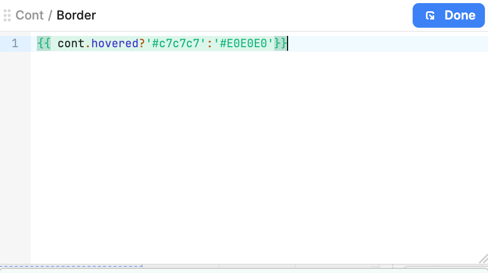
The ‘hovered’ attribute can be so useful in Retool apps and deserves much more usage: drop shadows on containers and buttons, background color changes, and more.
Interested in playing around with how we did this in your own environment? Members can download the Toolscript below to import it directly into their Retool environment.
In the rest of this UI inspiration series, we recreate some of our favorite application UI's, like Steam, Reddit, YouTube. Make sure to check them out!
Download the sample toolscript
The Toolbox newsletter members can download the JSON and import it directly into their Retool environment to test it out ⬇️⬇️⬇️


