There's a tendency with Retool to think that it's only possible to create basic, unpolished internal apps (read: ugly apps with default Retool-blue buttons). While it's certainly not yet a pixel-perfect builder, with every release of new features it's getting easier and easier to create beautiful apps that just look like the favorites you use every day. What's even better is that implementing these practical, sleek features is still really fast.
For that reason, we've been working on some simple UI inspiration templates that prove just how beautiful and functional Retool can be with just a few creative uses of components.
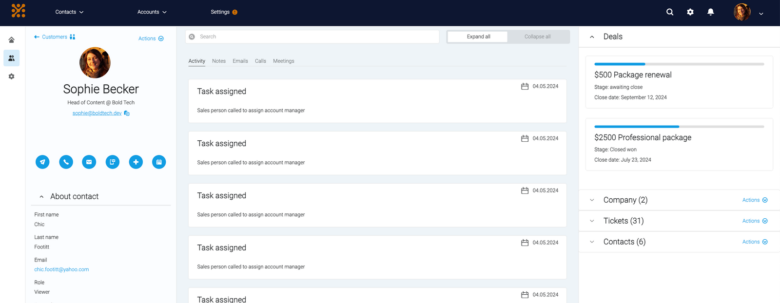
For our first template: a Hubspot-inspired CRM UI (play with it here!).
Here are some of our favorite parts of this UI and how you can implement them with Retool.
Columns of information with a clean design
Since sales agents often need quick access to lots of info on the same screen, we recreated the Hubspot vertical view functionality with a mixture of the sidebar frame, split pane frame and containers, with the ability to hide these away too.

One of the things we particularly like about the Hubspot UI is how clean and simple the design and color choice is. The varied colors across columns helps visually differentiate the sections but also gives a clean and practical look to the app.
Categorizing and hiding data
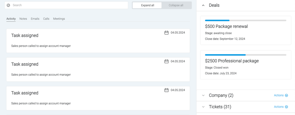
For the card-like functionality of client task tracking and touchpoints, we used a listview component. For the toggle information on the right-hand side panel, we used toggle containers to hide away information until necessary.

This gives the user full control over how much data they see at once and allows fast, organized access to related information in one place, without needing to switch tabs or pages.
Varied button types for actions
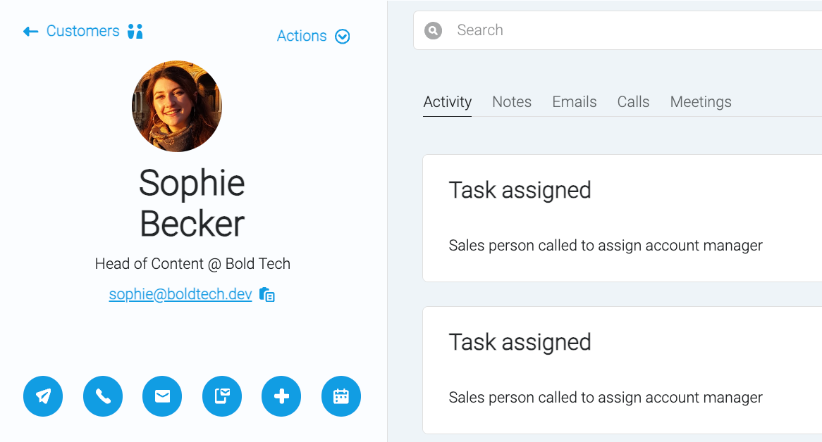
One thing we particularly like about the Hubspot interface is the ease with which you can take action on an account. So we made an effort to replicate some of Hubspot's intuitive action features such as the icon button row, with simple icons that are obvious to users and reduce the amount of space used up by action buttons for these primary actions. Secondary actions are tucked away in the actions dropdown.

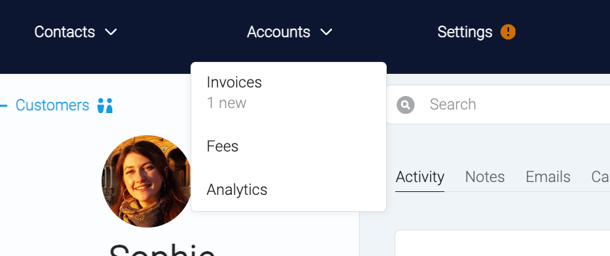
We also played with notification feature options in the navbar. Adding simple elements like notifications icons or captions to dropdowns with further information can be a great way to make apps feel more well-rounded and intuitive.

This app is a UI wireframe template inspired by Hubspot and created in Retool. You can adapt the template as you see fit for your CRM or Retool project.
Want to download the source code? Sign up to our newsletter below!
In the rest of this UI inspiration series, we recreate some of our favorite application UI's, like Steam, Reddit, YouTube and even Retool itself. Make sure to check them out!


