In the next of our Retool UI inspiration series, we’ve built a Reddit replica that would be sure to fool any keen Redditor (until they clicked something at least!). Reddit’s UX/UI design is super minimalistic, allowing users to focus on the content over functionality. While you may be unlikely to build a social media platform in Retool, this style of UI might be most useful when building business software that revolves around information, such as sales CRMs or customer support tools.
Play around with it here!
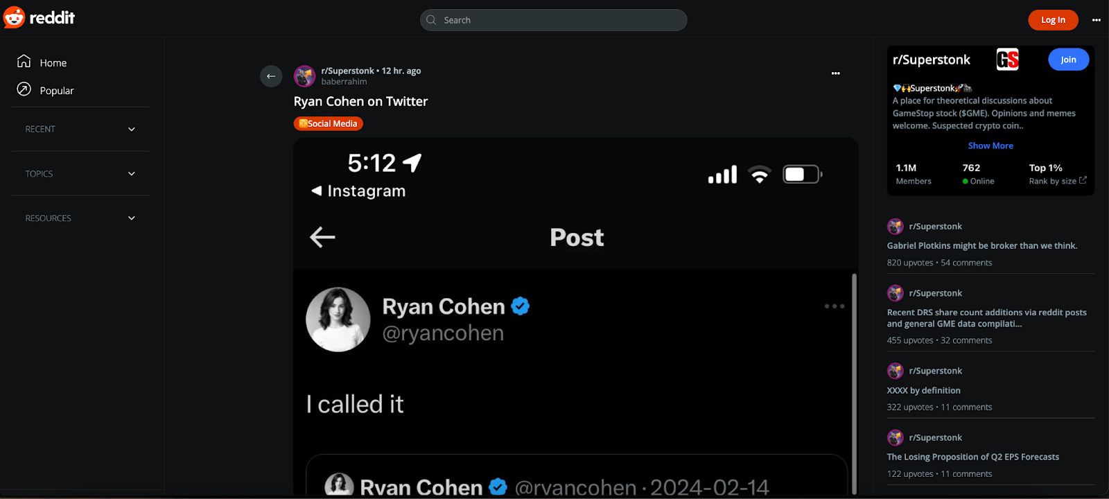
Let’s break down this UI style a little and see how this might be useful when building in Retool.
Dark mode styling
Dark mode is a relatively under-utilized way of styling apps in Retool, but using an example like Reddit shows how slick it can look when used effectively. Using the orange as an accent color for key action buttons and tags is also an effective color palette.
Here is the theme we used for this example which you can copy directly to your app theme settings:
Primary: D93900
Secondary text: 758791
Canvas & primary surface: 0F1113
Secondary surface: 2B3236
We also used high-pixel border radiuses to create rounded inputs for buttons and the search bar for example.
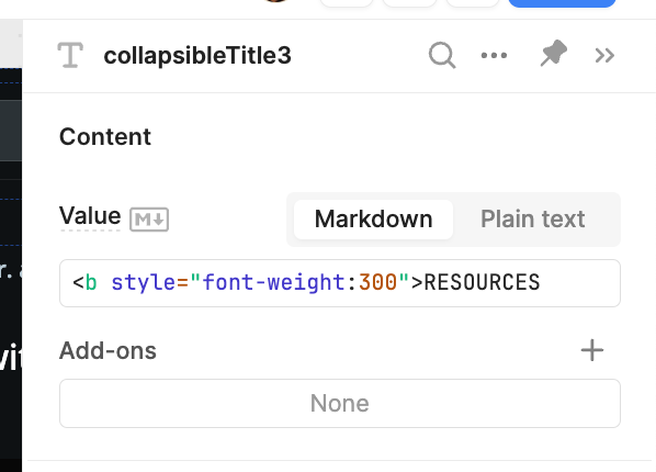
The font type here is Open Sans, but we used custom CSS to change the appearance of the nav text for instance:
Columns of scrollable information
One UI element we particularly enjoy about Reddit - like other social media platforms - is its ability to show different areas of functionality and data on the same page without overwhelming them.
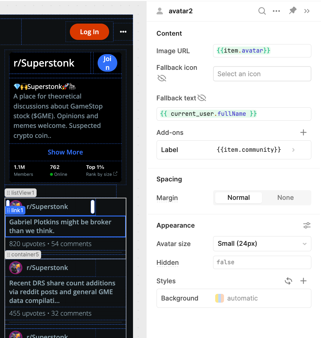
The three columns of functionality (navigation, forum content, and forum info overview) are visually distinct and individually scrollable to improve navigation of different data without leaving the page.
Okay - disclaimer - there’s a little cheating in here when it comes to the comments section, where this kind of UI is just not possible without extensive custom code. Nevertheless, some of the styling was easily replicated in Retool, such as the highlighted content in the right column which we built with a listview component, using a combination of avatar, link and text components.
We did something a little like this column layout in our Hubspot UI inspiration piece, using three columns to show company and deal data on the same page, but designed in a way to be easily hidden and ignored if not necessary.
Navigation bar
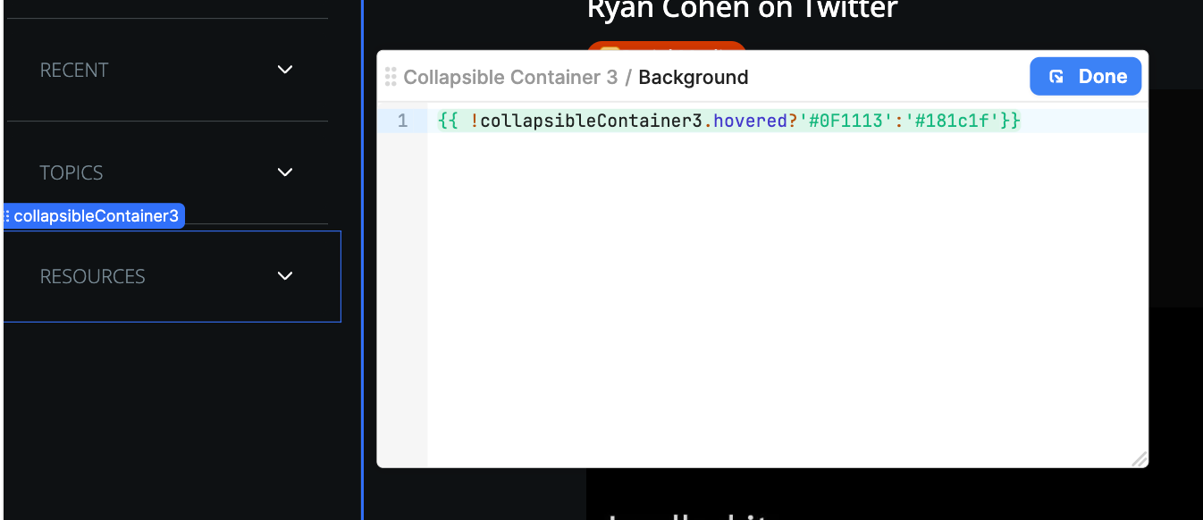
Retool’s native navigation bar is a little limited in terms of styling, so we had to get creative with this neat style of organization for site pages. To create this dropdown menu we simply used a collapsible container that allowed us greater control over text spacing and additional components like icons if needed.
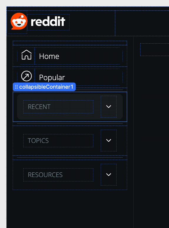
The Home and Popular items are composed of text components and HTML for the icons, which you can group to set an event handler ‘on click’, effectively turning anything into a clickable ‘button’ in Retool.
One key style feature we used throughout this UI was the .hovered attribute on components like the collapsible container. This attribute allows you to change the ‘Background’ styling according to whether the user hovers on the component, mimicking a lot of commonly-used UX design across the web and creating a highly professional-looking app.
Interesting in playing around with how we did this in your own environment? Members can download the JSON below to import it directly into their Retool.
In the rest of this UI inspiration series, we recreate some of our favorite application UI's, like Steam, Reddit, YouTube and even Retool itself. Make sure to check them out!
Download the sample toolscript
The Toolbox newsletter members can download the JSON and import it directly into their Retool environment to test it out ⬇️⬇️⬇️


