


In internal business software, the importance of designing beautiful and efficient UIs is often overlooked by developers. Since internal tools get far less exposure than customer-facing interfaces, developers often reserve their time, energy, and creativity for those customer products instead.
Unfortunately, neglecting the user experience of internal business tools can be a huge mistake. Those internal users are arguably the most important part of your product: the ones driving revenue, and innovation, and supporting the product and its customers.
Since we are pretty obsessed with building efficient UIs for internal tools that prioritize the employee’s experience, in this UI guide we\'ll run through some practical tips and tricks to apply to your apps to ensure the best user experience for your team. We’re going to focus on core data dashboards, such as admin panels, starting part 1 with a focus on tables.
Table component features
Tables are one of the core components of dashboard apps, so optimizing the data presented is of the utmost importance. If your users can interpret and understand data with a simple glance at a table, you give them more time and opportunities to solve problems, perform actions and come up with new business ideas based on these data metrics.
Retool has recently finalized the new table component and deprecated the former, and with this new version, there are some brilliant additions to the functionality. In this article we\'ll also run through some new elements, such as the expandable rows option, that offer great UI options for your apps.
For presenting data, table column formats currently include:
Standard validated input types:
- String, Multiline string, Email
- Number, Percent, Currency, Phone number, BigInt
- Date, DateTime, Time
Good options for visual indicators:
- Progress, Boolean, Icon
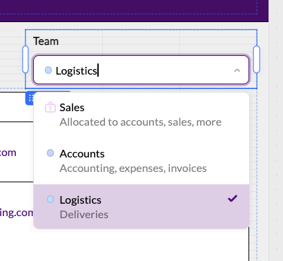
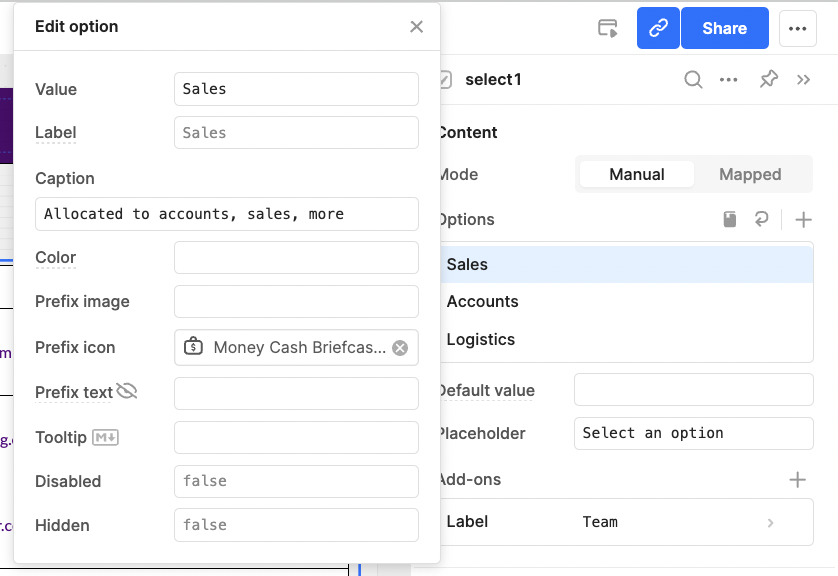
- Tag(s) - can be used for dropdown style editable table, and can add icons under ‘option list’
- Avatar - great for logos
- Image - tricky to use well but useful if needed
- Rating (though not our favorite)
More functional options:
- Link, Button
- Markdown, HTML, JSON
All of these options have varying settings, add-ons, and customization options. Where some options are a little more limited in terms of their settings, we recommend getting creative with others, which can lead to some great, often unexpected UI options.
Quick UX/UI tips
To get us started, here are some quick-fire tips for improving the layout of your tables in a few minutes. These take just moments to implement, but such small changes can still make a large difference to the overall user experience when combined.
Present data in varied, visual, and logical ways
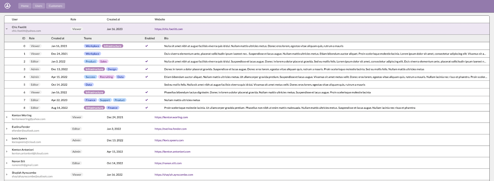
When presenting data in a table, it’s easy for an interface to quickly feel overloaded with information. It’s essential to organize columns logically. Grouping columns into related data makes data quickly digestible, whereas spreading related data out forces users to look up and down each row, losing time and context.
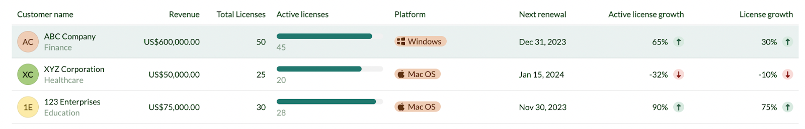
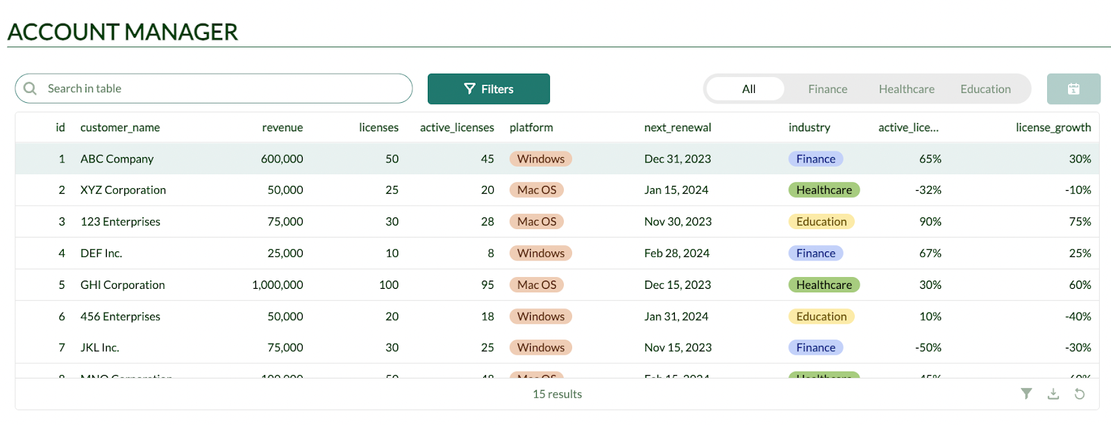
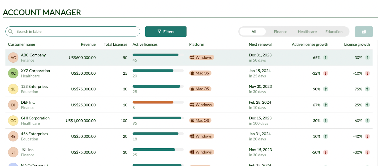
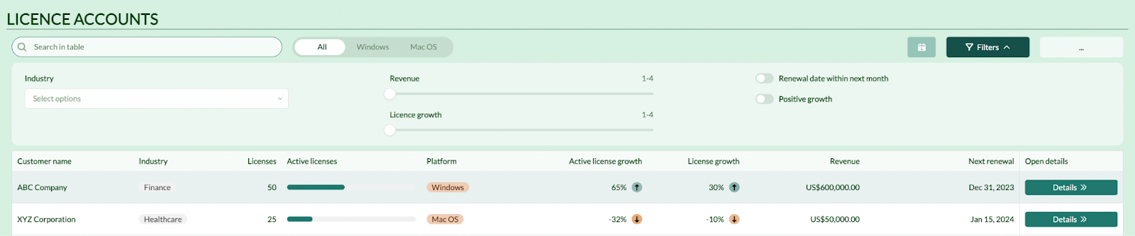
Example: in this table, customer data and revenue are grouped to the left, with the industry coming under the company as a caption, and an avatar that can be used for the company logo. The Total Licenses and Active Licenses figures are grouped closely, and the growth columns are kept together on the right side. The user can interpret the data in a logical flow, from user, to licenses, to growth. The progress bar is a great, visual way to help users understand the percentage of licenses that are active.
As well as organizing columns logically, it’s important to use consistent visual elements to make data scannable. For this purpose, we love Retool\'s ‘add-ons’ like the status indicator, which can give a quick trend overview of rows in the table. When using the status indicator, we prefer to delete the text to avoid cluttering the table with unnecessary textual data, since a simple arrow and color combination is easy enough to understand.
Finally, pictures are much quicker for users to interpret than text, so use icons in the tag formats to create clear visual indicators - as we have with our easily-recognizable Windows and Apple logo icons in the ‘Platform’ column above.
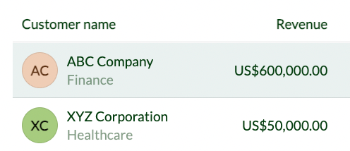
Use captions and color to organize secondary text/data
When designing tables, it’s a good idea to consider the hierarchy of the data you’re presenting. Thinking in terms of primary, secondary, and tertiary data is a great way to help organize the layout of the table.
Generally, if all text in a table is in the same color, font weight, and size, the user will typically only be able to interpret the data as a whole, rather than having their attention focused on the most important stuff.
Captions are a great way to implement this theory - by keeping related data grouped and visible, whilst not distracting from the key data where users’ attention should be focused.
The caption is also in a lighter font color by default, creating a clearer visual hierarchy of data:
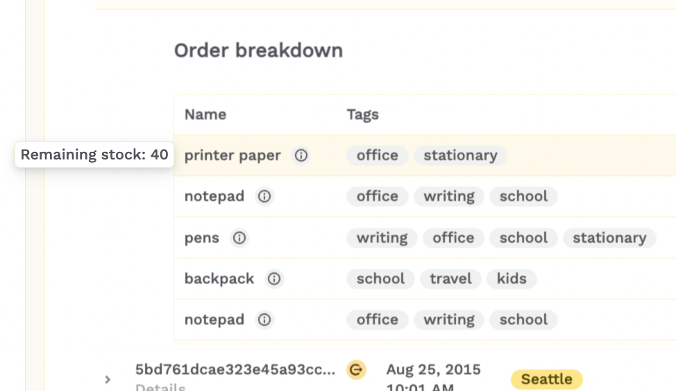
Tertiary data can be hidden even further - think the kind of data that might be useful, but isn’t crucial information. Here’s an example of how we linked to some handy data using a Tooltip that remains hidden until you hover over the relevant cell.
Smarten column headers and data layout
This is a really quick one - don’t forget the simple stuff! Smarten up your column header titles. We see plenty of developers leave data headings with the database titles (often in snake or camel case) which is much harder for users to read.
In Retool, the column will always be as wide as the header, so make sure to adjust the length of the column header text to reflect the width of the data.
Generally, it\'s best practice to left-align your text and right-align numbers, though this is the default in Retool tables.
Use color effectively
Like when using captions and more to organize data into primary, secondary, and tertiary ‘tiers’, it\'s a good idea to apply these principles to using color in tables too. If tables are broadly colorful (with no logic behind the color design) then the user just doesn’t know where to look.
We see so many apps where developers stick to the Retool table defaults - which often pick bright tag colors for random values that draw a user’s attention immediately to that data.
Effective tables will only use color in two or three key places, and only for the kind of primary data you want your user to look at first and foremost. In the example below, we use eye-catching colors for the ‘Role’ and for the ‘enabled’ checkbox - the two key values that are important for this dashboard.
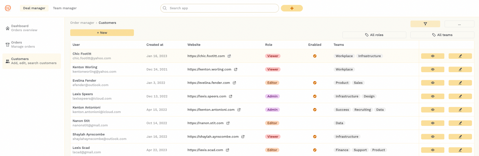
For our key actions, we use the same bright yellow as our primary color - indicating the significance of actions such as the data actions ‘View more’ and ‘Edit’ grouped on the right side of the table and the ‘+ New’ option on the top left.
Color also helps differentiate between the important filter buttons on the top right, as we use a lighter yellow for this secondary action.
Secondary data is best in a lighter gray font, which makes it visible without being distracting, like our email addresses. This is also good practice for things like form fields and placeholder data which are not always essential.
Quick tips case study:
Here’s an example table that shows the before and after of the implementation of these elements.
Before: a plain table as defaulted by the table component from our dataset.
After: a table optimized for data grouping, primary/secondary data skim-reading and additional information.
More UI features in the Retool table component
Now that we\'ve looked at some quick UI fixes, let\'s take a closer look at two key features of tables in data dashboards and how you can optimize them for user experience: expandable rows for dropdown data and a table essential: filters.
Expandable rows
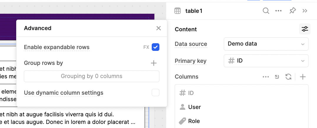
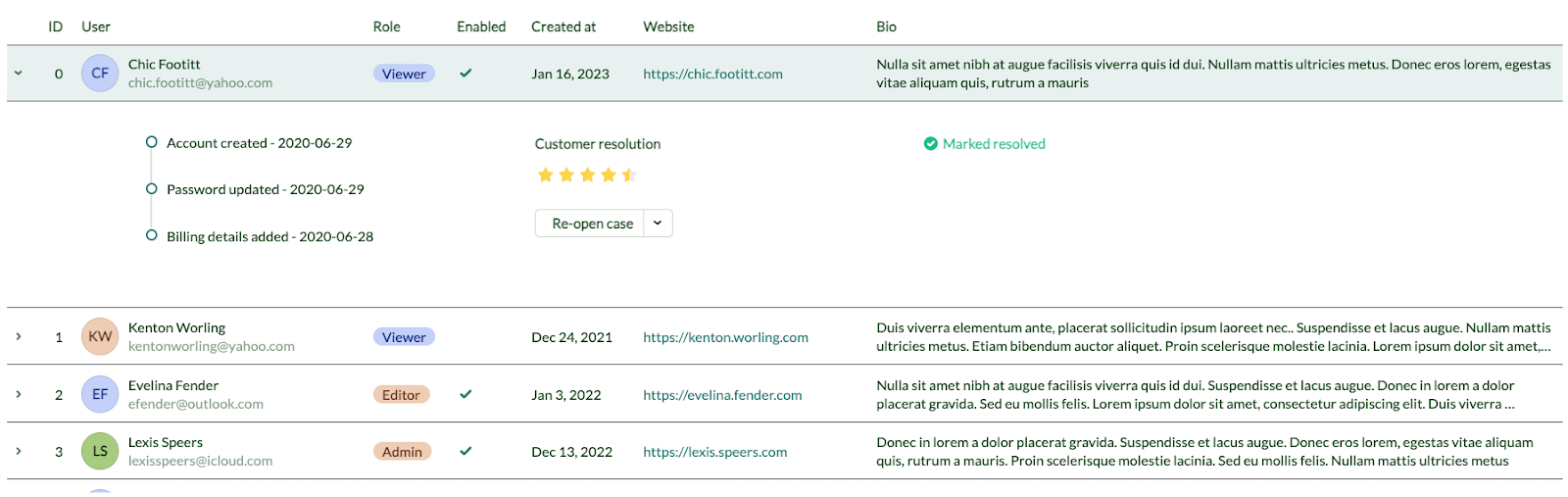
Expandable rows are a great addition to the new table component and allow for much better data exploration. By using the expandable rows option, you can display greater detail with additional nested tables, components like timelines, and more.
To enable expanded rows you simply need to click the ‘Advanced settings’ button in the table component’s content section and check the ‘Enable expandable rows’ option. This can also be controlled with JS by toggling FX.
Here are a couple of examples of how you can use expandable rows to improve user experience with nested details.
Example 1: Order breakdowns in an order table
To avoid overcrowding one table with details of the order, we added an extra table in the expanded row which details the exact order breakdown in a more readable format. The order value is summarized in the statistic component and more useful summary statistics could also be added, such as the status of the delivery or payment.
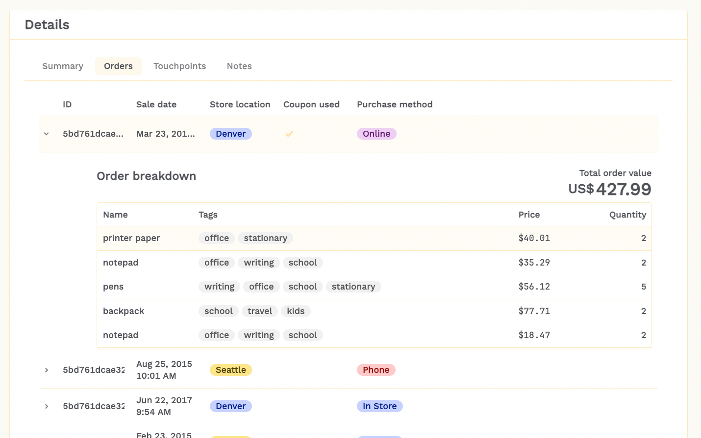
We used plenty of whitespace here to visually differentiate the two tables and a left indent to give a clear impression of the nested data structure.
Example 2: Heavy nested table data
In this example, our user needs to see a large amount of data under each table row. To visually differentiate the tables, we set the main one to a large row height and the secondary table to a small row height. We pared down the colors in the main table to create a greater focus on the tags in the secondary table, which is used frequently. We also used a different column header color to create a clear distinction.
Example 3: Summary data
In this example, we added some summary components, such as a timeline to summarize the account actions, a rating component, and a button. It’s important to note that this button is hidden from the user’s view and requires an extra click each time, so should only be used for secondary actions.
Expandable rows UI tip - closing one row when another opens
It’s not yet a native feature in Retool to set the expandable rows to only open one at once. To set this up, you will need an event handler that looks a little like this:
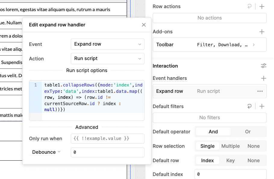
table1.collapseRows({mode:\'index\',indexType:\'data\',index:table1.data.map((row, index) => (row.id != currentSourceRow.id ? index : null))})Filters
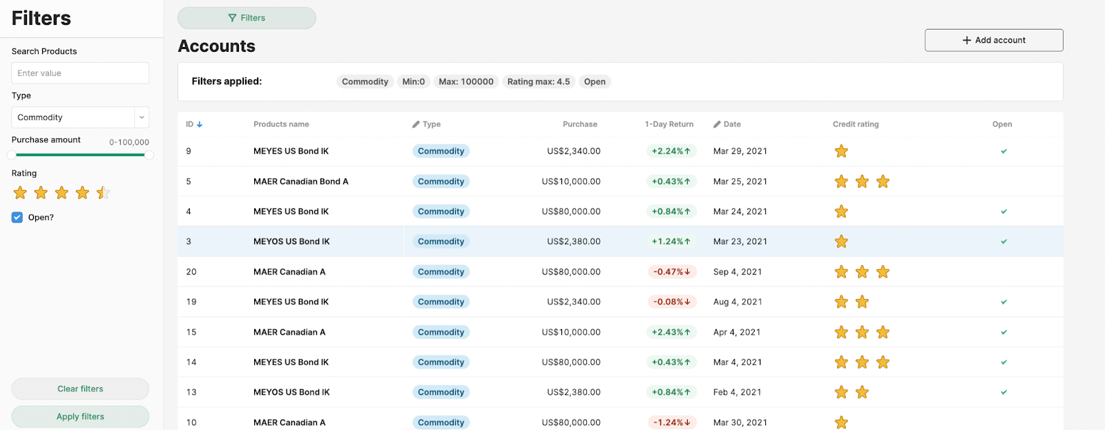
Most tables will have filters of some kind, but often they\'ll have many. Just like with all our other design principles, it’s important to consider the importance of each filter when deciding where to put it and how to display it. Secondary filters can often be tucked away into hidden or collapsible containers to keep the interface tidy, but – beware of using features like modals for advanced filtering that are frequently used, as they force users to open and close the modal window every time they want to change them.
Filters can be set in SQL (like we do in this SQL filters tutorial), but it’s often best to set them in Retool itself, in the front end using JavaScript, to avoid constantly refreshing your data. This depends on how big your dataset is and whether you paginate it. We talk a little more about this in our Performance article.
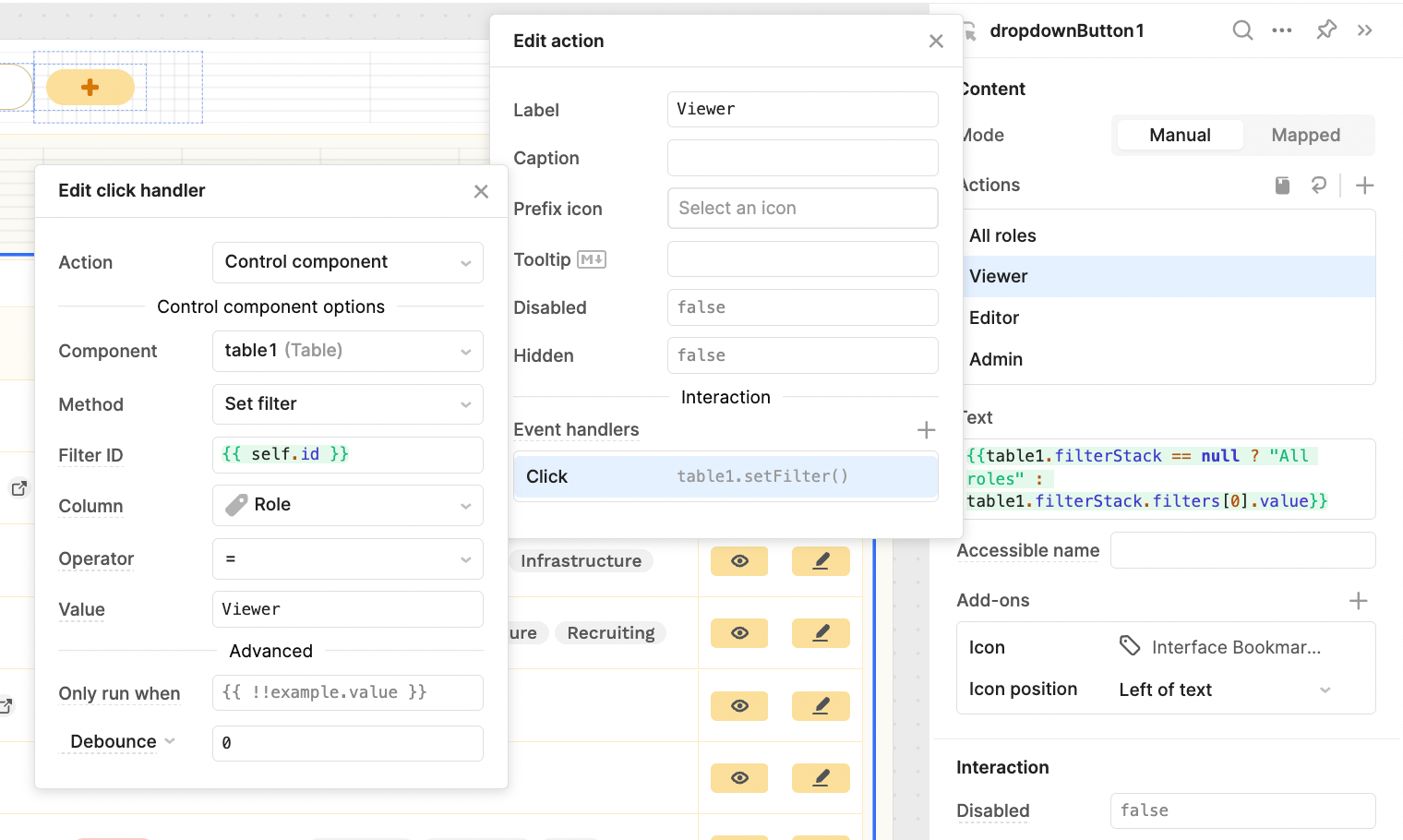
Here’s an example for how to set filters using an event handler:
This is a simplified example - bear in mind that having lots of different filter options means you should use event handlers to set the filterStack instead.
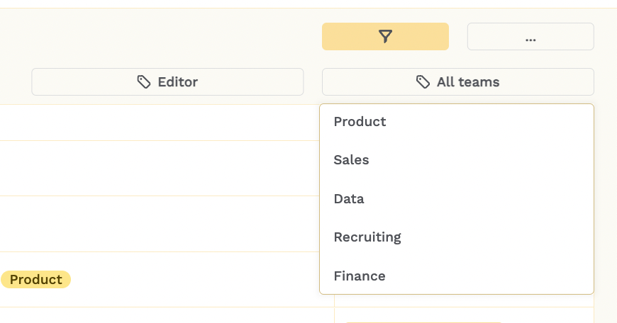
UI styles ideas for presenting filters
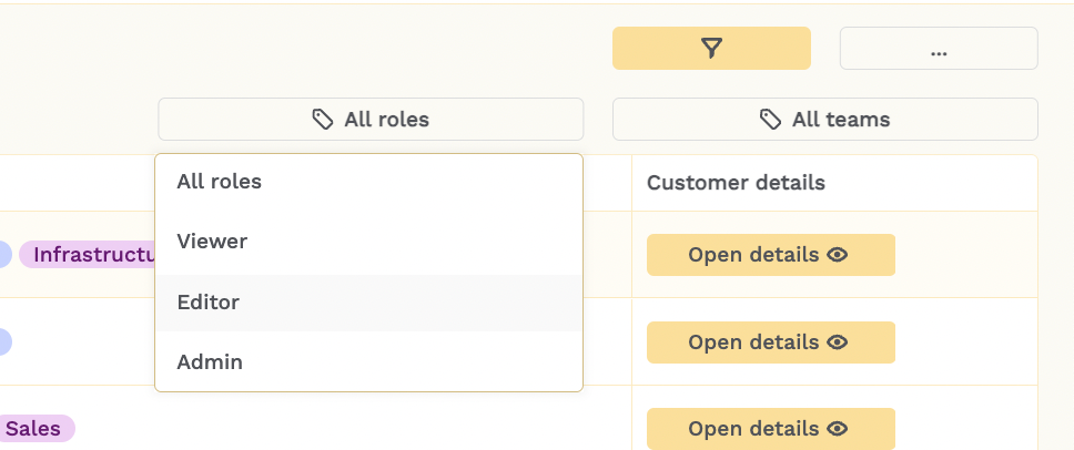
If only a single filter value is needed at once (i.e. no ability to multi-select options needed), a nice UI trick is using the ‘Segmented Control’ component to allow users to tab quickly between options rather than select from the dropdown. The \'Select\' (dropdown) component requires an extra click and doesn’t show all options at all times, so can be less useful.
Nevertheless, if you do opt for the dropdown filter, it has many more customization options. Using the color tags might help if there are already strong color associations in your app tags for instance, or icons as visual indicators can also work well. Captions help expand on information where needed.
You can use icons, as we did in the first, and captions to give more information where needed.
For single filter selections you can use a dropdown button to select, and change the button on selection to make it clear which filters are applied.
Finally, it\'s important to consider where you put these filters. You could put them all out above your tables, or you could use toggle buttons to show/hide an ‘advanced filters’ container, where you keep secondary filters that are used less often.

In a full-screen-table style of app, the sidebar is a great place to put the filters, which can then be made hideable. Or, you can use the split pane frame if it helps to have an adjustable width for this sidebar.
It’s always a good idea to make it clear which filters have been selected, which we did below with tags, especially if your sidebar is hideable.
Those were just a handful of our UI tips we regularly implement in our Retool apps - The Toolbox newsletter subscribers get access to monthly UI tips, as well as best practices for development and more.
Want to learn more about internal tools and how to build them? Check out our sections on low-code tools like Notion and Airtable, or developer tools like Retool and Windmill.

