We’re back once again to bust the myth that cool and complex UIs aren’t possible in Retool. With this week’s release, we’re sharing one of our proudest UI replicas: YouTube, but - you guessed it - in Retool.
You might not be looking to take on the Google giant with a video platform competitor built on Retool any time soon, but this example does show that there are some really unique UI features that you can build with a little tweaking of Retool’s native components.
YouTube in Retool... using native components you can build some cool UIs for your internal applications.
You can play with the Retube here.
Let’s go through some of our highlights and discuss how we might apply them to other Retool apps.
Retool 'popovers'
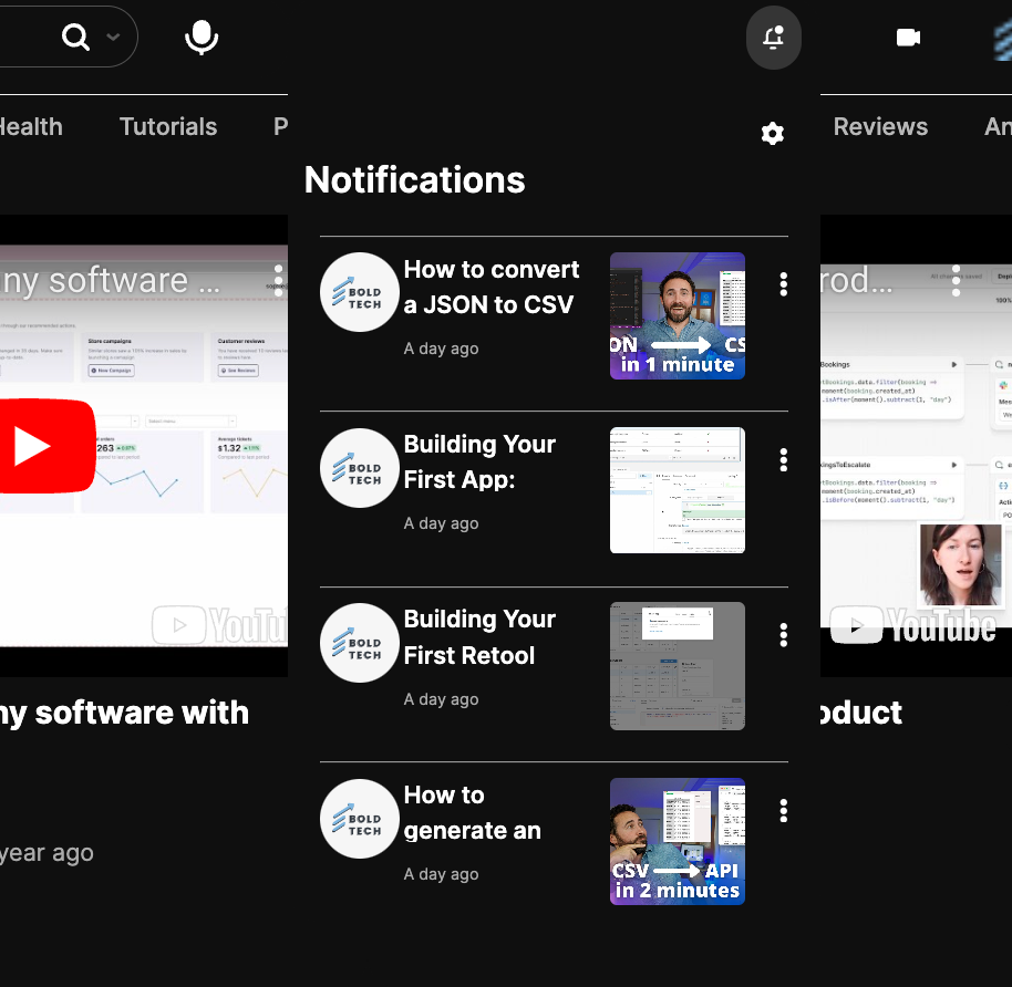
Our favorite UI feature in this replica is the popover effect on menu items. A ‘popover’ is a technical view, often a summary or a menu, that appears over other content when people click it. It’s a great way to optimize screen space with information that doesn’t need to be used at all times and is also very familiar to people as a common UI pattern across many highly used web apps like YouTube.

This is not a UI style that we see in Retool very often, and that’s because frankly, this is a really sneaky hack. In short (we’ll share a more detailed tutorial in the next few weeks), the way you can achieve this style of UI is by placing your summary into a container body, with a toggle button set to show/hide the body, and then placing that into another container’s header box. In this app, you can see this effect in the notifications section, add new video button, and the search bar.
It’s not a perfect option yet, and some additional tweaks need to be made to make this as seamless a user experience as possible, but it can nevertheless be a great option in many Retool app UIs.
Centralized search bar
We see a lot of Retool apps with the same search bar style: placed to the top-left side of a table with several dropdown filters. Shake it up! Placing a centered search with filters underneath as tabs is a common UI pattern in web applications outside of Retool, and one that ought to be used more in Retool apps too. This style of search and filter is easy to achieve using the tabs component (set to pills) and can be more intuitive for users who use platforms like AirBnb or YouTube often.
In terms of filtering views, tabs are a great way to create a single-click style of common filters that doesn’t require users to constantly scroll through long dropdown lists. As you can see in the YouTube replica, even having more than a dozen options can still look tidy when presented in the right way. Note, this is best reserved for UIs where filtering is one of the key functions users will be performing (as in YouTube) since otherwise, this style of UI can be overly busy.

Creating a collapsible sidebar in Retool
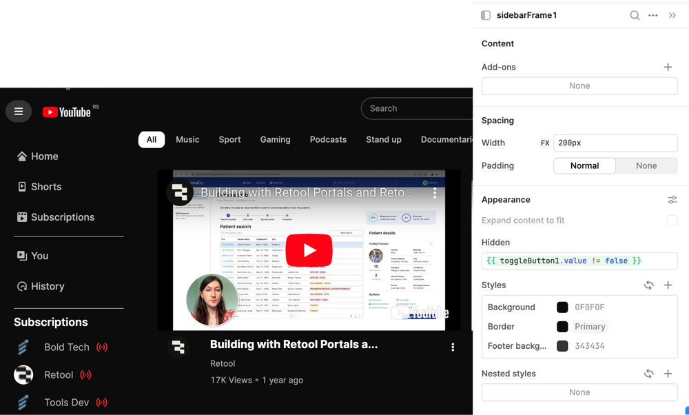
Another one of our features to highlight in this YouTube replica is the collapsible sidebar. This option to dynamically hide or show the sidebar navigation by the hamburger icon is a really familiar UI style that users will typically instinctively recognize, and can be a great way to give users the option for more screen space when needed. Don’t forget to place the toggle button in the header frame to ensure it’s always shown!
To build this in Retool, we simply set the sidebar frame’s hidden attribute by the true/false value of the hamburger toggle button. The toggle button is the best component to use in boolean functionality since these values are natively built into the component’s settings and therefore require less messing around.

Interested in playing around with how we did this in your own environment? Members can download the Toolscript below to import it directly into their Retool environment.
In the rest of this UI inspiration series, we recreate some of our favorite application UI's, like Steam, Reddit, YouTube and even Retool itself. Make sure to check them out!
Download the sample toolscript
The Toolbox newsletter members can download the JSON and import it directly into their Retool environment to test it out ⬇️⬇️⬇️


